For my first set of qualitative posters, I thought a little too big. I was thinking too outside the actual space of the posters, more so how each design would fit into a larger viz puzzle rather than standing alone as an individual piece. This time, based on the feedback I received, I collected the rest of the data and put all of that data on the space of a 11x17 poster.
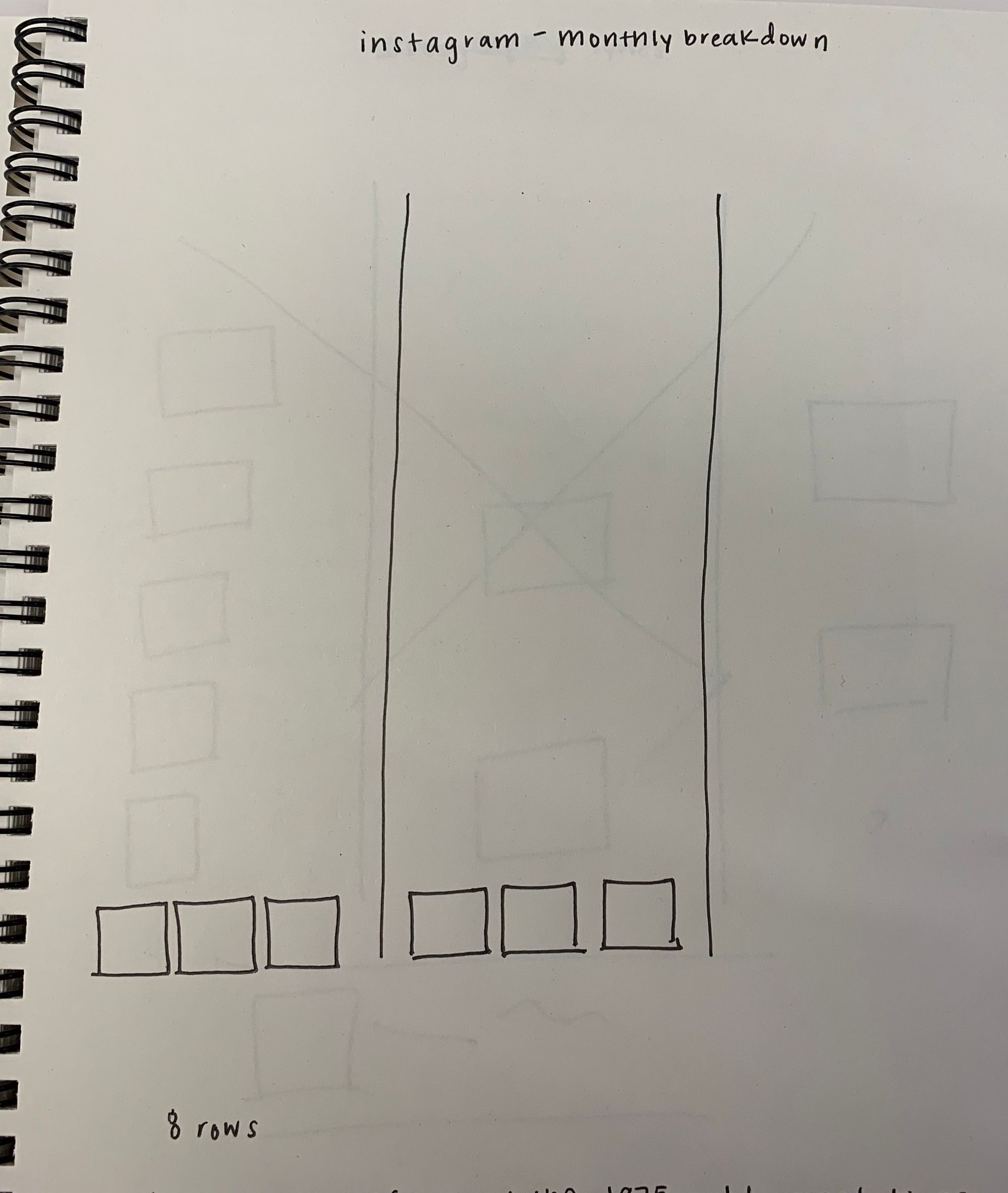
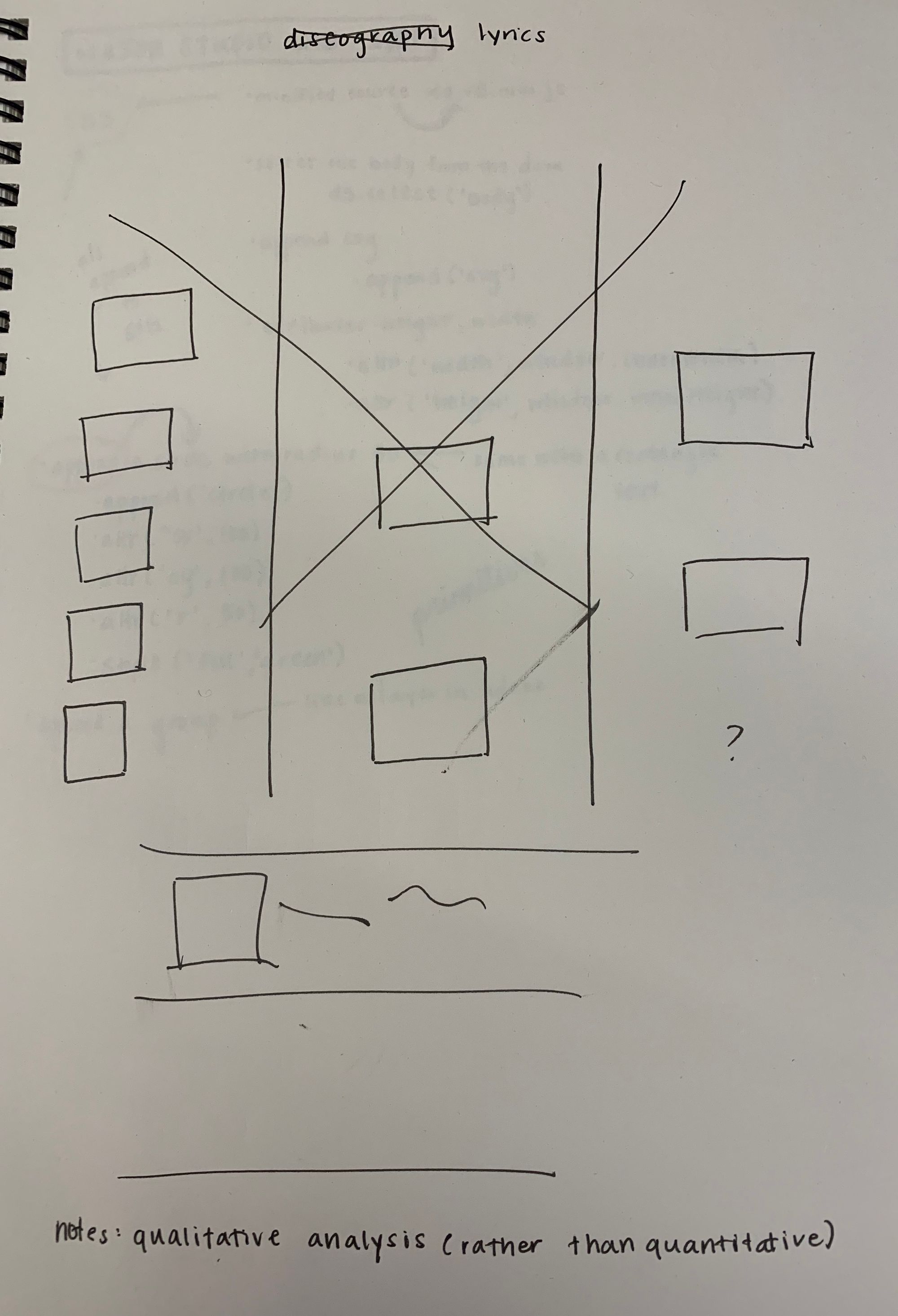
I chose the Instagram idea out of the three designs (Instagram, lyrics, tour history) I presented last week. It felt like the class was most intrigued by this concept and was curious to see the complete dataset, as was I. Also, thinking ahead, I felt like it could lead to a lot of interesting image analyses I've never worked in before.
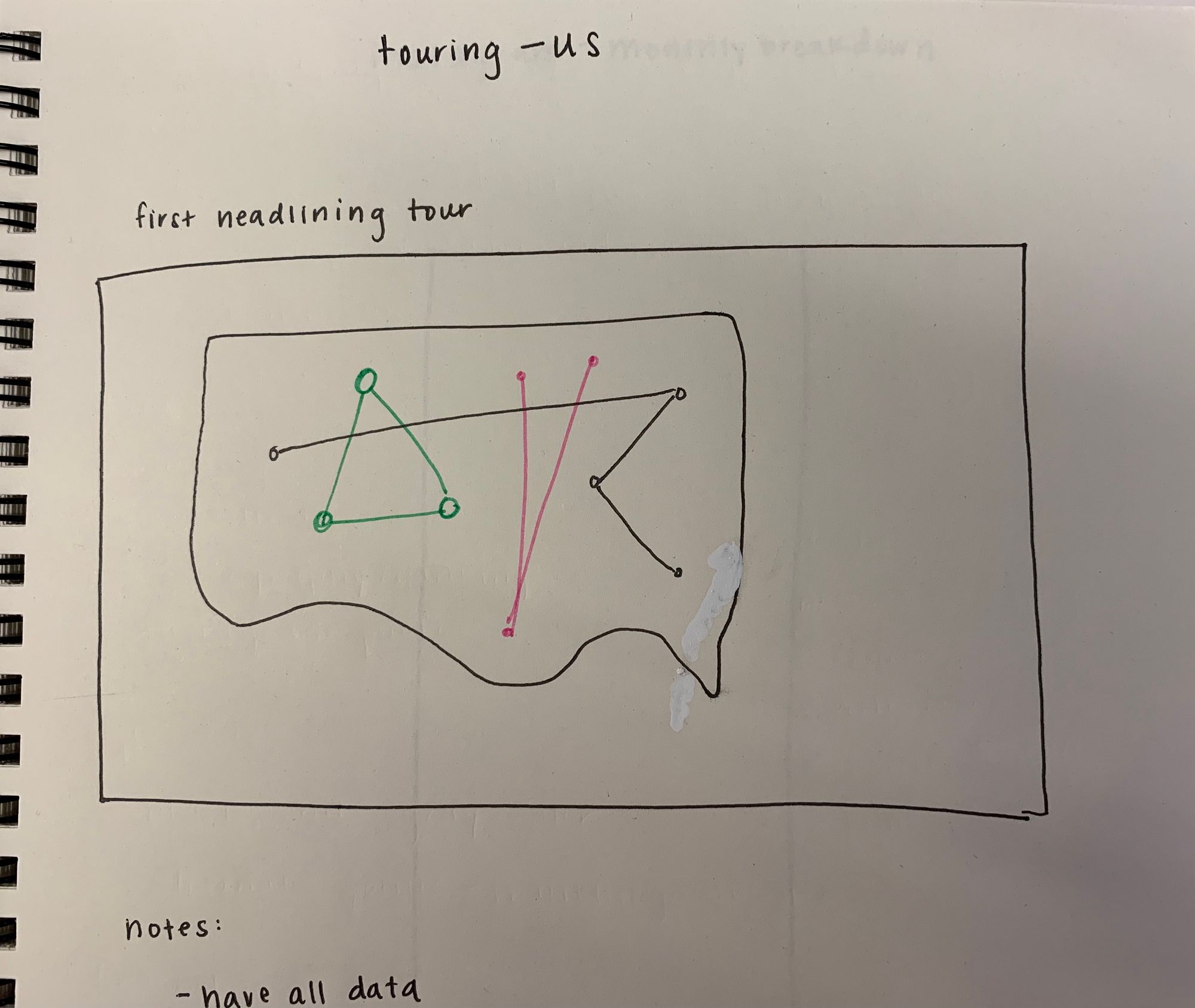
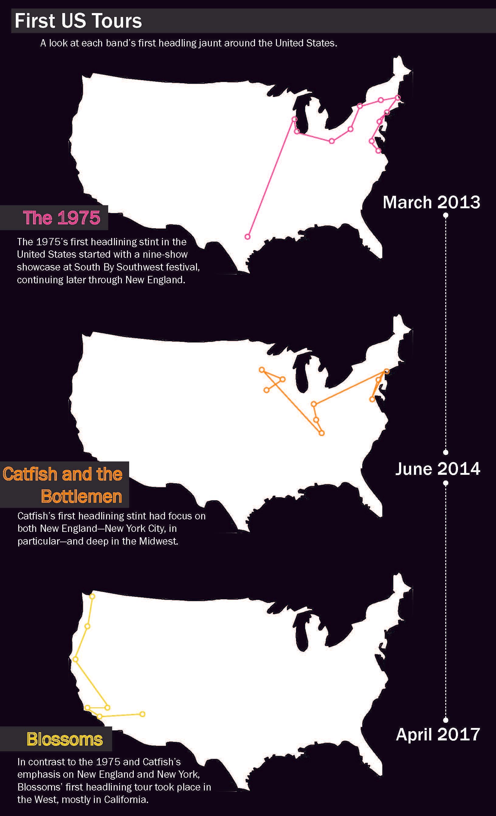
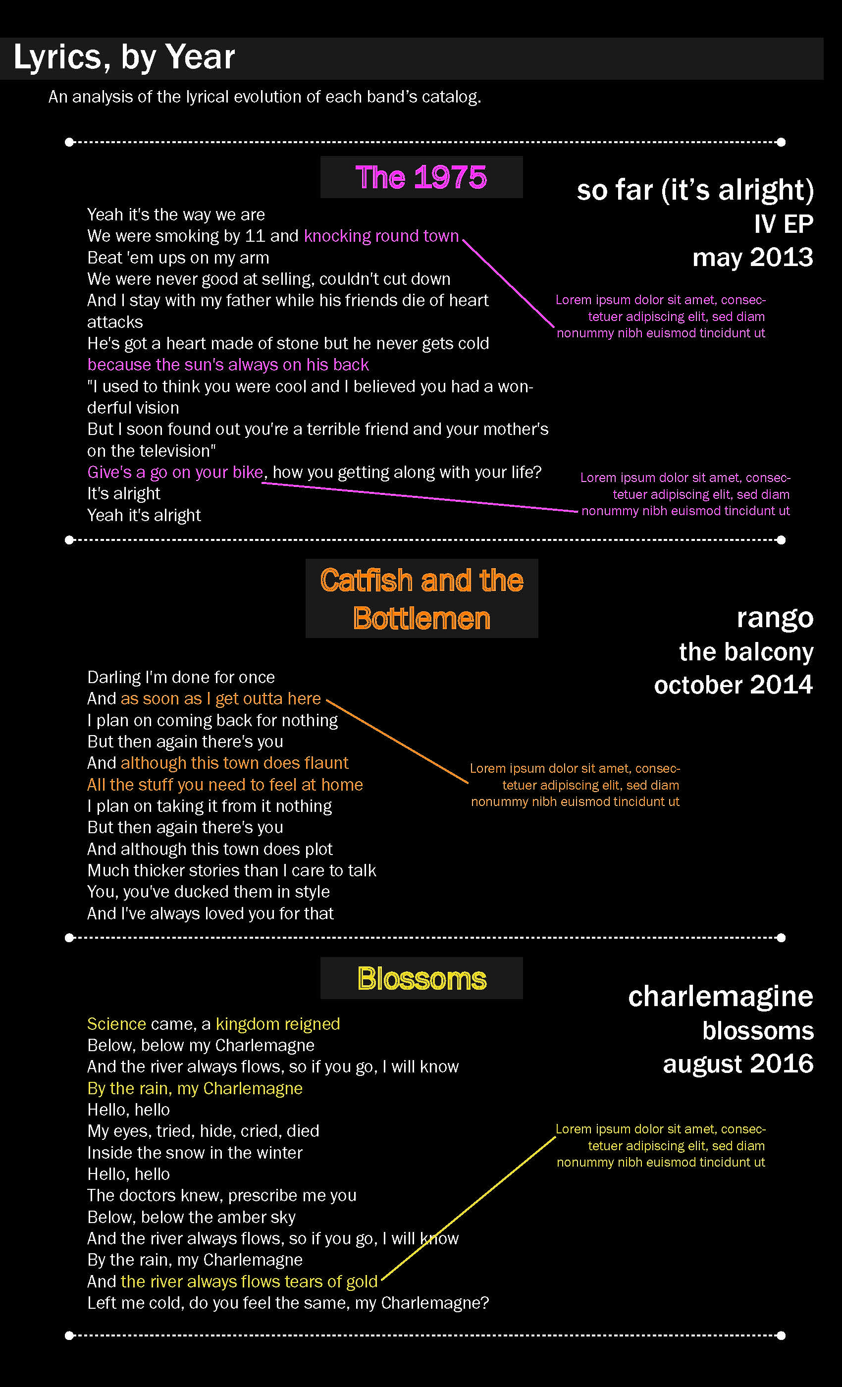
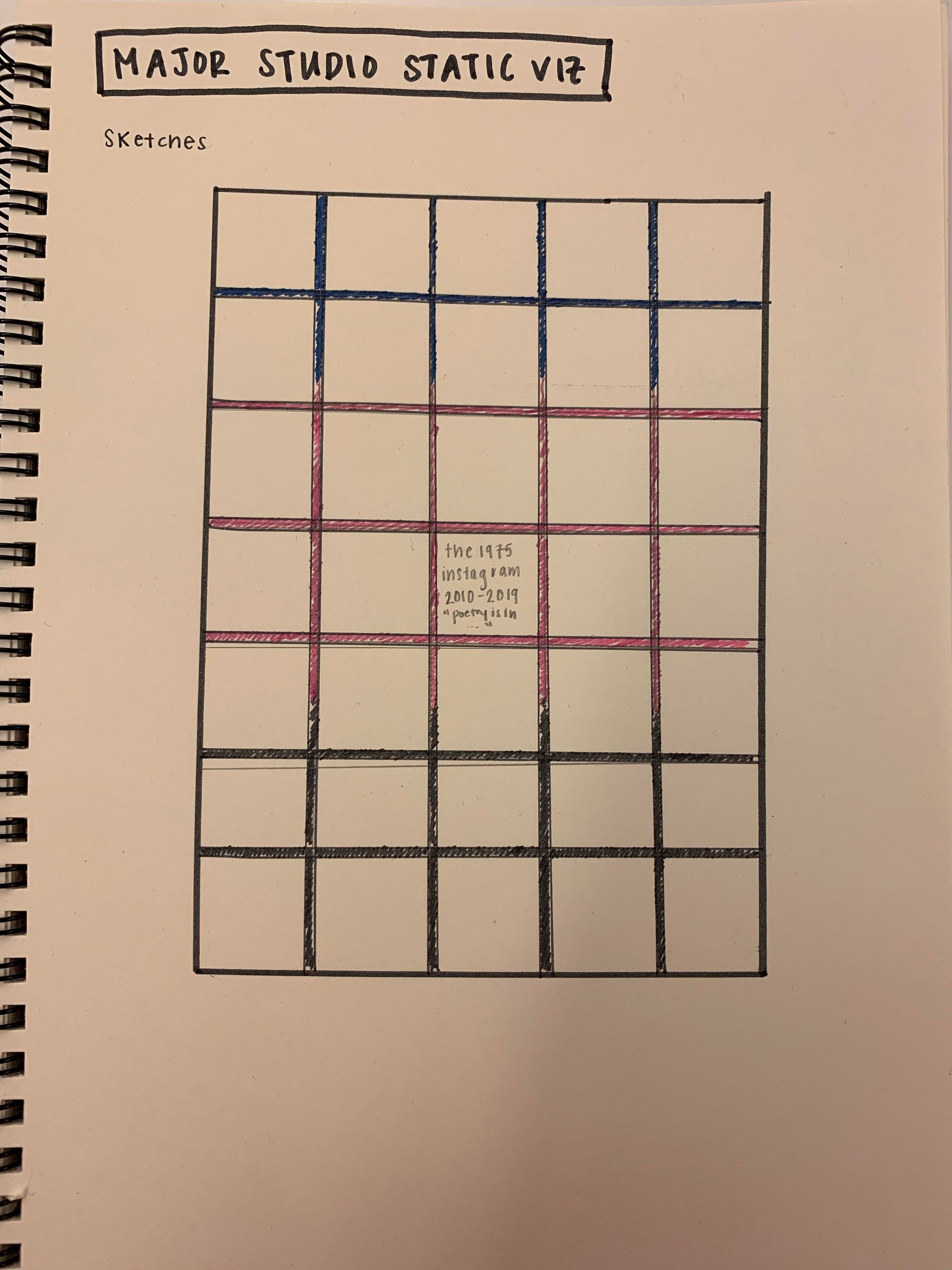
My original topic was comparing three different bands from the UK whose popularity is staggered over the past five years. The question was looking into the similarities in their paths to fame, in order to understand more about indie popularity in the UK. Here are some sketches I made from those original designs.

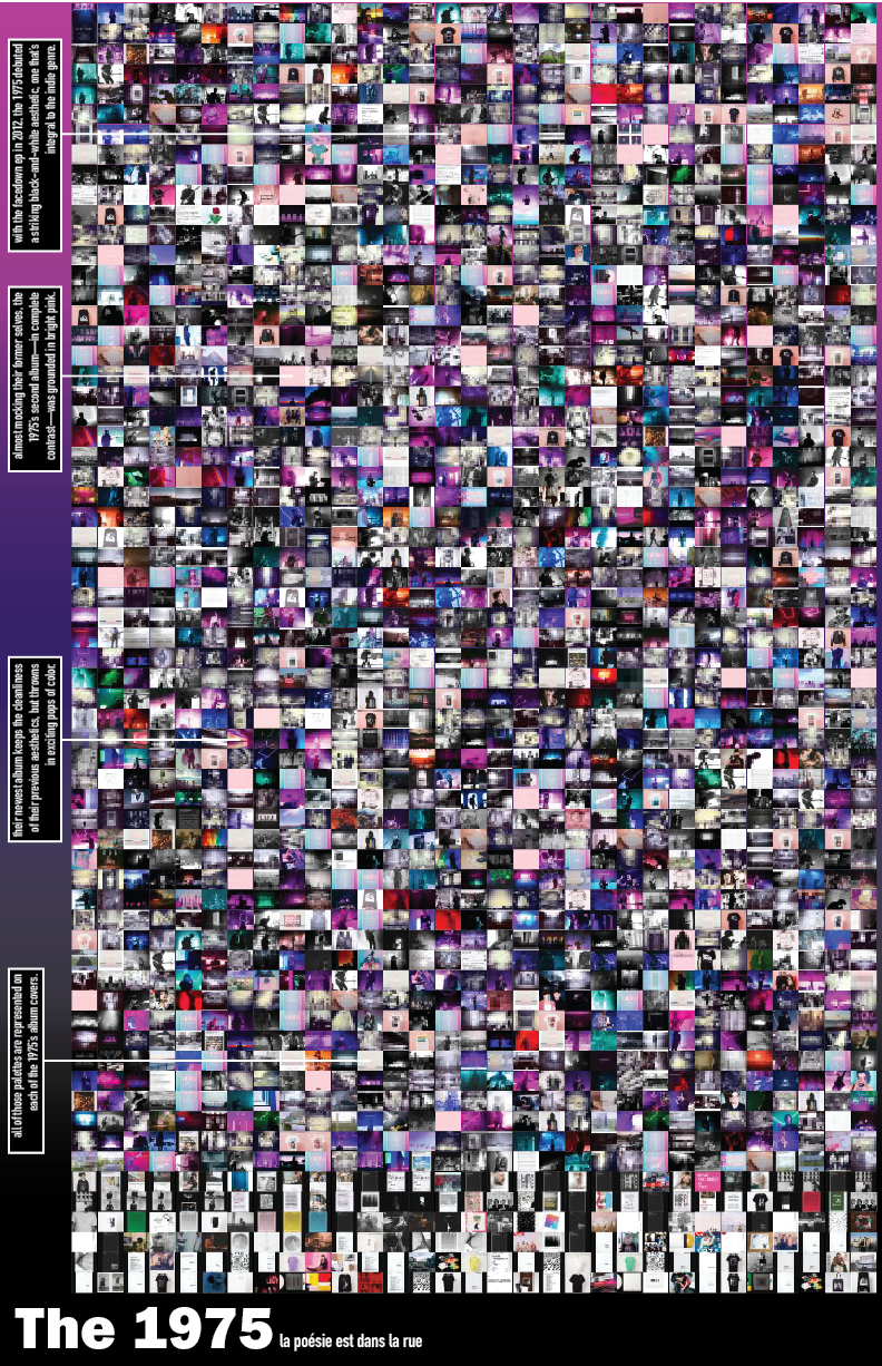
For this presentation, as opposed to the last, I decided to only focus on only one band, the 1975. They achieved fame a couple years earlier than the other bands, and while I may return to those two, it made sense to focus on just one at the moment, especially since I've done a decent amount of previous data work on them in the past. I've also been intrigued by their Instagram for a while—The 1975 have went through many "eras" in their image over the years, so the goal was to see if those changes were represented in their visual social presence that they often closely curate. I conjured up the idea of working with Instagram in the first place because of the 1975's account.
Therefore, in this case, the topic would be a band's Instagram presence, the question would be inquiring about the 1975's account in particular and if represents their image as a band over time, and the significance would be to understand a band's social presence as a reflection of their actual, physical presence.
For the data, I used an open, Chrome extension software called "Downloader for Instagram" to download all of the 1975's Instagram images (there were over two thousand). I then re-sized each to about 2% the original size of the photo using an online batch resizer. I then placed all the photos in a grid on InDesign, which I then transferred over to Illustrator for cosmetic design edits. I'm trying to force myself to work in Illustrator and InDesign before code since I'm still learning Adobe platforms.
My original design showed the photos in a grid pattern, similar to Instagram itself—a decision I kept in this new design. The photos encompass the whole poster, an effort to really confine all the data to the poster space, with annotations about their history. Below is a sketch from when I was designing the new poster.
For the final re-design, I went with a Meta Correspondence for my serif, and I went with Adobe Jensen for my sans-serif. The color palette is a reflection of the photos themselves. I decided to include a quote that is integral to the band and well-known among its fans, a quote that has to do with color itself ("la poésie est dans la rue": "poetry is in the streets in full living color," which can be found at the end of their music videos for "Chocolate" and "Sincerity is Scary").
Even though this is a data visualization, I grew up with music posters on my bedroom wall, and I think the result is a cool image that fans (of the band and music, in general) would find eye-catching and interesting. You can clearly see the colors that fans would relate to the band itself throughout the piece. In the past week, I wasn't able to find a solution to save the pictures in some kind of temporal order of when they were posted, but this is something I'd like to solve in the future. I may be able to scrape the page, or revert back to my previous method of taking the most-liked image from each month. Here's the final design I'm showing in class:
To think ahead a bit, I did a little research into image analysis options. I found a Python tutorial (language I'm most comfortable in) working with object recognition. I was also interested in this project, called "Homes For Sale," by Jason Salavon, which combines photos of single-family homes on the market in different cities around the United States into a single image. I also think the idea of counting contents of each photo (the band members themselves vs. tour announcements vs. crowd shots, etc) is a potential path.