
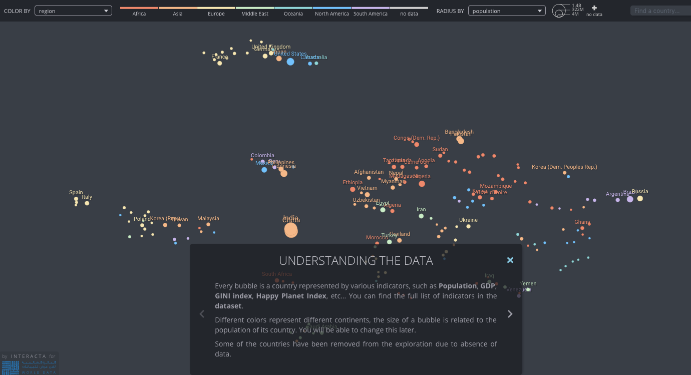
Isabel
1. Mapping real-time news snippets

News headlines, classified and located in a specific crisis zone. The data is quantitative in so far that it must use latitude-longitude, and times. The news content itself is qualitative.
More info: see the Live Universal Awareness Map project.
2. How people come and go
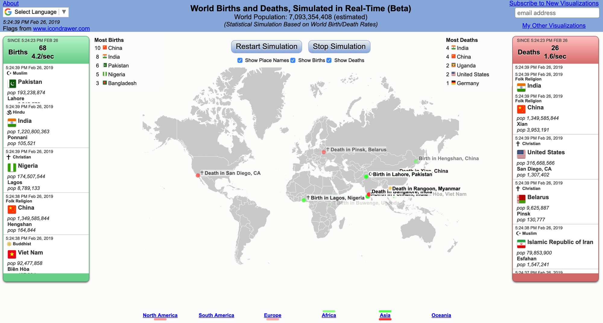
It is like watching a movie - with a good ending: births outnumber deaths. Appreciate the "dumb" simplicity of the data visual, the information is immediately clear. Each data point must mean a lot to the related individuals - somewhere in the world - whereas in this graphic, it's a simple dot.
Jed Crocker
This is somewhat old and not that stimulating, but I think about it all the time!
caitlyn ralph
The Unlikely Odds of Making it Big, by Russell Goldenberg and Dan Kopf for The Pudding

Grace Martinez
Mio Akasako
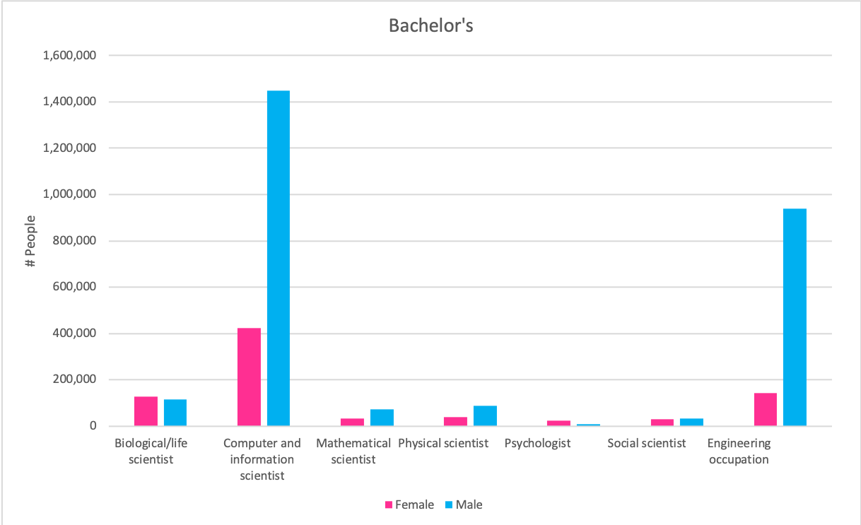
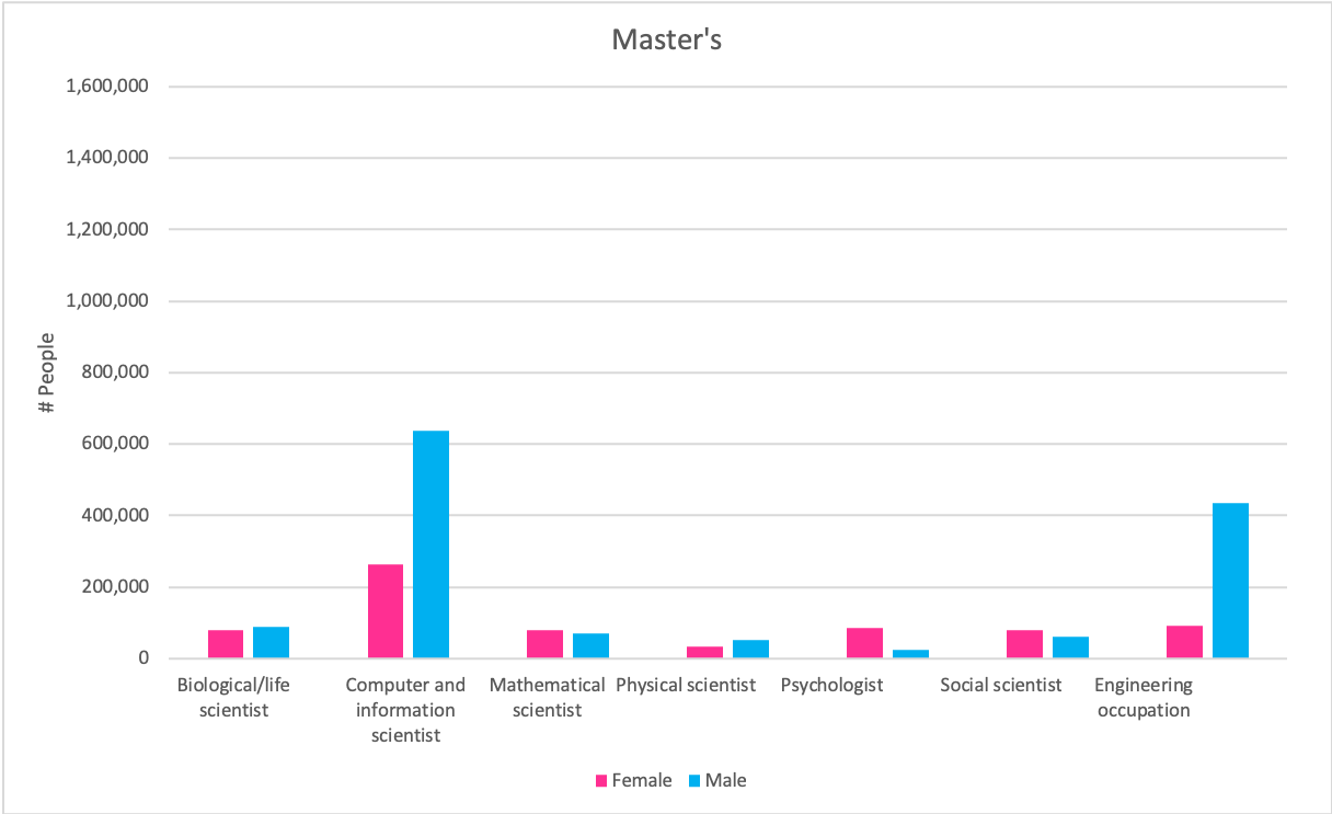
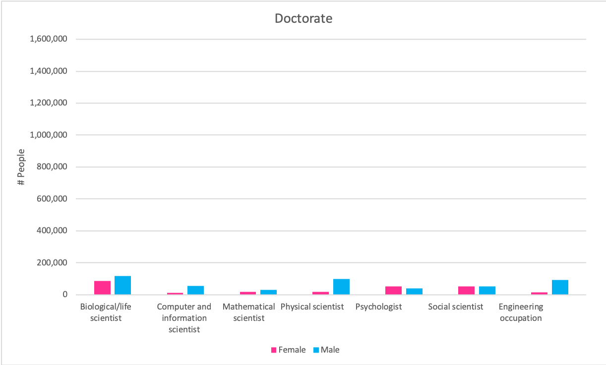
Graph 1
Claim: More men are employed in science and engineering related fields than women, regardless of the degree of higher education, in all occupations except social science and psychology (non-hard sciences).
Source: https://www.nsf.gov/statistics/2017/nsf17310/data.cfm (9-7)
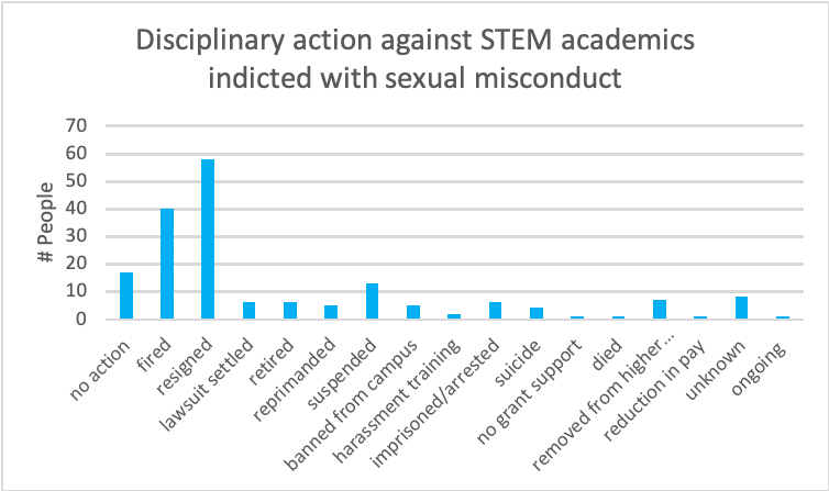
Graph 2
Claim: The majority of STEM academics indicted of sexual misconduct were either fired by the university or resigned
Source: https://docs.google.com/spreadsheets/d/1CCfcCKmBqyrMbD6fEQ8Llt3eD9MpnUd5eVm2DaIrUKo/edit#gid=0
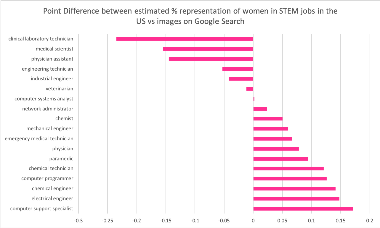
Graph 3
Claim: Women are overrepresented in image search results of common occupations in STEM fields
Graph 4
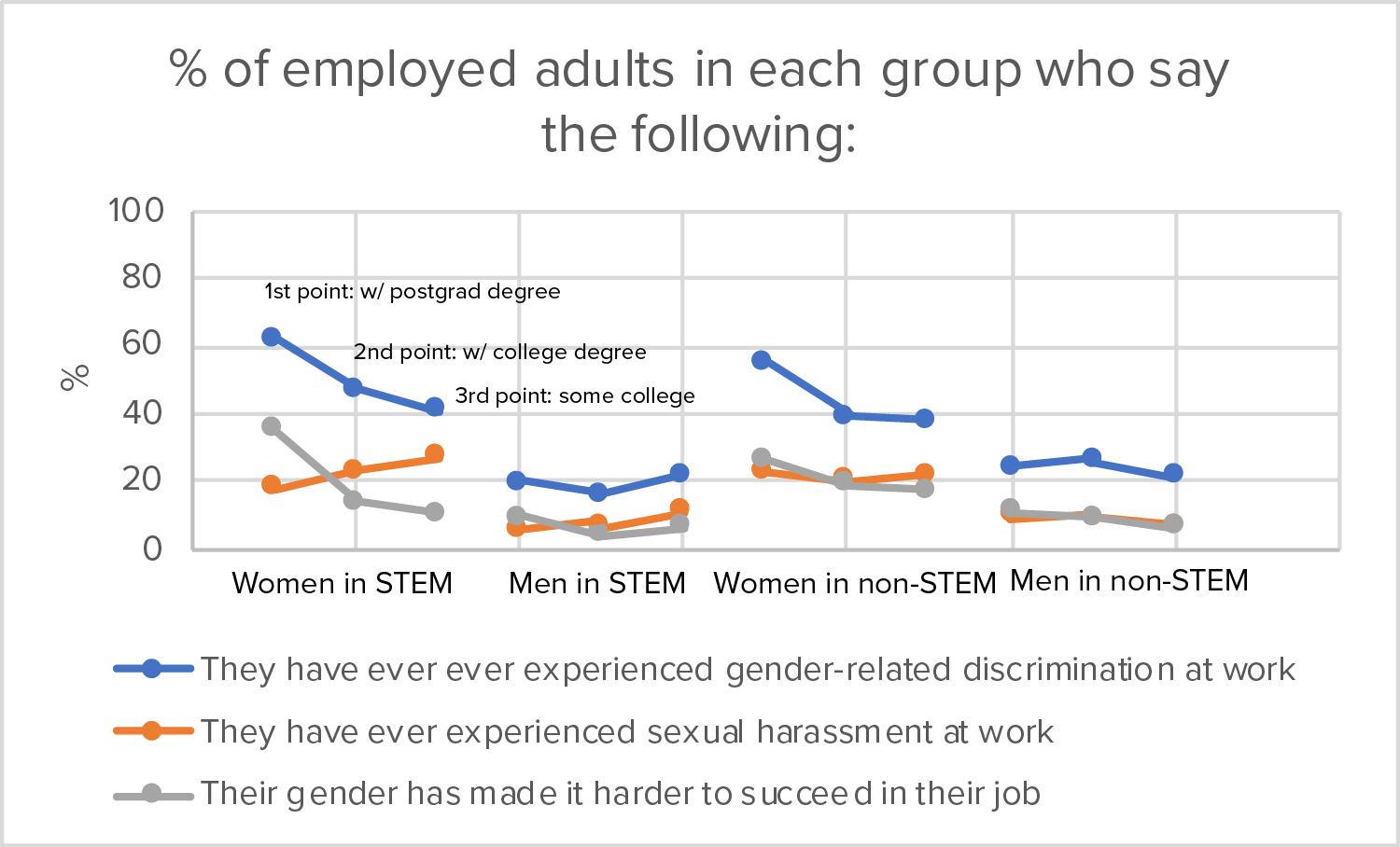
Claim: Women with higher education in STEM fields are more likely to say they have experienced gender-related discrimination at work, and that their gender has made it harder to succeed in their job.
Source: http://www.pewsocialtrends.org/2018/01/09/women-and-men-in-stem-often-at-odds-over-workplace-equity/
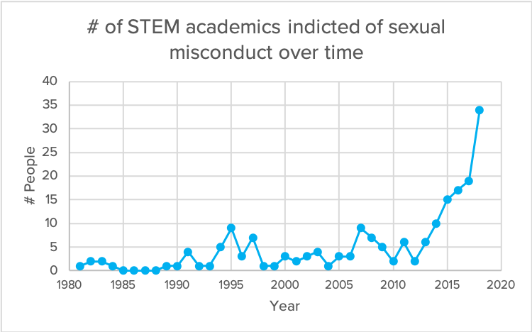
Graph 5
Claim: The number of academics in STEM fields indicted of sexual misconduct has increased rapidly in the past 5 years
Source: https://docs.google.com/spreadsheets/d/1CCfcCKmBqyrMbD6fEQ8Llt3eD9MpnUd5eVm2DaIrUKo/edit#gid=0
caitlyn ralph
viz
image of what i'm presenting in class here.
bar and line graphs are made and styled inside illustrator, so check them out in that link above.
graphs from r analyses in my markdown here.
data
i'm using songkick's api, and, according to their terms + conditions, i cannot post the tour data publicly. i do have it for all the bands i've mentioned. you can ask me, and i'll show you on my laptop. i'd also post my python notebook where i pre-process the data, but it has my auth token. i'm just not in the mood to get sued by songkick. :-(
here's where i manually went through every one of the 1975's instagram photos and tagged them to contain photos of the band or not.
you can find my r image analyses (along with those graphs mentioned above) in my markdown here, again. (shout out to my co-worker for helping me out with some starter code.)
and here's the 1975's instagram.
(ps: i should probably have noted earlier that not everything the 1975 puts out in the world is SFW. their instagram is fine, but their videos are not always. dive in at your own risk, and if you want to ask me about what's particularly NSFW, i can definitely let you know, considering i've devoted years of my life to studying them. go figure.)
Clare Churchouse
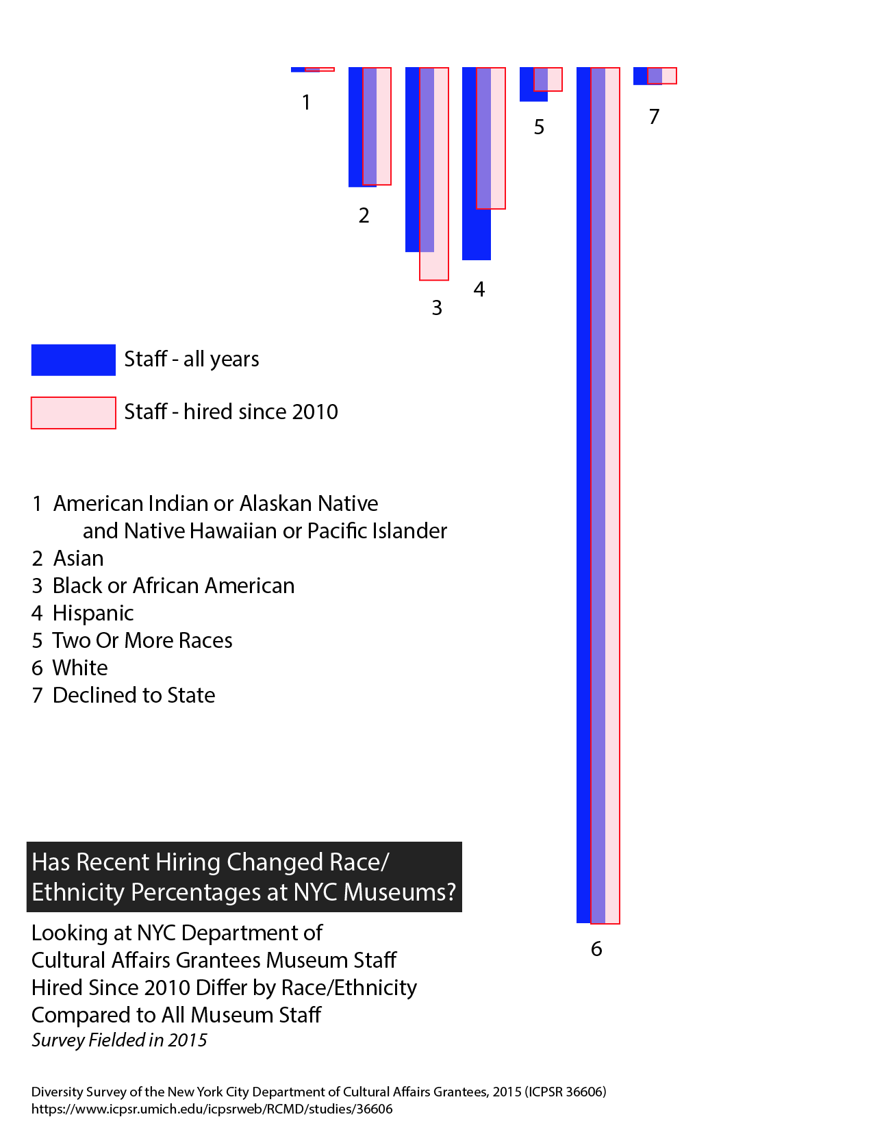
Claim: More recent hiring at NYC museums has seen an increase in Black/African American staff but a decrease in Hispanic staff
Data: Diversity Survey of the New York City Department of Cultural Affairs Grantees, 2015 (ICPSR 36606) https://www.icpsr.umich.edu/icpsrweb/RCMD/studies/36606
d3/aws node: https://console.aws.amazon.com/cloud9/ide/00651c2eccdb449798cec665916ff310
NYC DCLA data comparison of museum staff by race/ethnicity for any hiring year and for those museum staff hired since 2010 (the survey was fielded in 2015 so this is within the past 5 years.) Are there hiring patterns visible for NYC museums funded by the DCLA in terms of diversity of staff hiring over the past 5 years in relation to all staff at these museums? Data set NYC DCLA 2015 survey, ‘raceethnicity’ column, link to node.
Used d3 bar chart – as that makes sense for comparing quantities (and we have gone over bar charts in class) – and showed number for each group as identified in the survey codebook:
1 American Indian or Alaskan Native and Native Hawaiian or Pacific Islander
2 Asian
3 Black or African American
4 Hispanic
5 Two Or More Races
6 White
-8 Declined to State
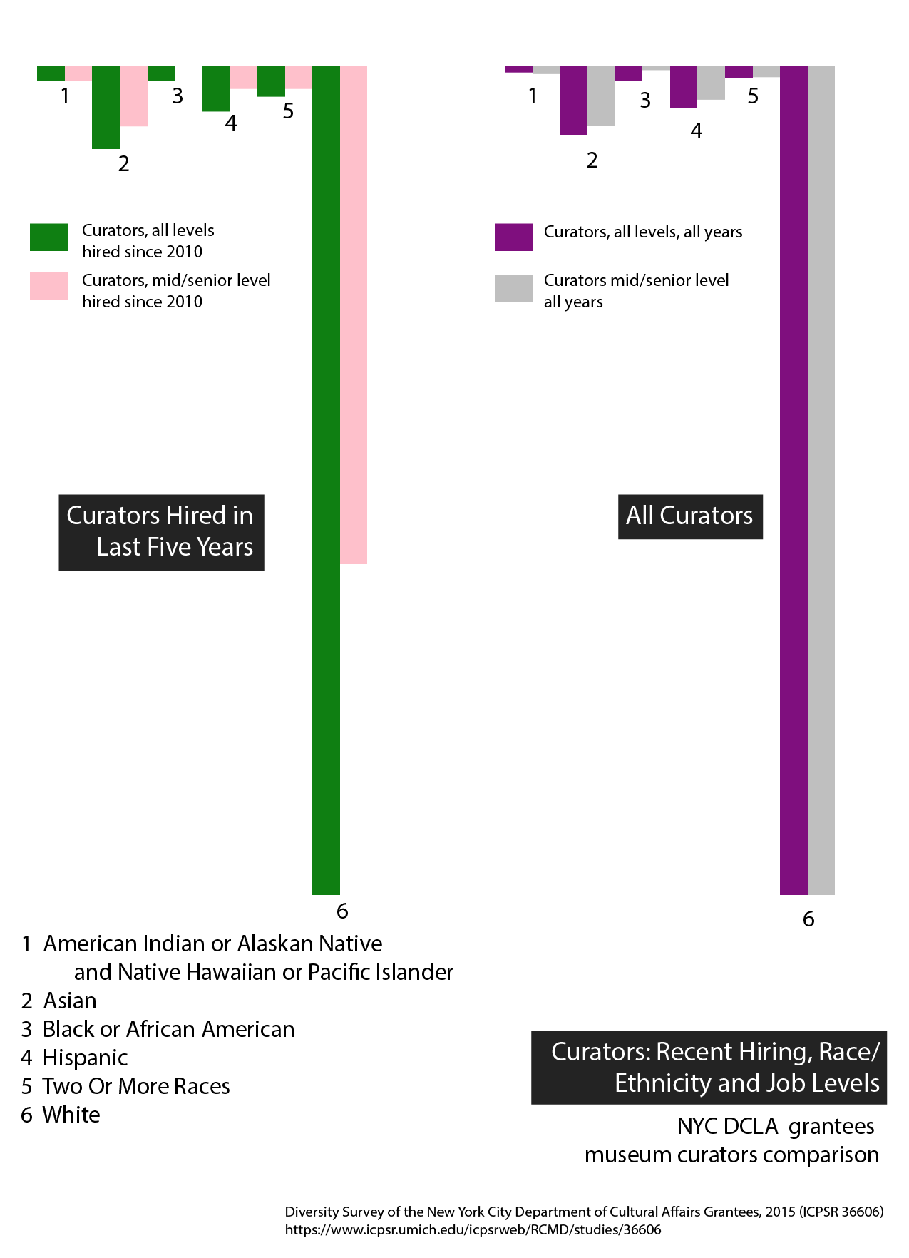
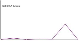
Claim: NYC DCLA museum curators are mainly at the mid or senior job level - recent hiring has seen a decrease in numbers of white non-Hispanic curators at the mid and senior levels but even so, white non-Hispanic curators are in the majority.
Data: Diversity Survey of the New York City Department of Cultural Affairs Grantees, 2015 (ICPSR 36606) https://www.icpsr.umich.edu/icpsrweb/RCMD/studies/36606
d3/aws node: https://console.aws.amazon.com/cloud9/ide/00651c2eccdb449798cec665916ff310 Selected museums and jobtype 4: ‘curator’. 1st bar charts compare curators hired in last 5 years by race/ethnicity with those same curators who are in mid or senior job positions. The 2nd bar charts compare all curators by race/ethnicity with those same curators who are in mid or senior job positions.
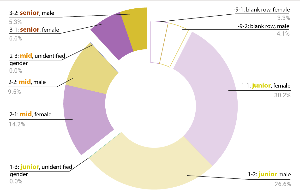
Claim: There are more women at every job level in NYC DCLA-funded museums from junior to senior positions
Data: Diversity Survey of the New York City Department of Cultural Affairs Grantees, 2015 (ICPSR 36606) https://www.icpsr.umich.edu/icpsrweb/RCMD/studies/36606
Google spreadsheets: file:///Users/clarec/Downloads/36606-0001-Data_NYCDCLA_charts/da36606-0001.html
Cross compared job level with gender for all NYC DCLA grantees categorized as ‘museums’ who answered staff survey in 2015 – data is for each staff member (8,094). The codebook put job ‘level’ in 3 categories and asked the member of staff who filled in the survey to select one category for each staff member: 1 Junior, 2 Mid, 3 Senior, Missing Data -9
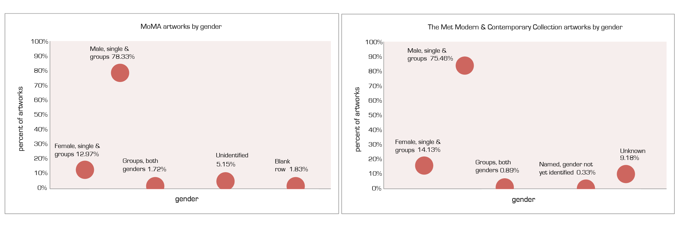
Claim: 4 in 5 Artworks at MoMA and at The Met MCAC Will Be By a Male Artist Comparison of MoMA collection and The Met’s Modern & Contemporary Art Collection by gender
Data: MoMA artworks csv, Jan 2019: https://github.com/MuseumofModernArt/collection/blob/master/Artworks.csv The Met open access csv: https://github.com/metmuseum/openaccess (used gender-identified data set, Jan 2018): https://github.com/churc/MajorStudio1/tree/master/MetProjects/gender/assets) Excel (uploaded to google): https://docs.google.com/spreadsheets/d/1JC6ucDsvQXrV_uUylcjkuto7Mo11Fb2I74cGXYvEFeY/edit#gid=537594401 MoMA artworks spreadsheet for all the departments was getting errors in google sheets and aws node (too large?) so used excel to find subtotals for gender.
In MoMA csv there are 377 different ways of filling in the ‘gender’ column for the artworks. Exported the subtotals into google sheets to filter and identify what categories to use. Grouped artists in similar way to previous work with The Met Modern & Contemporary Art Collection (MCAC) (female – both single and groups of only female artists, similarly with male, couple/collaboratives with both female and male artists, unknown/blank cell, unidentified. I have not examined the latter two categories closely in MoMA yet, fyi.)
MoMA collection (all departments) on github (Jan. 2019): 135,083 identified in spreadsheet by gender in some sort of way; 2515 artworks gender column blank.
The Met MCAC (Jan. 2018): 14,350 artworks
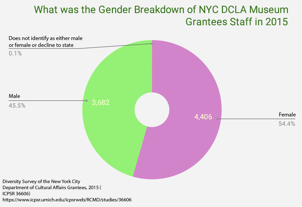
Claim: NYC Museum Staff/Volunteers Don’t Reflect MoMA or The Met MCAC Collections by Gender. What was the gender breakdown of NYC DCLA grantees in 2015 for museum staff?
Data: Diversity Survey of the New York City Department of Cultural Affairs Grantees, 2015 (ICPSR 36606) https://www.icpsr.umich.edu/icpsrweb/RCMD/studies/36606
Google spreadsheets: file:///Users/clarec/Downloads/36606-0001-Data_NYCDCLA_charts/da36606-0001.html
8,094 museum staff (1,117 of these are volunteers: have included them in the data here) Took ‘museums’ category, ‘gender’ category. Codebook defines gender categories. NYC DCLA grantee museum staff are over 54% female:
Female: 4406
Male: 3682
Does not identify as either male or female or Decline to State: 6
Art museum collections do not seem to reflect the gender of the staff.
To do – is the artwork by nationality in NYC art museums acquisition changing over the last decade?
a. for Brooklyn Museum query api – contemporary art collection, nationality
b. for MoMA (select departments or whole of MoMA?) MoMA github data set, ‘Nationality’ column and ‘DateAcquired’ column. Look at what is going on at a collecting level in terms of which artists are being acquired.
c. compare with Met Modern & Contemporary art collection
d. can I find some way of acquiring the 2015 and 2018 art museum staff data set since this would correlate much more closely with art museum collection data. If not, look at the NYC DCLA and narrow the filter for budget and number of staff.
Suzanna Schmeelk
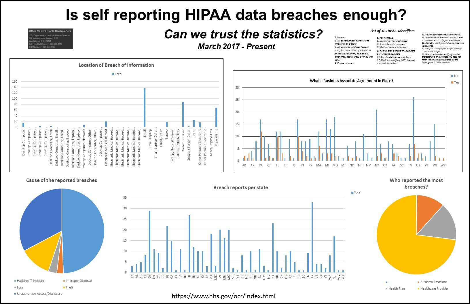
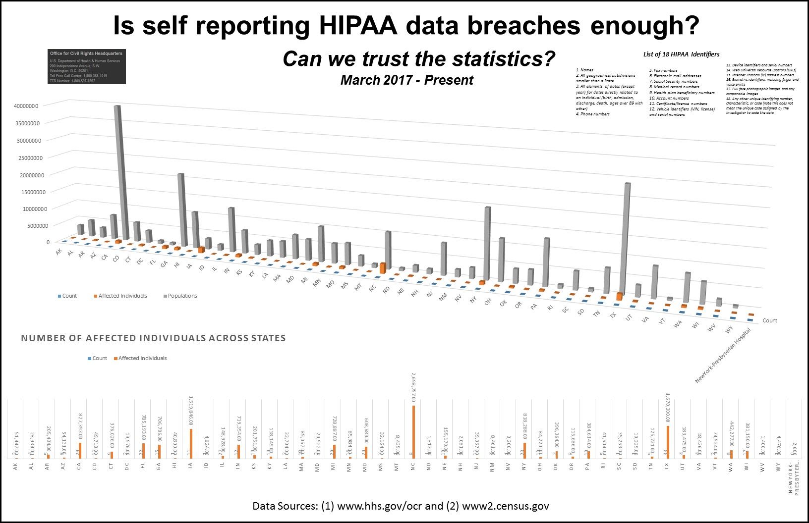
The United States Department of Health and Human Services Office of Civil Rights (US Dept of HHS OCR) maintains a "breach portal reported within the last 24 months that are currently under investigation by the Office for Civil Rights." Breaches occur through the loss of Patient Health Information (PHI). A list of 18 HIPAA PHI identifiers is here.
The data reported on the OCR website was graphed into the Quantitative poster.
The questions asked on the quantitative poster were:
(1) How many reports per state remain open to investigation?
(2) Which category of covered entity have the most open investigations?
(3) What was the cause of the open breach investigations?
(4) Where was the breach information lost?
(5) Were Business Associate agreements in place when the breach occurred?
Ryan Best
My approach with this week's assignment to construct some initial quantitative views was to focus on current census data, obtained through the US Census's API. I used the American Community Survey 5-Year Data (2017)'s Data Profiles endpoint, which "contain[s] broad social, economic, housing, and demographic information. The data are presented as population counts and percentages. There are over 1,000 variables in this dataset."
I focused this week's assignment on five particular statistics, all compiled at the census-tract level:
- % of the population who own their home
- % of the population whose income in the last 12 months was below the poverty level
- % of the population who are nonwhite
- Median market value of homes
- % of homeowners who have a mortgage
I thought these statistics might tell an interesting story on the current legacy of redlining policies on the areas they encompass, but I want to make sure I stress test this list (and also add wealth metrics to the list).
The first views I constructed were map-based, with each of these metrics plotted on separate maps by census tract. I then overlaid HOLC rating visual filters on these maps, allowing us to see a subsection of this overall map based on redlining grades. Interactive prototypes for those maps are available at http://ryanabest.com/ms2-2019/quant/ (these prototypes maps take a little time to load and may need to be refreshed once when accessed).
I also wanted to look at this data outside the context of maps for easier comparisons from zone to zone and tract to tract. To do this I used the shapely python library to crudely estimate which HOLC zones each census tracts overlaps with. Many census tracts overlapped with multiple HOLC zones with different grades, so for now each match of tract-to-grade is retained (i.e. if a tract matched with a 'A' and a 'B' zone, it will get two records in my data set). I then constructed some rough-draft views in Tableau to compare these metrics across tracts based on their HOLC grade. Overall, it looks like A-Rated zones still have higher proportions of white homeowning residents than their lower-rated counterparts.
Isabel
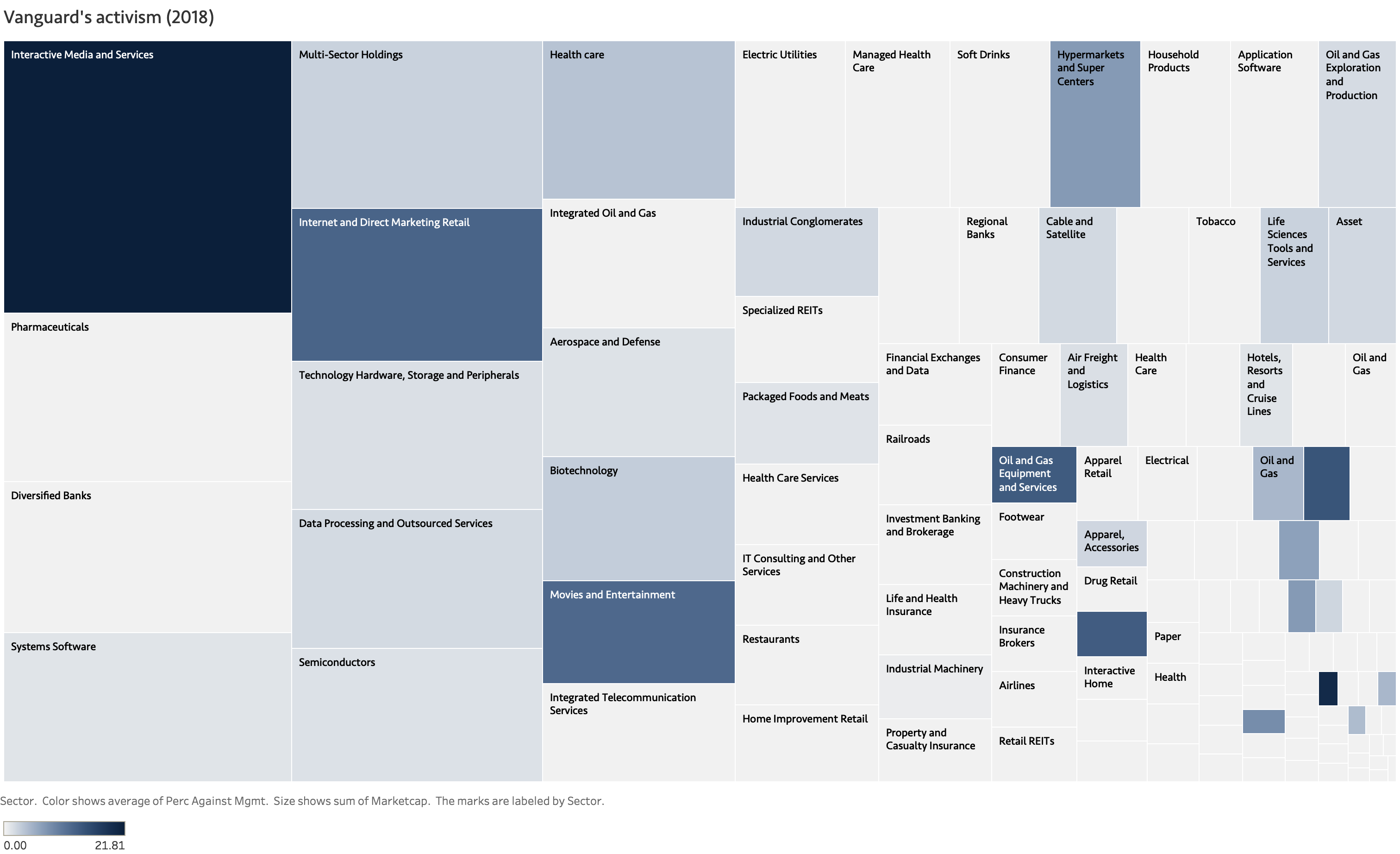
Among retail investors ("main street" investors as opposed to Wall Street), passive investing (i.e. investing through index funds and ETFs) has increased significantly over the past decades, at the expense of active investing (e.g. buying individual stocks). Estimates are that about 30% of the US stock markets is in passive investment funds - and that number is growing. Credit rating agency Moody's projected that by 2024 passive ownership supersedes active investment. Funds allow individuals with less assets to invest in the stock market by pooling money.
Theory says that shareholders are key to keep management on track. The proxy voting at companies' annual shareholder meetings are an important means: it gives shareholders the ability to let their voice be heard. That is the theory. But, passive investors are not supposed to be interested in the shenanigans of a particular company. Passive investing means riding the wave of the market: funds follow an index (a group of companies, determined by a certain algorithm). This is fine for investors as it is low-cost, and often low-risk, without terrible return on investment. However, if more investment is passive, how does this affect the stewardship role that shareholders are supposed to have?
Data
For purposes of shareholder engagement and transparency, US federal rules require each fund to vote at annual shareholder meetings and submit its voting records. For each year, the Edgar database of the US Securities and Exchange Commission (SEC) contains voting records of the largest funds.
By scraping the text files (see example) from the regulatory Edgar filings, I am building a several data sources:
- Shareholder activist trends since 2000.
- In 3 separate data files: for the three largest fund providers, an overview of how they voted in the 2018 proxy season. Intent to expand this for the past 5 years (is 5 proxy seasons).
- For the last 5 years: overview of all proxy issues, for each SP500 company, voted upon by the 3 largest funds.
The aim is to identify trends in funds' shareholder engagement, and dissect activist tendencies in funds' voting patterns in terms of topic, sectors and company size (market capitalization).
Jed Crocker
Canadian Listening Habits:
Vast Majority of Fisheries Workers Prefer Country Western;
Skilled Service Workers Mostly Enjoy Adult Contemporary

Canadian Radio Broadcasting Operating Expenses Doubled Between 1997 & 1999; Nearly Double Again Before 2009

Canadian Non-Commercial Radio Revenue Holds Over Expense Totals Consistently (2013 – 2017)


The BBC World Service Site at Oxford Ness Has More Licensed
Effective Radiated Power Than Any Other UK Station

plotting UK radio stations’ technical specifications leads to interesting aesthetic results (containing very little meaning)
Kiril Traykov
(I have not found a way to post PDFs on this web-site yet, so everything is submitted as JPEG)
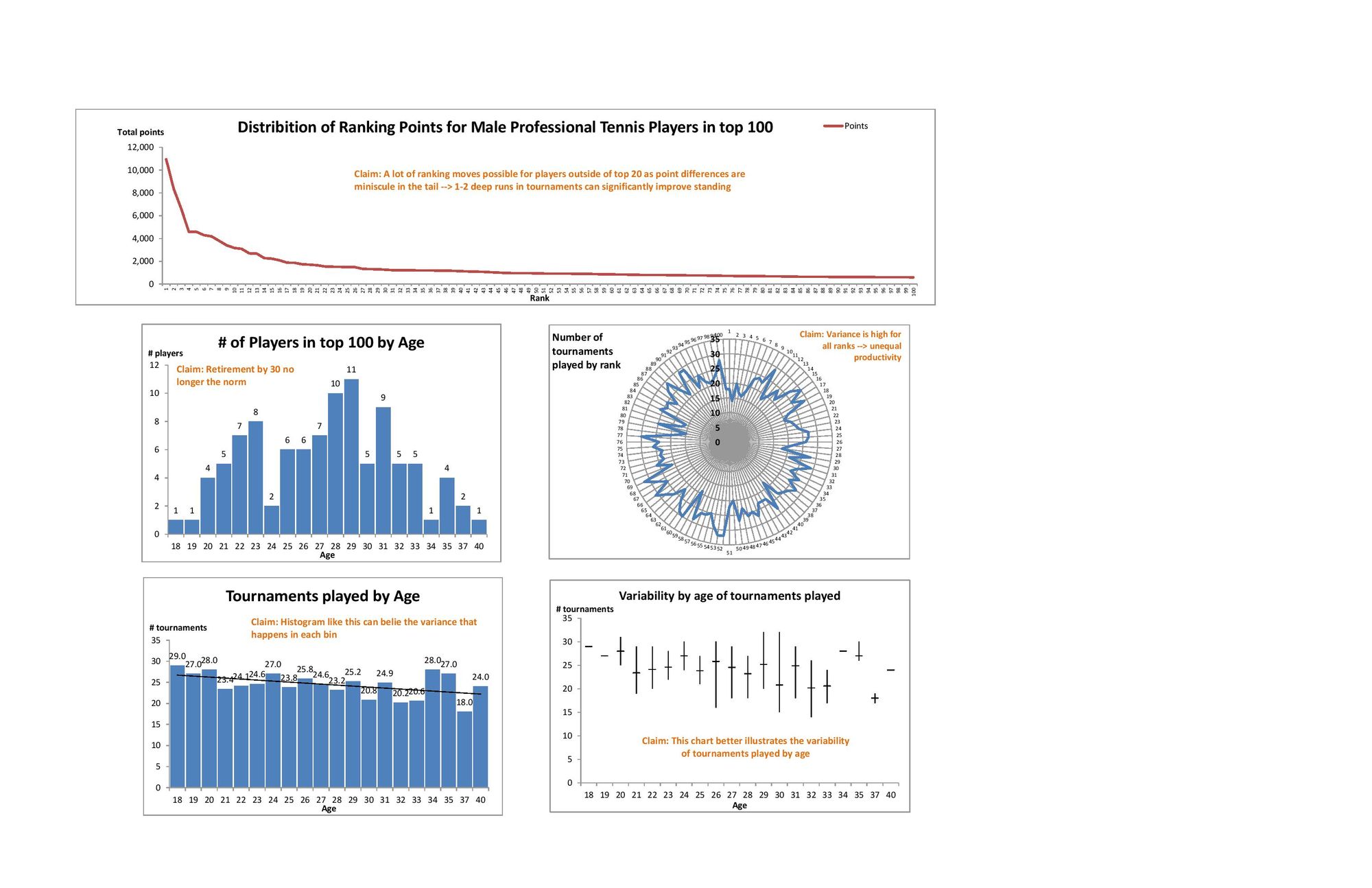
My final quantitative assignment explores the relationship between age and schedule/utilization (# of tournaments played annually) for professional tennis players. Players typically travel from a place to a place every week to compete in tournaments so a professional tennis career is associated with more traveling than other sports (whose players may stay at their home base 50% of time or within one country mostly). The hypotheses that this analysis will inform are:
- Do players tend to reduce their schedules as a result of fatigue or fear of injury as they age? --> Not supported by the data since "older" players (30-35 in age) still play 20-25 tournaments per year (although on average they drop 1.5 (men)-2 (women) tournaments). There is a drop after age 35.
- Is there a difference by gender? --> Yes, the data suggests that men play more tournaments earlier in their careers (ages 18-30) but then women outplay men in later ages (30-33).
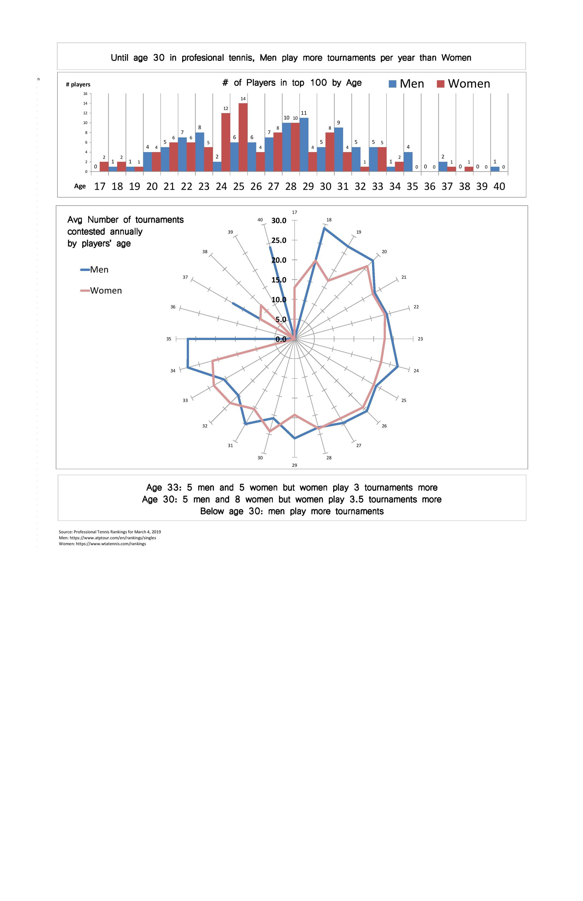
The original sketches explored several different ways to establish a relationship between age and utilization. Most of my peers really liked the circle diagram, so I refined it and included a comparison of men vs women.
Grace Martinez
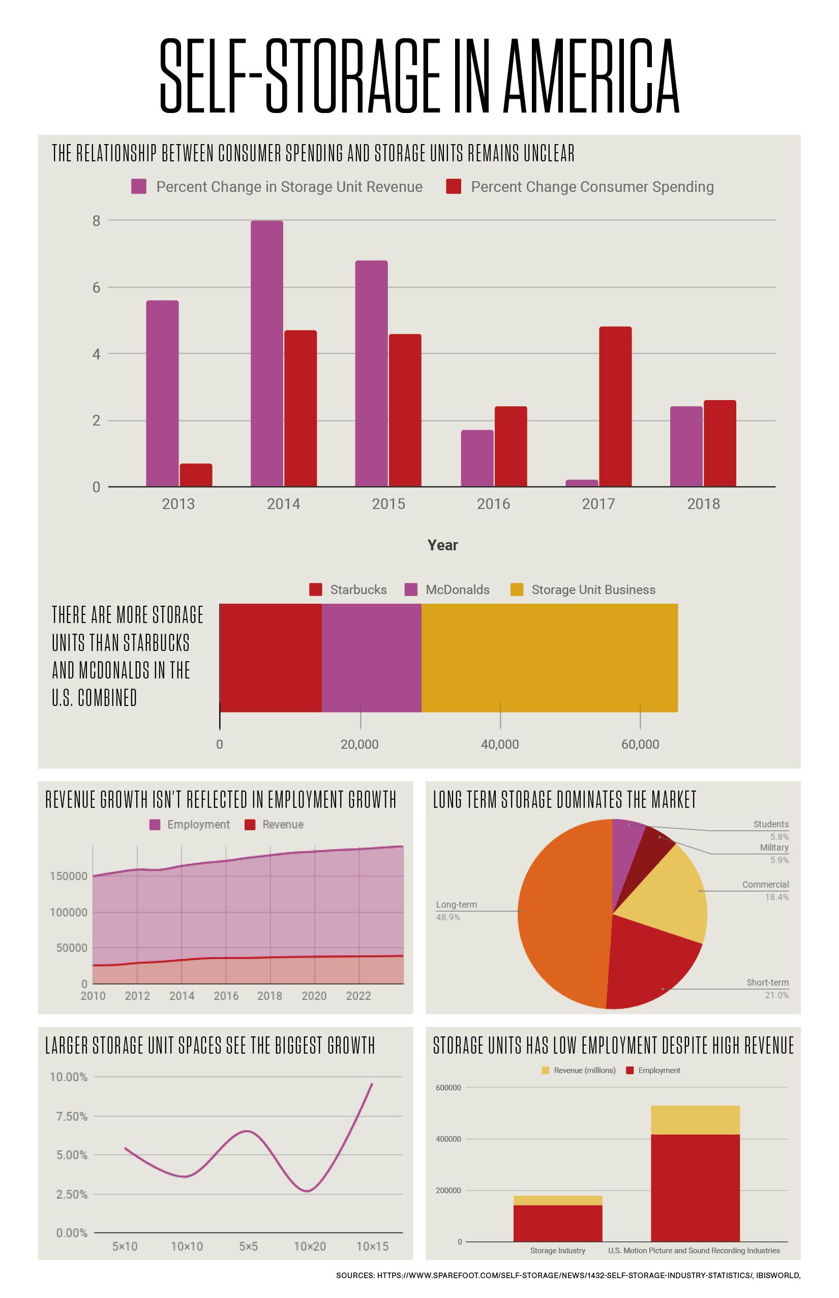
Claims:
- The relationship between consumer spending and Storage units remains unclear.
- There are more storage units than Starbucks and McDonalds in the U.S. Combined
- Revenue growth isn’t reflected in Employment Growth
- Long term storage dominates the market
- Larger storage unit spaces see the biggest growth
- Storage units has low employment despite high revenue
I created my charts in google sheets: https://docs.google.com/spreadsheets/d/1l2-Iazgyr7omRpMOrjbiEOEQgJOdNdWfUu2InJr2DkM/edit?usp=sharing
This was a learning curve for me as I've never used google sheets to make the charts.
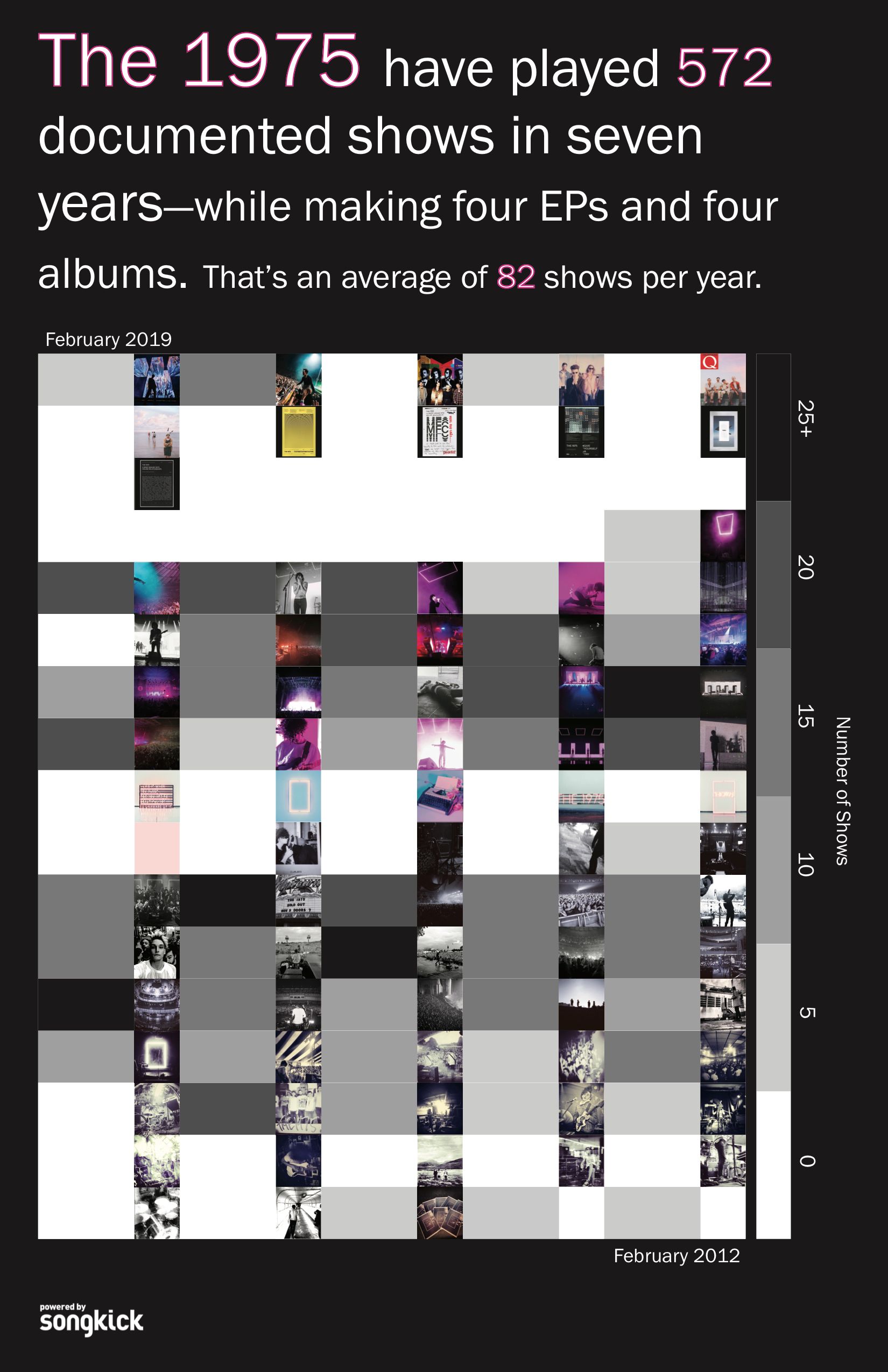
caitlyn ralph
out of the sample quantitative viz i presented last week (number of US shows, number of total shows, number of Instagram photos with the band members, and two examples of color analysis), the one that appealed most was the number of shows the 1975 played and the distances they potentially traveled.
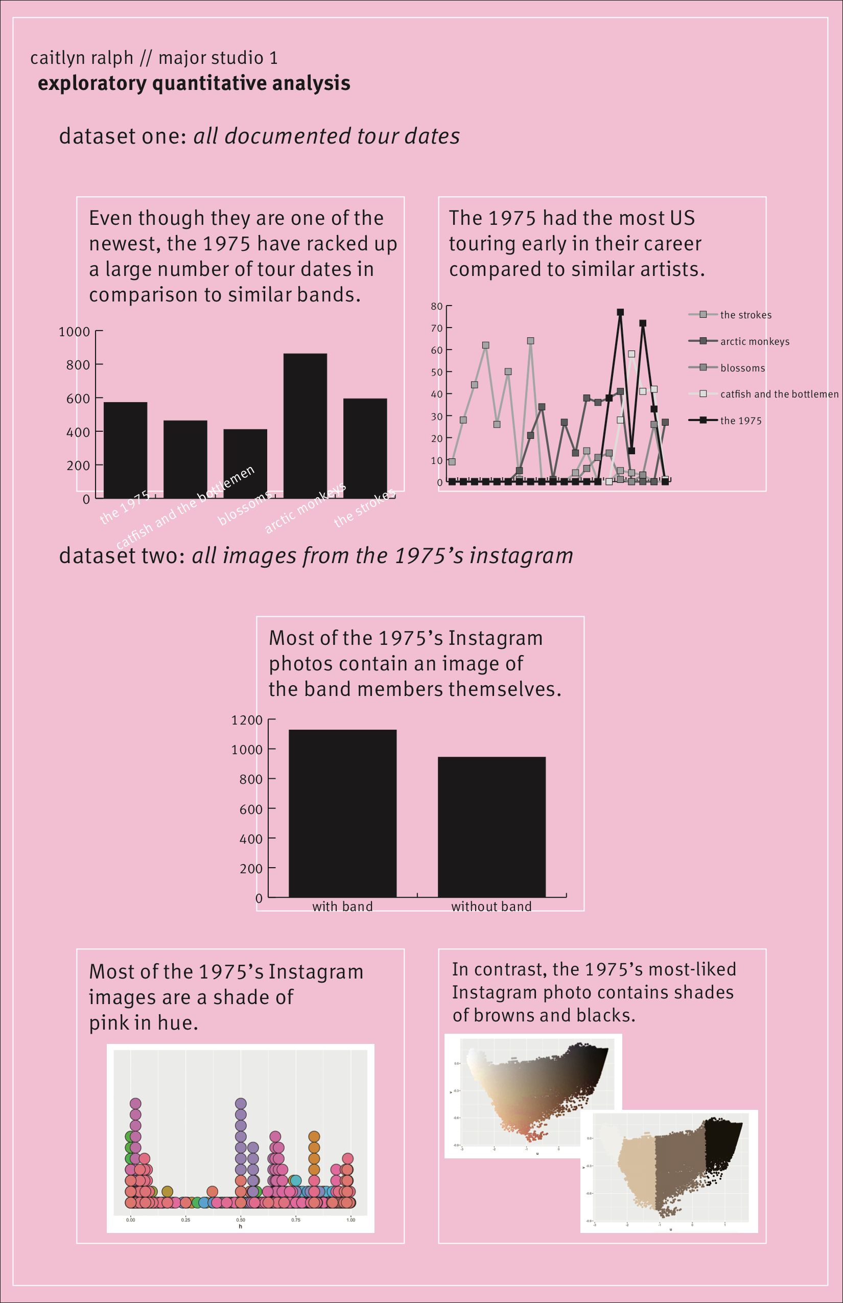
from this, i've decided the topic for my final quantitative poster would be an analysis of the 1975's touring history paired with their instagram posts to actually see what the tours looked like throughout time (which i realize is a qualitative measurement, but i feel like the poster is anchored by the quantitative visualization of the number of shows).
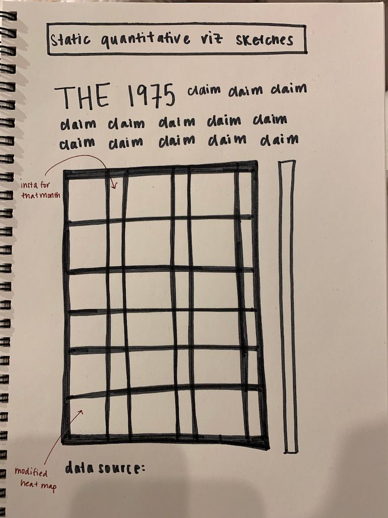
my final design is a calendar heat map of the number of shows the 1975 played each month. next to each month's box is an instagram photo from that month. the darker the box, the more shows the band played that month.
the data is still the songkick data i pulled and cleaned for previous iterations. the instagram photos are also still from the band's instagram. the poster was done in illustrator.
Ryan Best
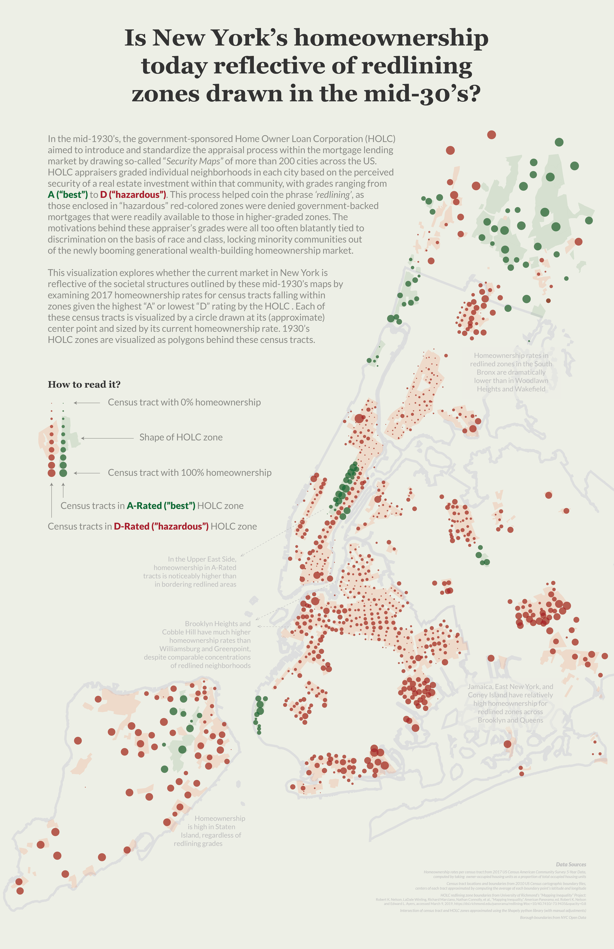
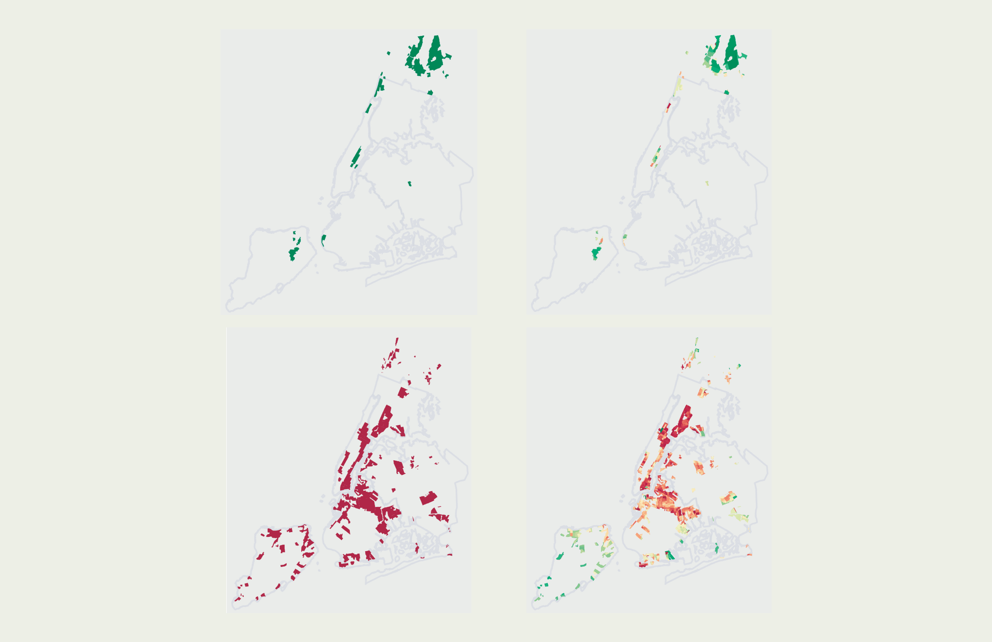
This visualization examines where the current homeownership landscape in New York City reflects the societal structures dictated in mid-1930's redlining maps, which served to exclude minority and low-class neighborhoods from the burgeoning mortgage market in the New Deal era United States.
Data
The data for this project came from a few different sources, as I was able to build on the data I used for my qualitative project and add a quantitative lens to these redlining maps. Like the qualitative project, the boundaries of each redlined zone came from the Mapping Inequality project. I then pulled geographic boundaries for all census tracts in New York State from the US Census's 2010 cartographic boundary files, filtering this list to tracts within the five boroughs and Westchester county, and the Data Profiles section of the 2017 US Census American Community Survey (ACS) 5-Year Data API to calculate the current ratio of occupied housing units in each tract that are owner-occupied (which I would use as my "homeownership percentage" estimate). Using the Shapely python library, I determined whether each census tract intersected with an HOLC zone, along with the grade of the HOLC zone(s) they intersected with. For this specific project I only maintained census tracts that intersected with an A-Rated or D-Rated zone, mapping each census tract with a circle located at the approximate center point of that tract (estimated by taking the average of the latitude and longitude of all points within the that tract's boundaries). There were a handful of tracts that intersected with multiple HOLC zones present on this map, and in those instances I maintained only one of these associations. The process for picking which grade to assign each of these census tracts was rather subjective – looking at the map I made a judgement call on which HOLC zone the tract was closest to, and associated that tract with only the grading for the zone I determined looked closest.
Visualization
I decided to push forward the considerations of this poster from last class, which explored homeownership's relationship with these redlining grades with a heat map small multiples approach:
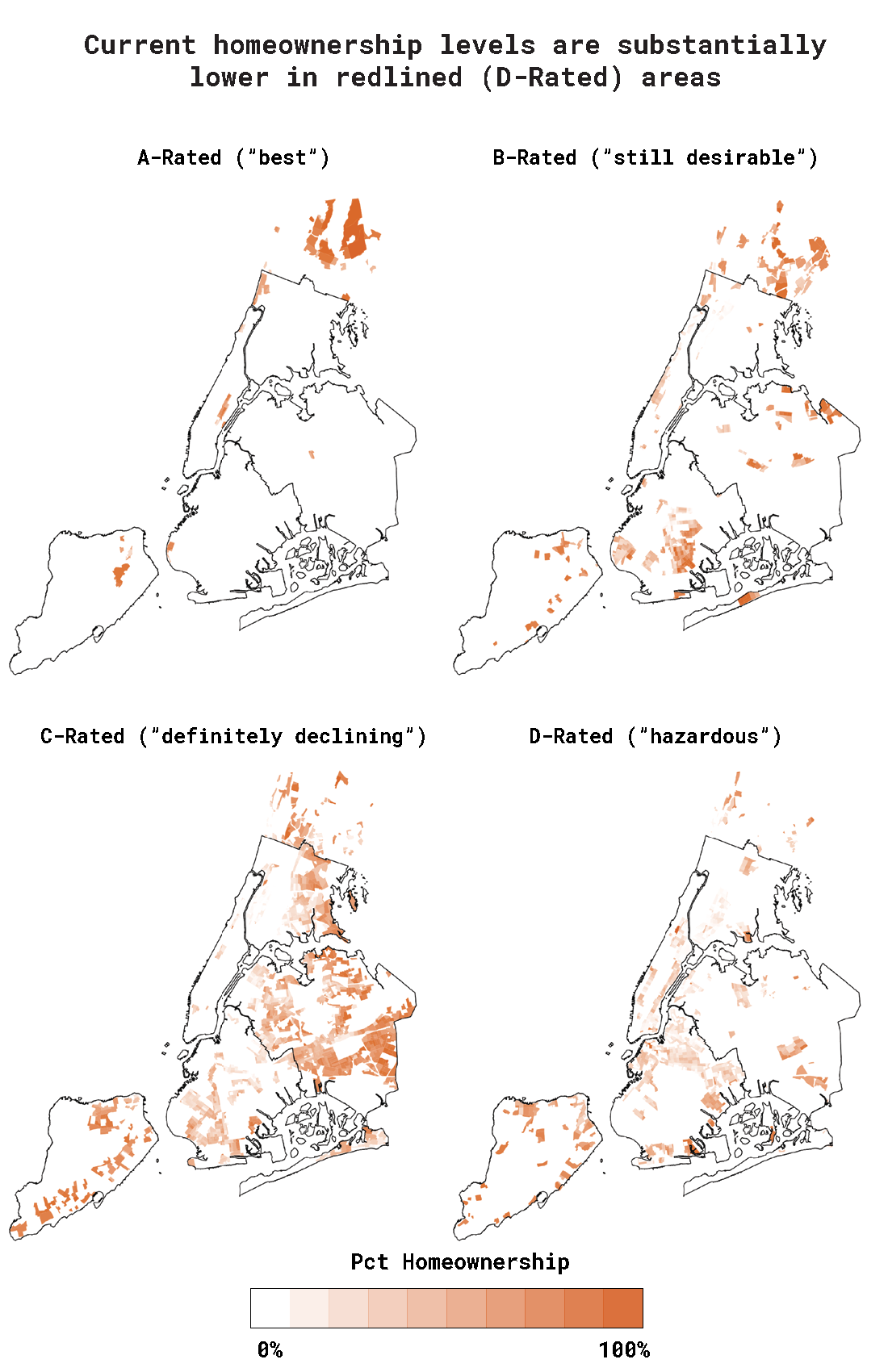
While approaching how to iterate and improve on this visualization, I kept a few pieces of feedback I received in critiques last class in the forefront of my thinking – specifically that using the heat maps in a small multiple form didn't allow for quick comparisons between grades, and that an interesting narrative angle to this data might be not only exploring whether A-rated zones are different than D-rated zones, but where D-rated zones differ from one another. To incorporate this feedback with somewhat limited space on the poster, I decided to scrap the small multiples approach in favor of one map that covered as much of the poster as it could. This gave this map more room to breathe on the poster and pushed me to visually represent different zone gradings in a now shared space. My goal with the approach to share this space for all tracts, I wanted to facilitate easier comparisons from area to area, both across different grades and within the same grade. I decided to only keep A-rated and D-rated zones (losing B-rated and C-rated), since I didn't want to clutter a constrained visual area and pursue a narrative of comparing the highest and lowest echelons of this rating system.
I also ended up scrapping the heat map approach in favor of using shapes to represent each tract. I had two main reasons for this decision: first, it seemed to be more successful in visually highlighting differences in homeownership rates across zones and clusters/pockets of tracts. Second, it established a connecting between an abstraction of census tracts and the map itself, which might provide me a bridge to represent these tracts or zones in a more purely graphical non-GIS approach without losing the association with this map – the two could work in conjunction and now share a visual language.
I also wanted to add a visual legend to explain my visualization approach, which definitely would not be able to function alone without this explainer. I also added annotations to highlight specific pockets of this data that I found interesting or compelling and might merit further exploration. My goal was to include this text so it didn't detract from the power of the visuals themselves – they'd be muted enough to not distract while present enough to be noticed. I made sure they were smaller and blended in with the map and the background a bit to establish them as a clear third in the text hierarchy (behind my intro paragraph and visual legend). These annotation should exist as a pay-off for the dedicated reader to read during their detailed exploration of this visual, which has a lot of data points and narrative packed into these 187 square inches.
The coloring and format behind the visual language I used in this piece (especially the "How To Read It?" label) was inspired by Giorgia Lupi and Accurat, especially The Empire Strikes Back
Next Steps
There are a few directions I'm exited to explore that would help me improve on this visualization and the strength of its narrative. First, I didn't incorporate any longitudinal data into the story yet. That was other feedback I was very interested in pursuing after last class, but didn't find a great way to fit it in here. I also pulled related homeownership data from the 1990, 2000, and 2010 decennial censuses but have a good deal of work left to do before this data would be usable or would tell an interesting story. This includes making sure I find the right census tract boundaries for those years and seeing how far back I can find relevant data, since this story would be strongest if I could show how homeownership (or other relevant statistics) have change since the maps were drawn in the 1930's, instead of having nothing to explain what happened during the 80+ years of history between then and now. I'm also interested in exploring what that 'abstracted' non-GIS visual would be that would pair well with this approach and allow for easier comparisons across zones, areas, or tracts. Finally, I was excited by the concept of pushing the concept of a data-driven book after the qualitative project, and I don't want to lose focus on that approach. I'll also need to really think through how this visual (or the next iteration(s) of this visual) would pair with the approach I had in the qualitative project – would full-page maps operate as their own chapters in a book that look at zone-by-zone language and images? What would a zone-specific visual look like in the page of a book?
Tools
Adobe Illustrator / d3 / Python / Shapely / Pandas
Earlier Iterations
Early iterations and approaches to this project focused on pushing the small multiples heat map approach, playing with colors and layouts that could provide more effective comparisons in a visually compelling way (although no such approach succeeded quite as well as the final design):
Suzanna Schmeelk
Case after case after case in the news reports poor, uneducated, and unethical hospital management around The United States. In fact, Beckers Hospital Review states that 11 hospitals in 2018 are on the brink of closure. Needless to say hospitals are not without their own labor issues. Revcycle intelligence reports, "Hospitals and health systems are responding to and anticipating these labor challenges by reducing their workforce and outsourcing key roles." It's a bit ironic to think that the healthcare worker we might meet in an emergency room (ER) who is saving our life maybe severely discriminated against, a temporary employee without benefits, entirely outsourced, unable to keep the job because of maternity leave issues, or even underpaid from their peers. Turns out no one is watching; no one cares—scary, right? Please keep this all in mind as we continue to consider the HHS OCR data breach public data.
Taking the feedback from last week, I juxtaposed the HHS OCR Data Breach data with US Census data. I addition, NYP, one the largest hospitals in NYC, publicly reports their bed count. All these data sources, I aggregated to get a clearer picture of breaches and "what it means" from a size perspective. The following quantitative graph reflect the state breach quantities by state populations and the NYP bed count. In addition, the blue boxes represent the number of breaches for a particular state, so we can how many breaches occurred for the affected individuals.
Clare Churchouse
Data: Schonfeld, Roger, and Sweeney, Liam. Diversity Survey of the New York City Department of Cultural Affairs Grantees, 2015 - on the National Archive of Data on Arts and Culture (NADAC) website https://www.icpsr.umich.edu/icpsrweb/NADAC/ accessed here: https://www.icpsr.umich.edu/icpsrweb/NADAC/studies/36606
Working in aws node here
- Firstly worked with the double bar sets: NYC DCLA museum curators are mainly at the mid or senior job level, recent hiring trends at the mid and senior levels - to investigate why the bar heights did not seem correct. Worked out from Thursday’s d3 class that the bar charts need to all be mapped to the relative max height. Initial visualization depicting NYC museum curatorial staff by race/ethnicity and comparing those numbers to those curatorial staff hired in the 2010s (2010 – 2015 – the survey was fielded in 2015). Bar charts with hover with correct bar lengths and in browser
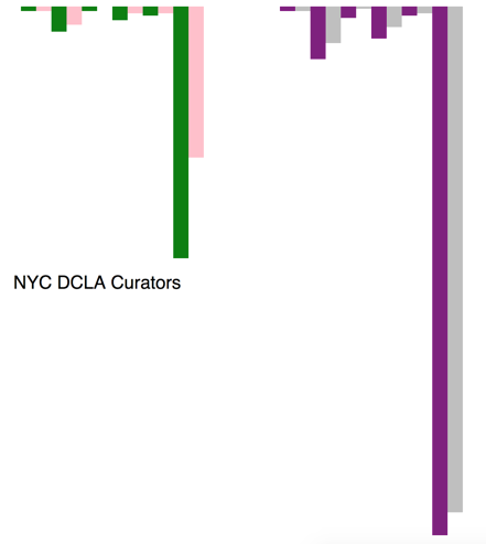
Secondly, used the same data set and switched to the bar chart to compare more recent hiring at NYC museums for all curators and those hired within the past five years. Corrected the relative max height - which has changed what I am seeing here in terms of numbers. Per class feedback, worked in d3 to change this from a bar chart visualization to a line chart to better compare the relative changes.
Line chart – first step image above – then needed to pair ‘all curators’ with curators hired in past 5 years by race/ethnicity. To do this, first grouped the data using concat and filter to get 7 paired arrays with all curators and curators hired in the past five years. Used path to draw a line from the left side – all curators – to the right side – number of curators hired since 2010 for each of the 7 race/ethnicity to show the relative numbers of curators by race/ethnicity and hiring trends by race/ethnicity. The codebook for the NYC DCLA data set notes the following race/ethnicities:
1 American Indian or Alaskan Native and Native Hawaiian or Pacific Islander
2 Asian
3 Black or African American
4 Hispanic
5 Two Or More Races
6 White
-8 Declined to State
The survey was fielded in 2015 so the numbers for the 2010s ranges across five years. There are 8,094 staff working in museums, 324 of whom are curators. Of those 324 curators, 135 have been hired since 2010.
The online data visualization is: https://vfs.cloud9.us-east-1.amazonaws.com/vfs/00651c2eccdb449798cec665916ff310/preview/hkMusData/index3simpleline.html
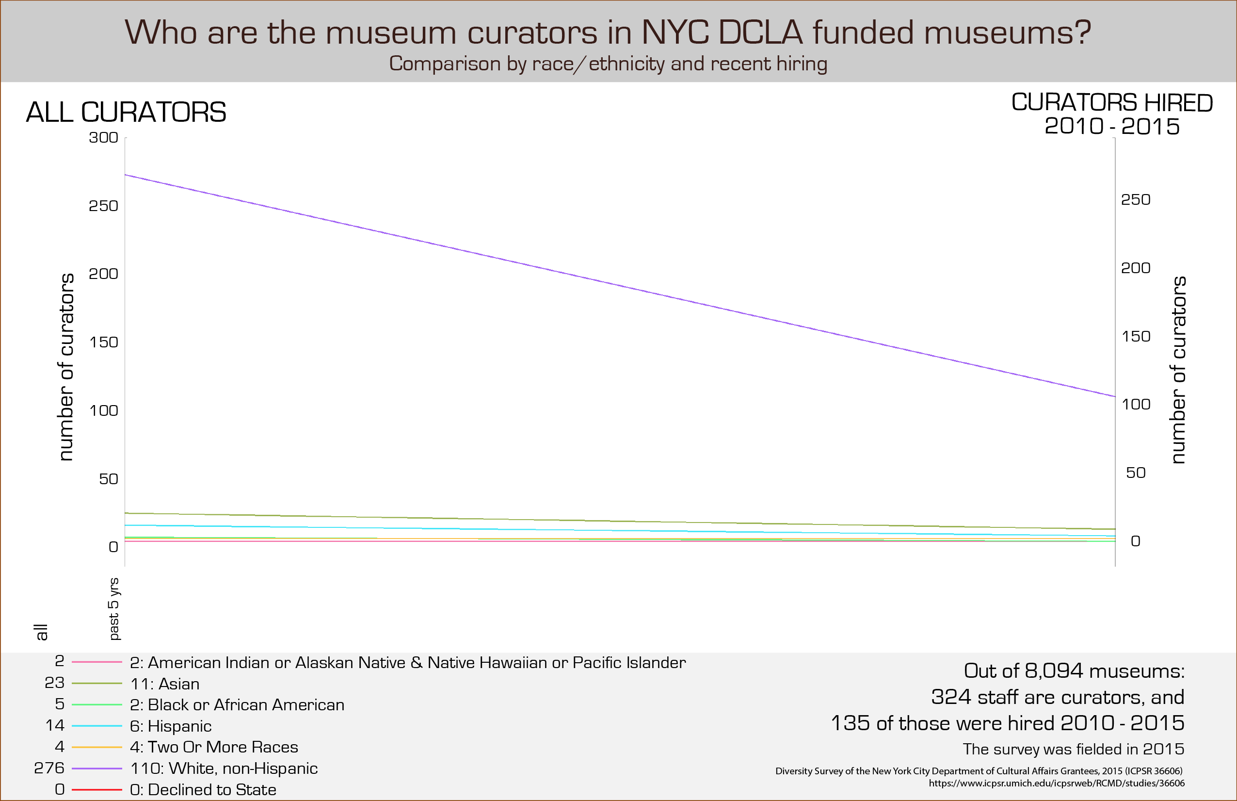
The resulting visualization shows hiring trends in the last five years. The outlier purple line, ‘white non-Hispanic,’ is so much higher at 276 for all curators that it is hard to see what the differences are for say, 5 Black or African American curators – so I decided to include the numbers in the legend to give the exact information. I’d suggest that a ‘close-up’ of the lower part of the chart would be a useful addition here, or a series of individual bar charts - small multiples - for each race/ethnicity so that the trends and numbers can be seen more easily.

To do - move to other data columns to compare by budget and investigate the larger museums. Compare this data set with museum collection data that shows who museums are collecting and - if I can acquire the numbers - who museum audiences are.
Mio Akasako
I had several different datasets I was working with last week, but decided to stick with one that I used for my qualitative visualization, to explore what it could provide a bit more. The dataset comes from the Geocognition Research Laboratory, which has documented all public instances of sexual misconduct and violation of relationship policies by academics in this database. These are the two preliminary graphs that I combined and added additional information to:


Purely exploratory in nature, I wanted to see if there were any pattern differences between reports of sexual misconduct in STEM vs non-STEM fields, and what the pattern of disciplinary action against STEM academics looked like. This required going through the whole database (755) and manually placing them in STEM and non-STEM categories. I also went through manually to produce summaries of the outcomes listed (these are listed as sentences; I needed to shorten them into phrases, and also combines some similar outcomes for the sake of producing cleaner data). I used pivot tables to get the numbers of the different outcomes each year. I made two charts separately in Excel, then imported them into Illustrator, where I proceeded to manipulate and make them more aesthetically pleasing.
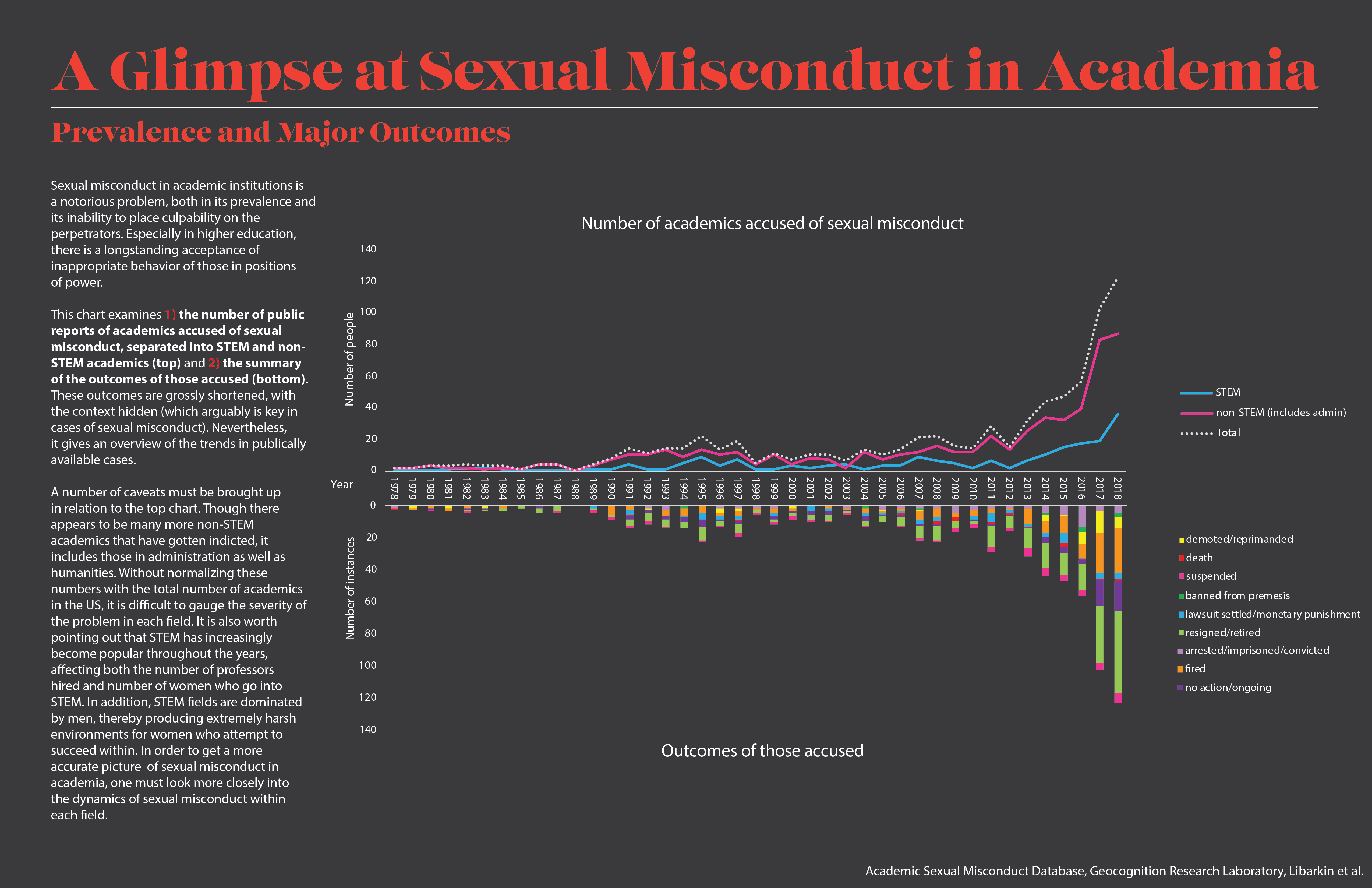
The chart examines 1) the number of public reports of academics accused of sexual misconduct, separated into STEM and non-STEM academics (top) and 2) the summary of the outcomes of those accused (bottom). These outcomes are grossly shortened, with the context hidden (which arguably is key in cases of sexual misconduct). Nevertheless, it gives an overview of the trends in publically available cases.
To be completely honest, I wanted there to be a difference in pattern between STEM and non-STEM, but the nature of the data overlooks many confounding factors that could skew the data. A number of caveats must be brought up in relation to the top chart. Though there appears to be many more non-STEM academics that have gotten indicted, it includes those in administration as well as humanities. Without normalizing these numbers with the total number of academics in STEM and non-STEM fields in the US, it is difficult to gauge the severity of the problem in each field. It is also worth pointing out that STEM has increasingly become popular throughout the years, affecting both the number of professors hired and number of women who go into STEM. In addition, STEM fields are dominated by men, thereby producing extremely harsh environments for women who attempt to succeed within. In order to get a more accurate picture of sexual misconduct in academia, one must look more closely into the dynamics of sexual misconduct within each field.
Jed Crocker
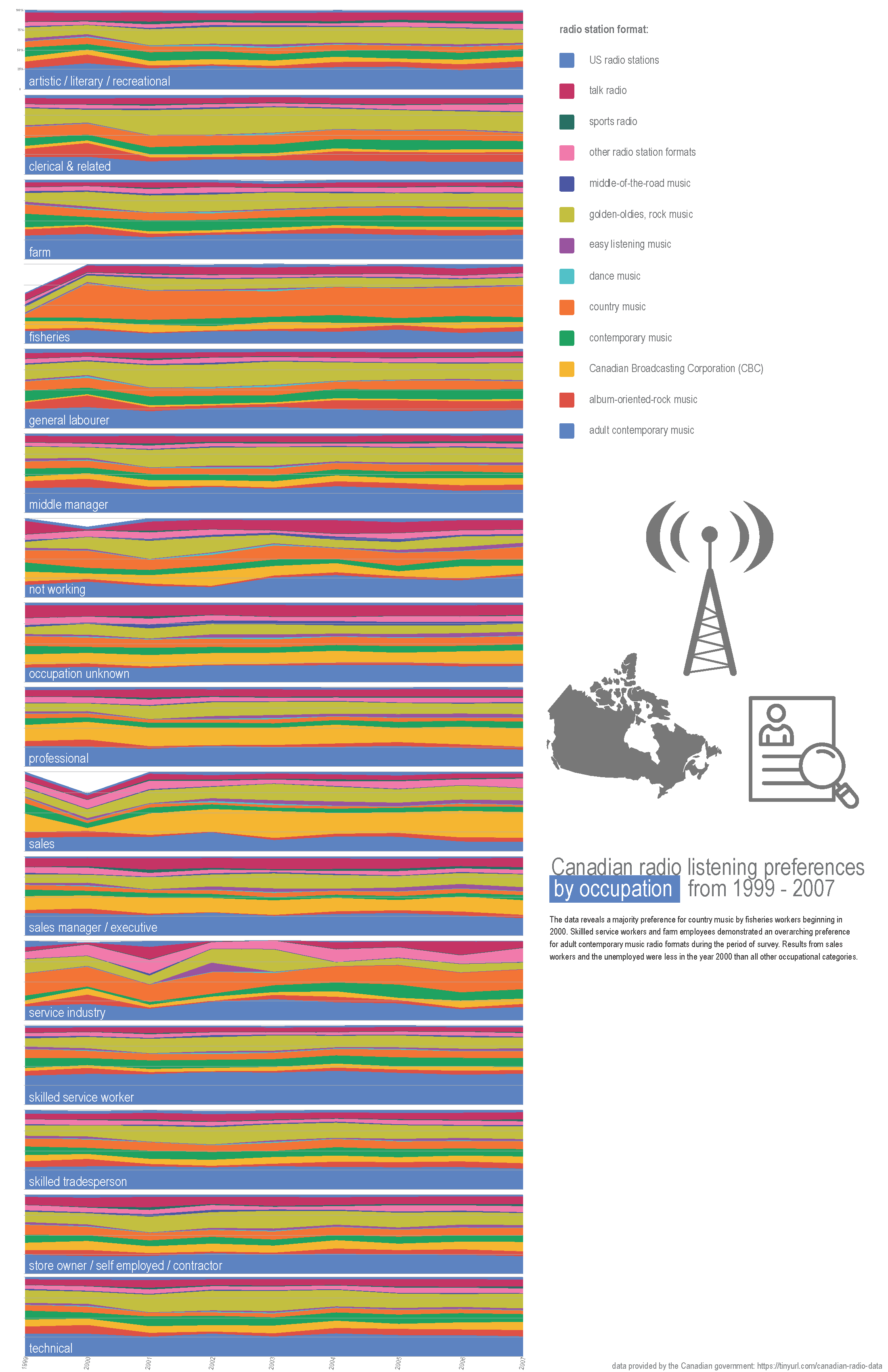
The final visualization produced for the quantitative assignment was based on this dataset provided by the government of Canada, on surveyed radio format listening preferences defined by total percentage share of the listeners’ occupations. Based on the feedback received on the initial drafts last week, this was the data that compelled the most attention and interest.
Other topics that were in the running last week (drafts) were:
- Canadian non-commercial radio - Operating expenses vs income/revenue
- Canadian commercial radio operating expense growth over time
(It turns out that Canada releases some high quality data about their radio operations, much more so than other places!)
- Some technical data about the frequency power and ranges for UK radio stations
- and some nonsense mapping of various radio station technical parameters which were mapped as if they had qualitative meaning but ended up becoming more pure aesthetically interesting (like a glitch chart.)
In general, I found it difficult to procure meaningful quantitative data about the radio industry broadly that could be mapped and made more interesting through visualization. It was clear to me (especially after feedback) to revisit/refine to the Canadian listening habits data --- but after this project I don’t intend to return to this data set again.
The initial draft of this data set (created through Google Sheets) aggregated the percentage information into one value per occupation per radio format for the whole time period of the survey (1999 - 2007), as seen directly below. I knew that I wanted my second draft to show how these preferences changed by each year, within each occupation. In order to somewhat successfully accomplish this, I thought that a small multiples stacked bar-chart (based on the original draft stacked bar chart) would be the key. I didn’t want to plot each graph in a grid form, and instead run them either all horizontally or all vertically --- both of which presented challenges within the static print format (specifically on 11 x 17 paper.)
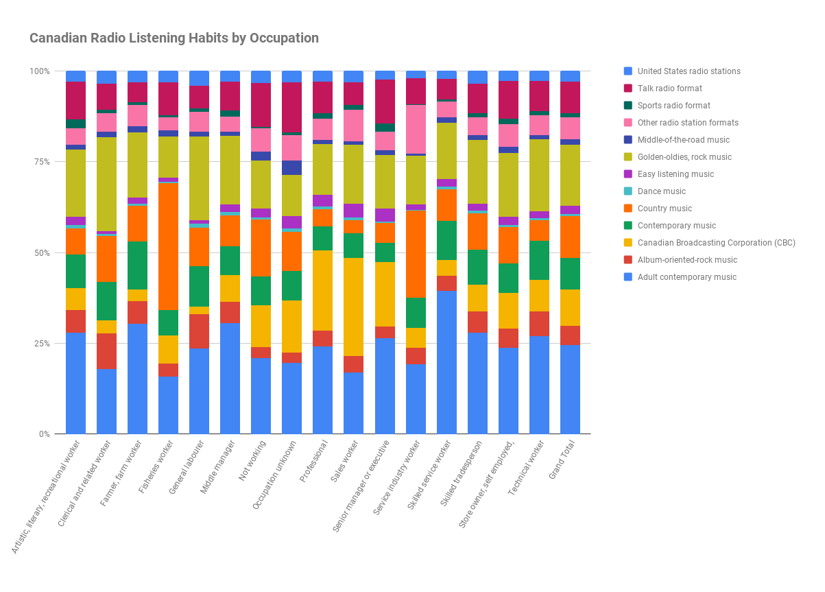
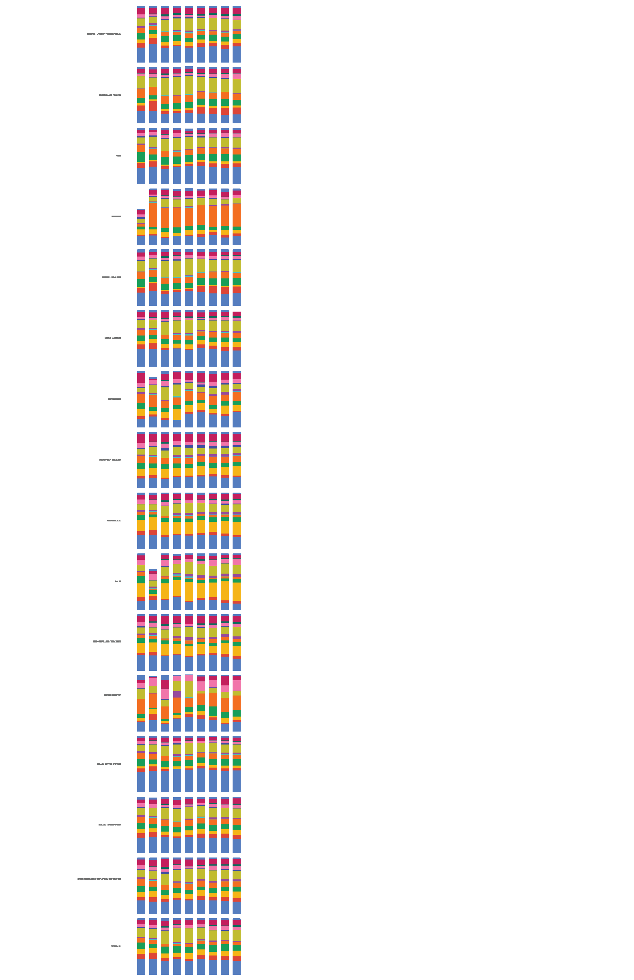
Due to these challenges, I changed the format from the stacked column chart and moved to a stacked area line chart, thinking that getting rid of the white spaces between each bar would be easier on the viewer’s eyes. I also was able to elongate the graphs to more reasonably use the area of the page surface than the column chart allowed. (I had determined to stick with the Sheets output charts for this exercise, as it seemed as good a format as any to relay the information from the data set. The color choices are arbitrary but appealing – and I tried several alternatives --but stuck with the original aesthetic which ended up looking the best, particularly after running through the copier on a fuller/darker color setting.)
I then created one graph per occupation and began a tedious process of combining and reformatting the exported svgs in Illustrator.
In order to be actually informative, I think the paper format is a bit of a failure in terms of size and clarity of the information. I’m also missing the roll-over/hover effect that is helpful in a screen format for precise percentages. The dataset is a bit of a stretch for quantitative analysis --- though I am working with precise numbers here, as opposed to radio station call numbers, etc. In the end the design choices feel a bit random in terms of the information that is being presented. I made multiple versions of this --- a few versions included the lines extending from each graph and to turn into wavy lines that were meant to resemble radiowaves, but in the end that looked like a mess (and serve as a reminder of my very limited Illustrator skills.) The final version did not include any extended radio lines.
I’m appreciative for the two weeks on this quantitative assignment. It was satisfying to search for tangentially topical datasets and explore through an ‘off the shelf’ medium and format the information into exploratory graphics.
Grace Martinez
Based on last week’s feedback, I focused in on comparing the Storage Unit industry to other big companies synonymous with being ubiquitous: McDonalds and Starbucks. Though instead of comparing the number of locations, which was one of the graphs of my initial poster, I zoomed into the squarefoot difference, which was more drastic.
I found storage unit industry square footage data from the IBISWorld industry report. For McDonalds, I took the number of 2016 (there weren’t any later) number of locations and multiplied it by the average square footage of those locations. Sources: ttps://www.statista.com/statistics/587130/average-floor-space-qrs-us/, https://www.statista.com/statistics/256040/mcdonalds-restaurants-in-north-america/
For Starbucks, I took a similar approach where I took the average number of starbucks store size (latest one was 2014) and multiplied it by the number of locations.
Sources: https://stories.starbucks.com/stories/2014/three-starbucks-stores-that-inspire-one-of-the-most-creative-people-in-busi/, https://www.statista.com/statistics/218366/number-of-international-and-us-starbucks-stores/
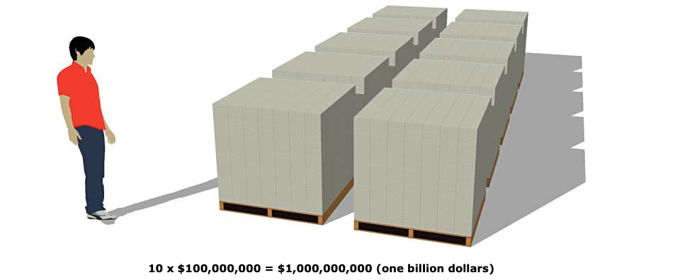
The scale was more impressive than the sheer number of locations.
I also wanted to see the storage industry compared in terms of numbers of employees employed. I found that even though the storage unit industry is not only double in number of locations and 10x bigger in space, they only employ less than half of the employ of employees than Starbucks and McDonalds combined.
The revenue from the storage industry was, as expected, also way larger.
I wanted to compare space of public housing and space per person, but had no luck finding any clear data on that.
Data sources and calculations can be found here: https://docs.google.com/spreadsheets/d/1l2-Iazgyr7omRpMOrjbiEOEQgJOdNdWfUu2InJr2DkM/edit?usp=sharing