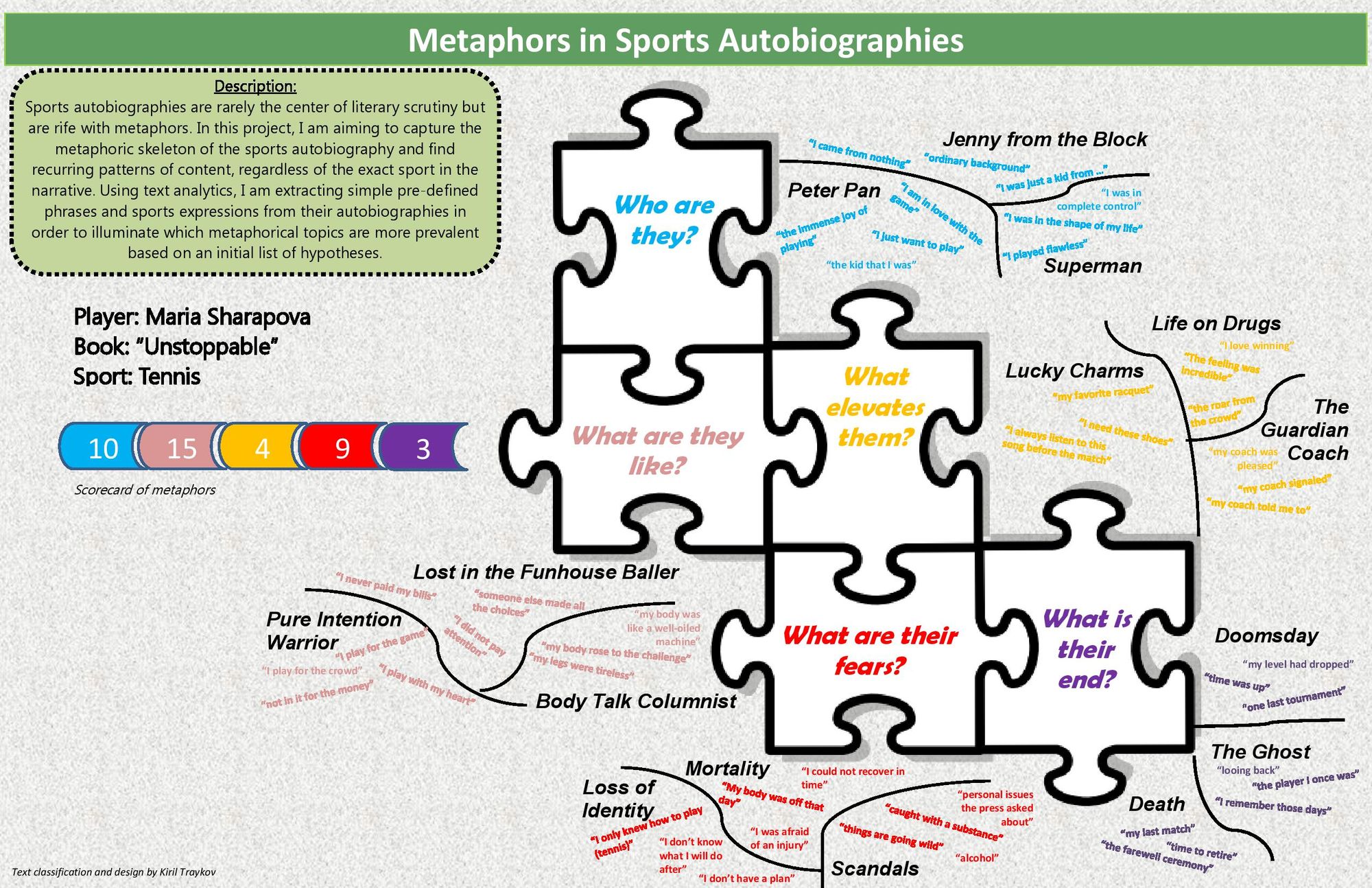
The purpose of the poster is to illustrate text quotes from sports autobiographies grouped by metaphor into 5 main categories (with 3 sub-categories in each). The main categories have been converted into questions to increase the intuitive perception for the viewer. The quotes that appear on this poster are mock-ups as the actual output depends on coding work that needs to be done. Thus, the "data" is only illustrative.
The poster uses color and visual cues (in the form of puzzle pieces) to differentiate between the categories, yet keep them together as a whole (to instill a single body of work, that of the autobiography). The exact positioning and typography is a whimsical art decision, to make it visually appealing and unique.
The feedback from the first version was that the comments are what makes the poster interesting so I decided to splatter them all over. I omitted putting any charts except a scoreboard to count the number of quotes for each category (although the viewer can count the quotes as well). So the scoreboard is just for summary purposes. The poster can probably exist even without it.
The earlier iterations had two differences from this final version: 1) white space, as I like minimalism and 2) quantitative charts, as I cannot imagine publishing anything without a data summary on it.
I do not consider this to be an improvement but it is just a different form of presentation.
For my first set of qualitative posters, I thought a little too big. I was thinking too outside the actual space of the posters, more so how each design would fit into a larger viz puzzle rather than standing alone as an individual piece. This time, based on the feedback I received, I collected the rest of the data and put all of that data on the space of a 11x17 poster.
I chose the Instagram idea out of the three designs (Instagram, lyrics, tour history) I presented last week. It felt like the class was most intrigued by this concept and was curious to see the complete dataset, as was I. Also, thinking ahead, I felt like it could lead to a lot of interesting image analyses I've never worked in before.
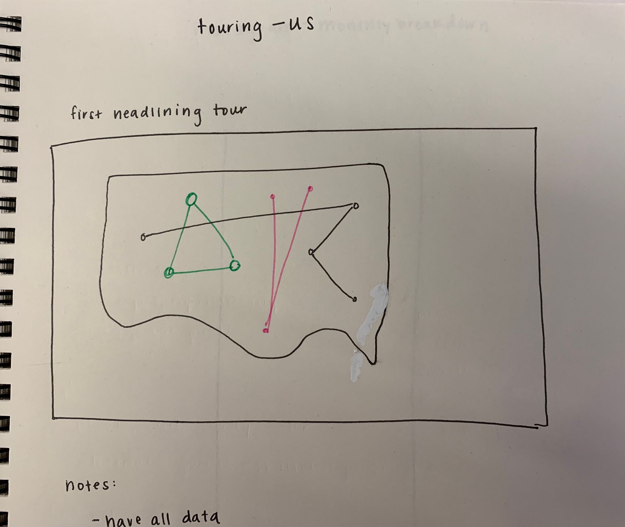
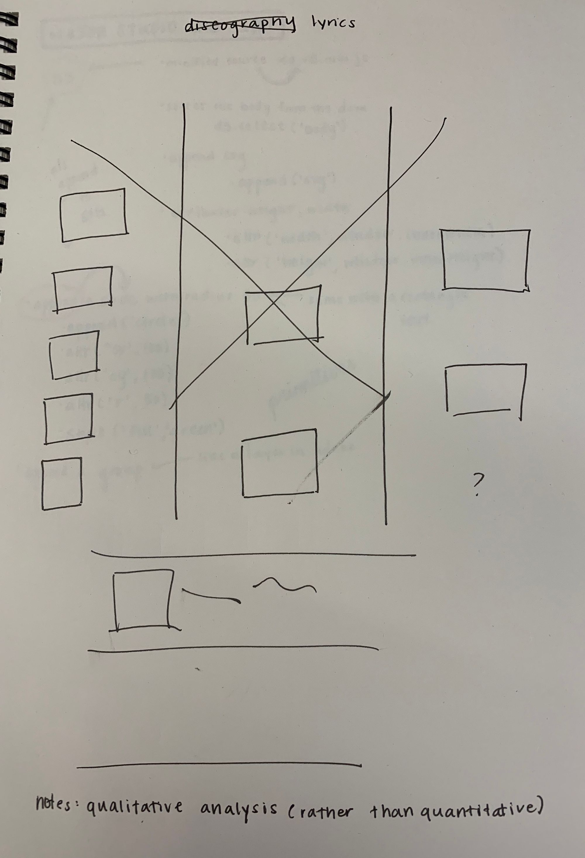
My original topic was comparing three different bands from the UK whose popularity is staggered over the past five years. The question was looking into the similarities in their paths to fame, in order to understand more about indie popularity in the UK. Here are some sketches I made from those original designs.
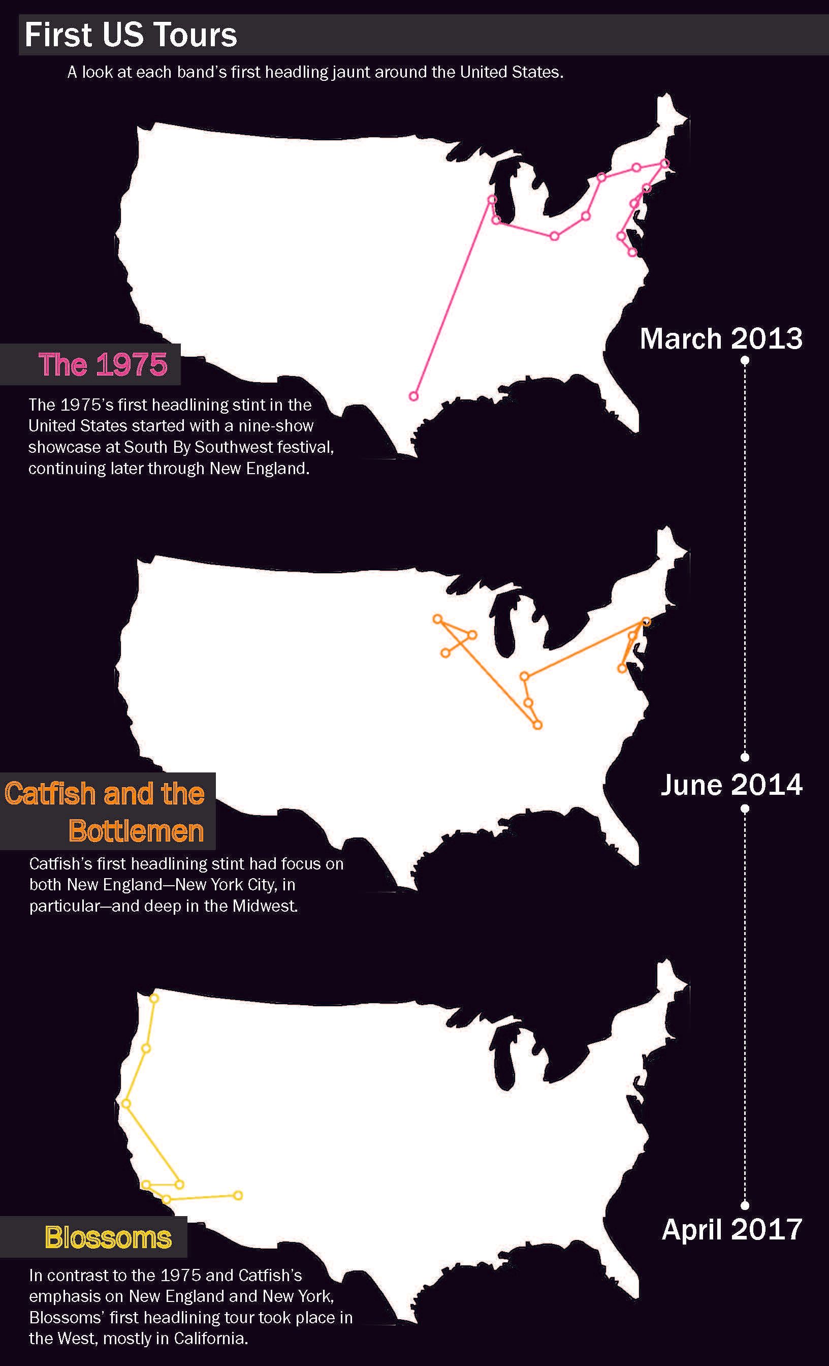
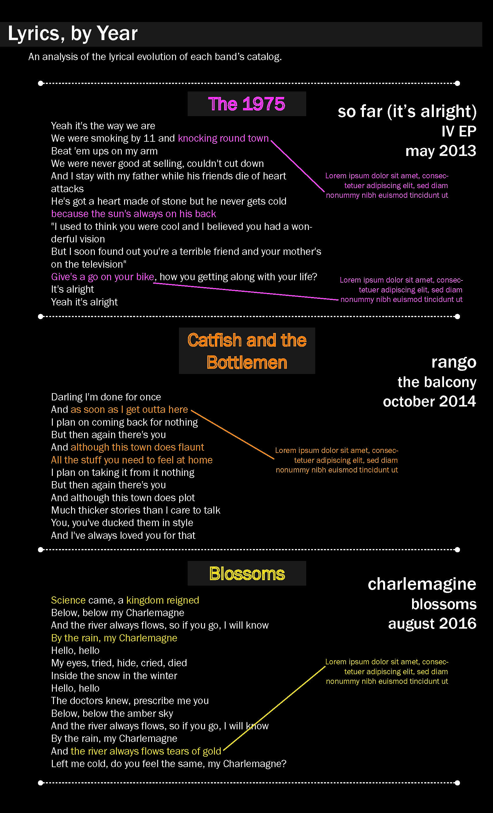
I ended scrapping the idea of putting all the data on one map and inside separated them out on their own individual maps.Some of the feedback I received in class question what story this was telling, and if maps were the best way to visualize it.My initial sketch here translated almost exactly to the final design.The feedback here primarily pointed to the lack of complete data.Originally, I was going to play around with a visualization of their discography. And then, last minute, I decided to pivot to lyrics instead.Feedback here also surrounded incomplete data, but there were a lot of cool ideas thrown out about scraping Genius for fan theories around song meanings and running each catalog through sentiment analysis softwares (IBM Watson, in particular).
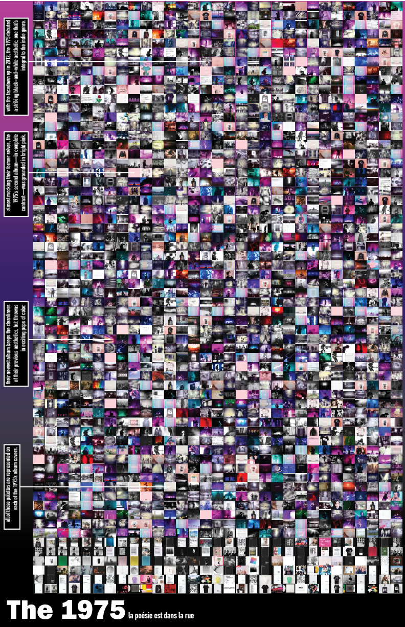
For this presentation, as opposed to the last, I decided to only focus on only one band, the 1975. They achieved fame a couple years earlier than the other bands, and while I may return to those two, it made sense to focus on just one at the moment, especially since I've done a decent amount of previous data work on them in the past. I've also been intrigued by their Instagram for a while—The 1975 have went through many "eras" in their image over the years, so the goal was to see if those changes were represented in their visual social presence that they often closely curate. I conjured up the idea of working with Instagram in the first place because of the 1975's account.
Therefore, in this case, the topic would be a band's Instagram presence, the question would be inquiring about the 1975's account in particular and if represents their image as a band over time, and the significance would be to understand a band's social presence as a reflection of their actual, physical presence.
For the data, I used an open, Chrome extension software called "Downloader for Instagram" to download all of the 1975's Instagram images (there were over two thousand). I then re-sized each to about 2% the original size of the photo using an online batch resizer. I then placed all the photos in a grid on InDesign, which I then transferred over to Illustrator for cosmetic design edits. I'm trying to force myself to work in Illustrator and InDesign before code since I'm still learning Adobe platforms.
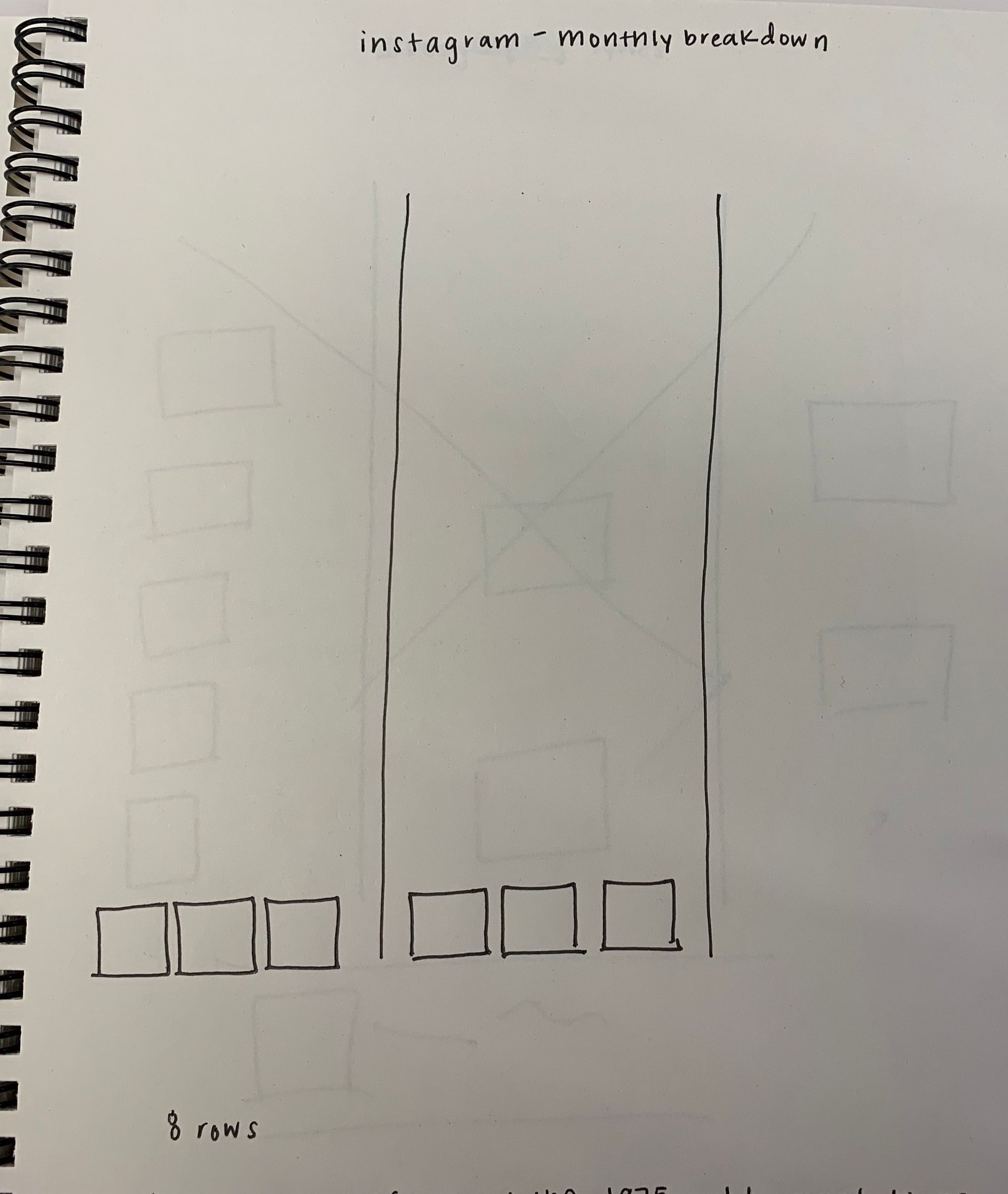
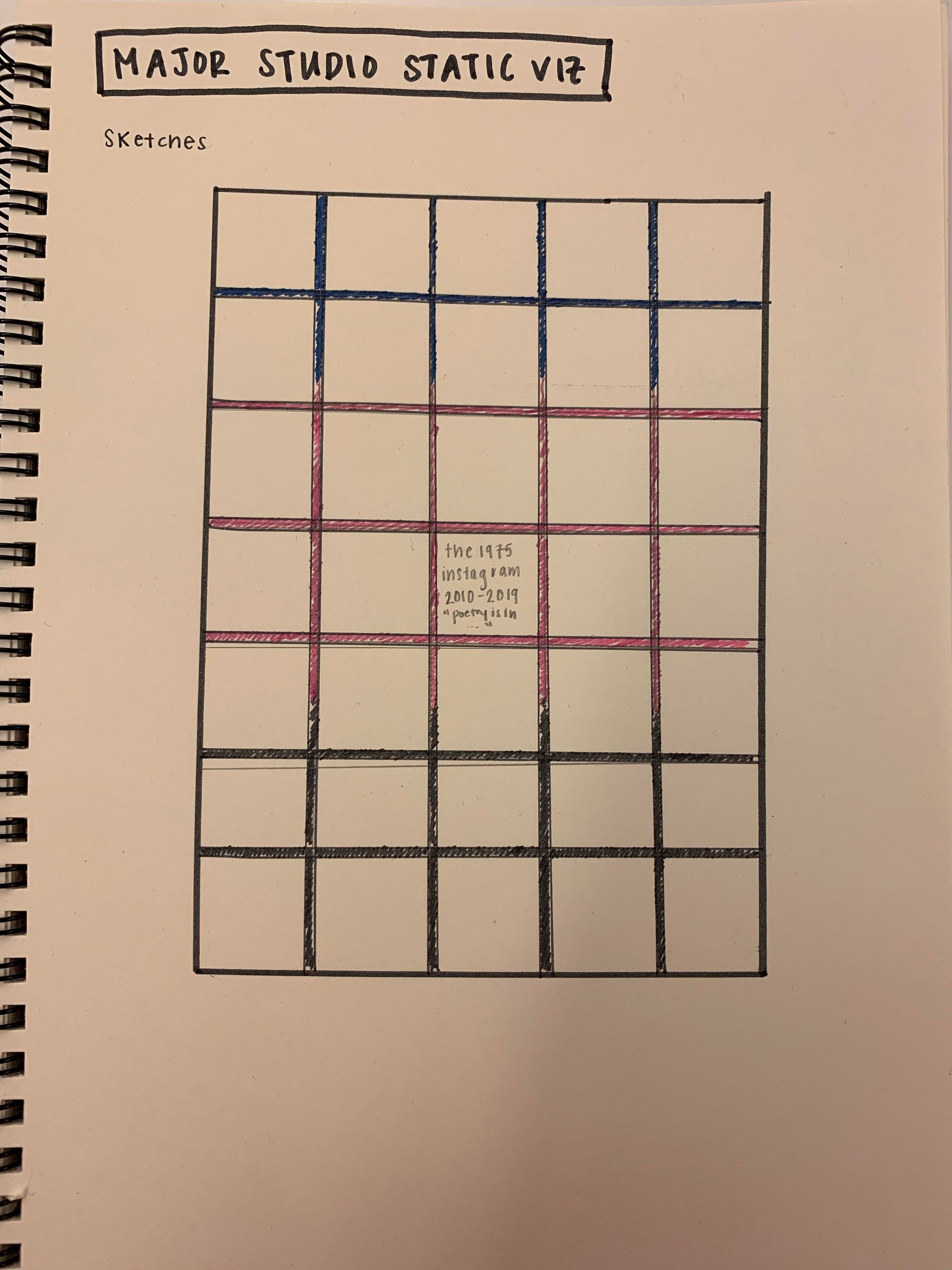
My original design showed the photos in a grid pattern, similar to Instagram itself—a decision I kept in this new design. The photos encompass the whole poster, an effort to really confine all the data to the poster space, with annotations about their history. Below is a sketch from when I was designing the new poster.
For the final re-design, I went with a Meta Correspondence for my serif, and I went with Adobe Jensen for my sans-serif. The color palette is a reflection of the photos themselves. I decided to include a quote that is integral to the band and well-known among its fans, a quote that has to do with color itself ("la poésie est dans la rue": "poetry is in the streets in full living color," which can be found at the end of their music videos for "Chocolate" and "Sincerity is Scary").
Even though this is a data visualization, I grew up with music posters on my bedroom wall, and I think the result is a cool image that fans (of the band and music, in general) would find eye-catching and interesting. You can clearly see the colors that fans would relate to the band itself throughout the piece. In the past week, I wasn't able to find a solution to save the pictures in some kind of temporal order of when they were posted, but this is something I'd like to solve in the future. I may be able to scrape the page, or revert back to my previous method of taking the most-liked image from each month. Here's the final design I'm showing in class:
To think ahead a bit, I did a little research into image analysis options. I found a Python tutorial (language I'm most comfortable in) working with object recognition. I was also interested in this project, called "Homes For Sale," by Jason Salavon, which combines photos of single-family homes on the market in different cities around the United States into a single image. I also think the idea of counting contents of each photo (the band members themselves vs. tour announcements vs. crowd shots, etc) is a potential path.
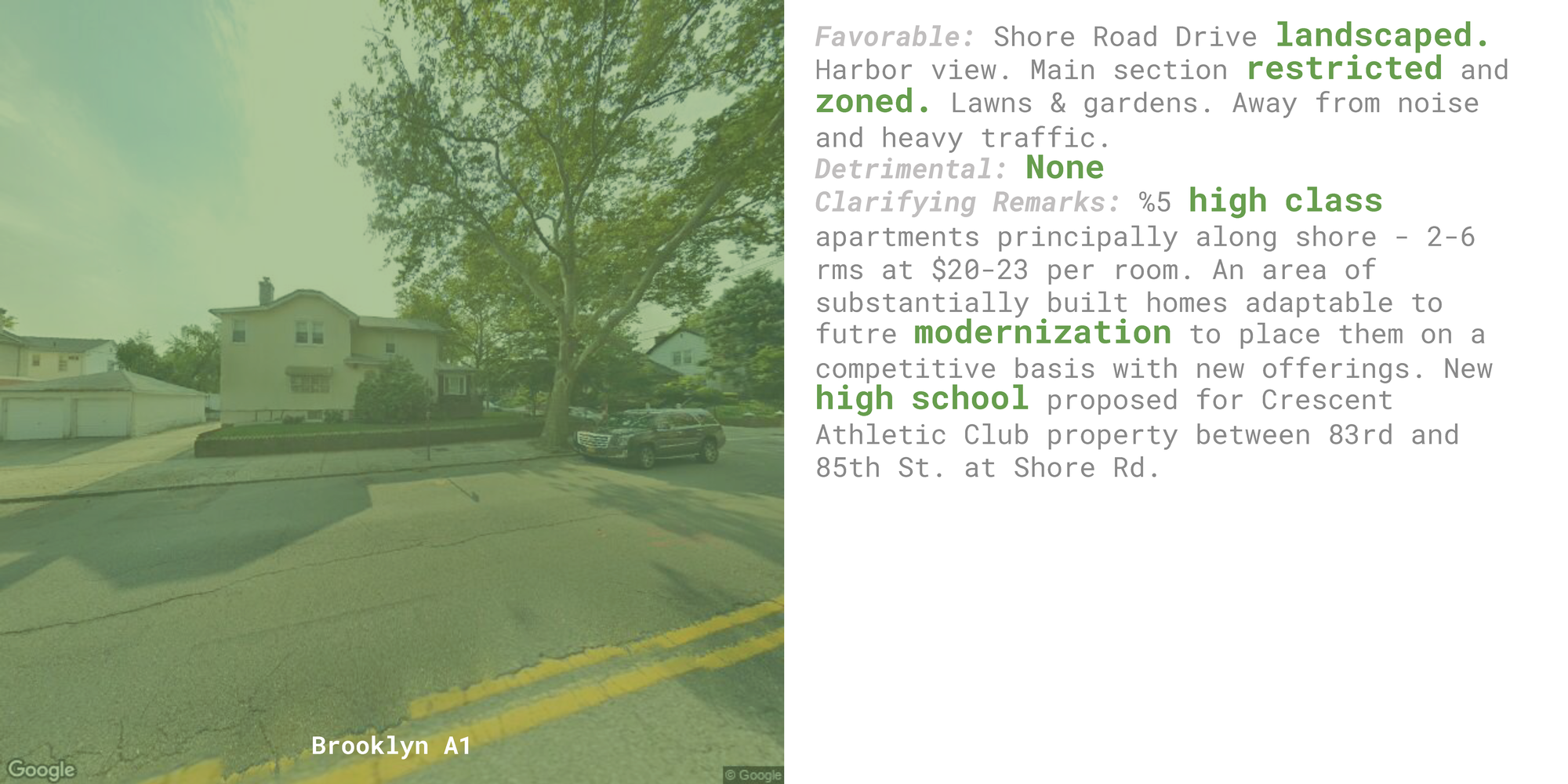
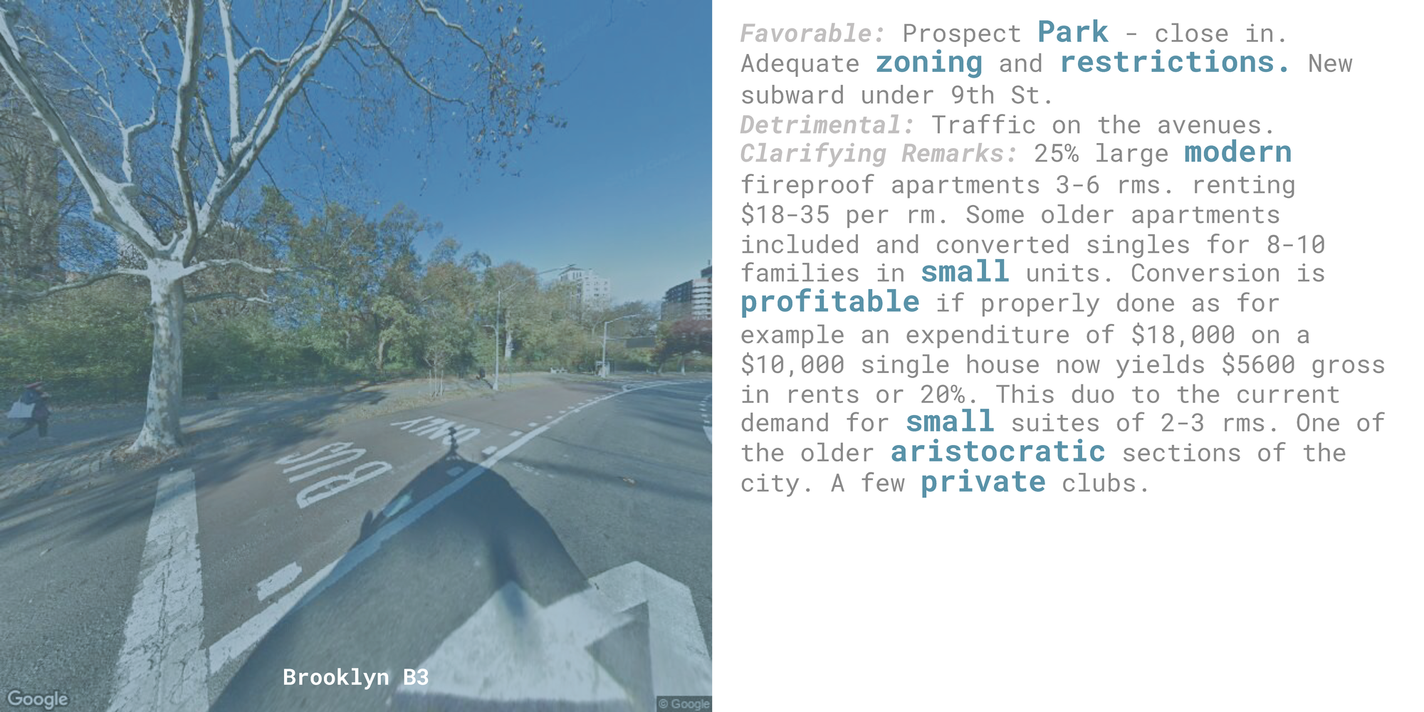
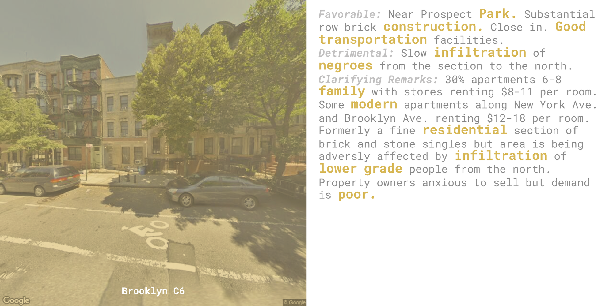
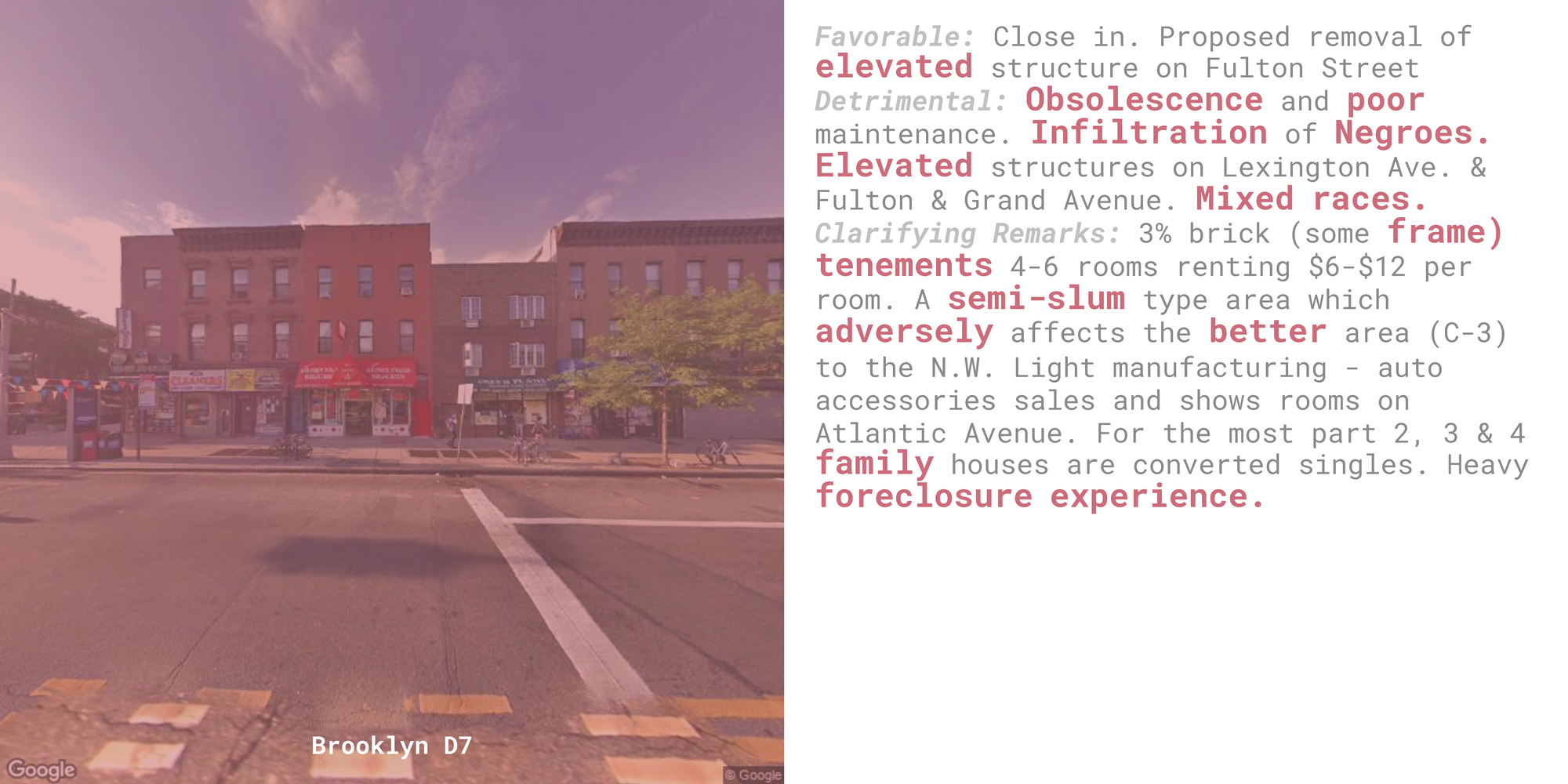
This book design explores the language used by the Home Owner Loan Corporation (HOLC) appraisers to rate the potential security of real estate investments within neighborhood tracts, connecting these judgements with snapshots of those same neighborhoods today.
As part of the mid-1930's New Deal suite of government programs aimed at providing stimulus to an American economy saddled with the Great Depression, president Franklin D. Roosevelt set his sights on boosting The United States' mortgage and home building market through his establishment of the HOLC. This organization aimed to spur real estate investment and facilitate homeownership by introducing and standardizing appraisal methods within this mortgage lending process. Part of this initiative included creating physical Security Maps of more than 200 cities across the United States, detailing neighborhood-by-neighborhood factors that would either favorably or detrimentally influence the perceived security of a real estate investment within that community. Each neighborhood was given a color-coded grade ranging from Green/A ("best") to Red/D ("hazardous").
This process, later coined 'redlining' after these maps littered with zones of perceived perpetual blight covered in red ink, determined who could feasibly participate in mortgage markets. Those enclosed in redlined neighborhoods would have a hard path to homeownership, finding it impossible to procure fair, non-predatory mortgages or insurance – from either the private market or the very government that issued these damning grades. People who lived in these neighborhoods were essentially "locked out of the greatest mass-based opportunity for wealth accumulation in American history" (Melvin L. Oliver and Thomas M. Shapiro in their 1995 book, Black Wealth/White Wealth, quoted by Ta-Nehisi Coates).
The motivations behind these ever-important neighborhood gradings were all too often blatantly motivated by race. In this project I wanted to explore the language used to document these redlining decisions, exploring the reasoning appraisers gave behind the grades they doled out while connecting this language with quick jaunts into the current-day versions of these communities.
Data
Mapping Inequality, a project of The Digital Scholarship Lab at the University of Richmond, underwent an extensive digitizing of HOLC Security Maps. The research team, led by Robert K. Nelson, managed to create interactive panes of these 1930's static maps, tracing each specific zone to its geographic boundaries. They also scanned the area descriptions used in the appraisal of these zones, transcribing these forms to digital text. For each city this team provides data downloads, offering original and 'georectified' images of the original maps, along with geoJSON and shapefiles of these maps by city.
For this project I used the geoJSON files for Brooklyn, the Bronx, and Manhattan – the New York metro-area city area regions that included digitized area descriptions data. These files included really helpful data for each zone within that region, including the zone ID, the zone grade, the list of lat-lon coordinates constituting the boundaries of that zone, and a dictionary containing all text from the zone's area description.
Text
I took the three of the free-form sections from the area descriptions for analysis in this project: Favorable Influences, Detrimental Influences, and Clarifying Remarks. I wanted to determine which words were frequently used across zones or were particularly telling of the appraiser's perspective in evaluating the zone and its residents. So I first complied a list of every word used across the three text fields in all zones within all three boroughs, counting how many time the words were used overall and for each grade. I then looked through the list of 1,713 unique words that were used at least once (or were misspelled in this unique way at least once) and picked out 145 of these words that I wanted to highlight.
Picking which words I wanted to highlight was a highly subjective and iterative process. I wanted to look at words were unique to higher or lower rated zones (had a comparatively higher usage rate in that zone that other zones), would tell a compelling narrative when emphasized within a zone description, or would allow the reader to compare its context across zones in a meaningful way. I also would run through visual samples of what these area descriptions would look like with a particular list to see which specific words didn't fit or looked like they were missing, adjust the list, then rinse and repeat. Ultimately I think the list I ended up with is representative to what I wanted to portray, but I'd be interested to see what a collaborative list of highlighted words would look like.
Images
I also wanted to compile images for each zone, allowing the reader a small window into what the appraiser might have seen. Originally I thought it would be most relevant to look at these zones at the time the appraisal was made, allowing us a glimpse into what the might have actually seen – but I decided instead it would be more compelling to look at the current neighborhoods. I want my projects around this topic to portray the how the effects from this practice are still being felt and how it has left a generational hardship on its victims. To this end, I thought it would be more prudent to connect this past rhetoric with the zone's current landscape.
In order to pull images for each zone, I connected the list of lat-lon coordinates constituting the zone's border with the Google Street API. I averaged the lat and lon coordinates to get each zone's approximate center point. (While this approach would break down in trying to find the center point of a larger surface area given the complicated physics of geolocation and our circular globe, it should be sufficient for such small areas.) I then fed these coordinates into the API, saving a 2048 x 2048 image of each location that would serve as my 'representative' window into the current neighborhood.
Visualization
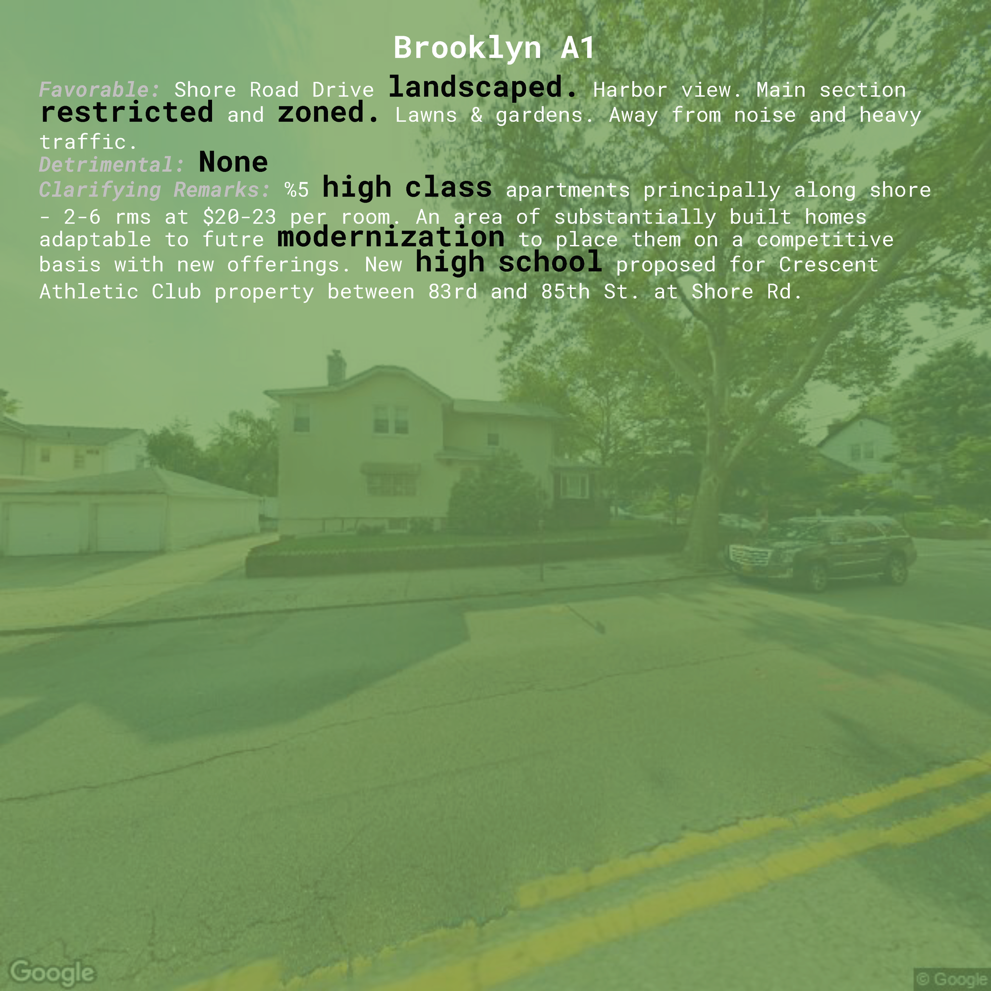
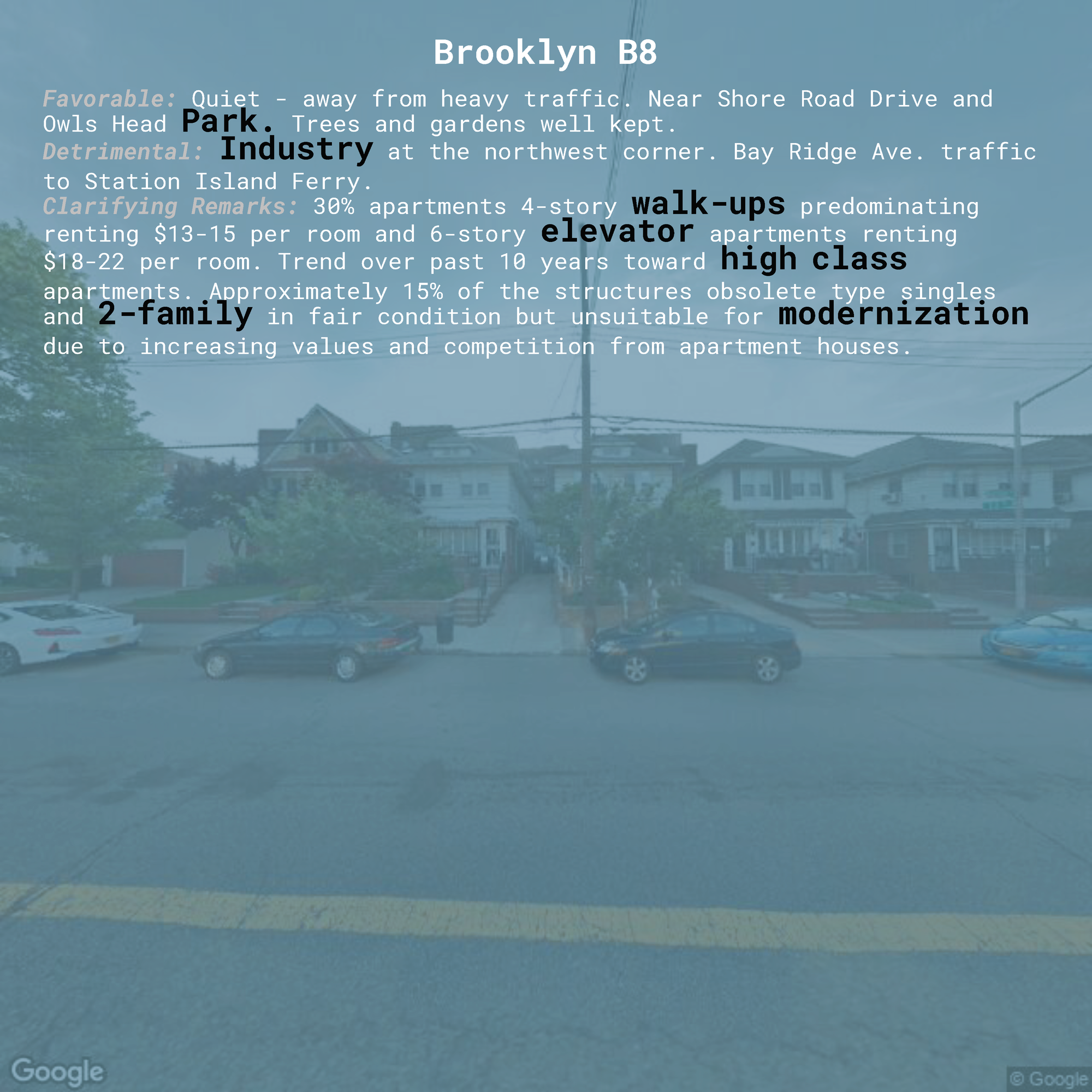
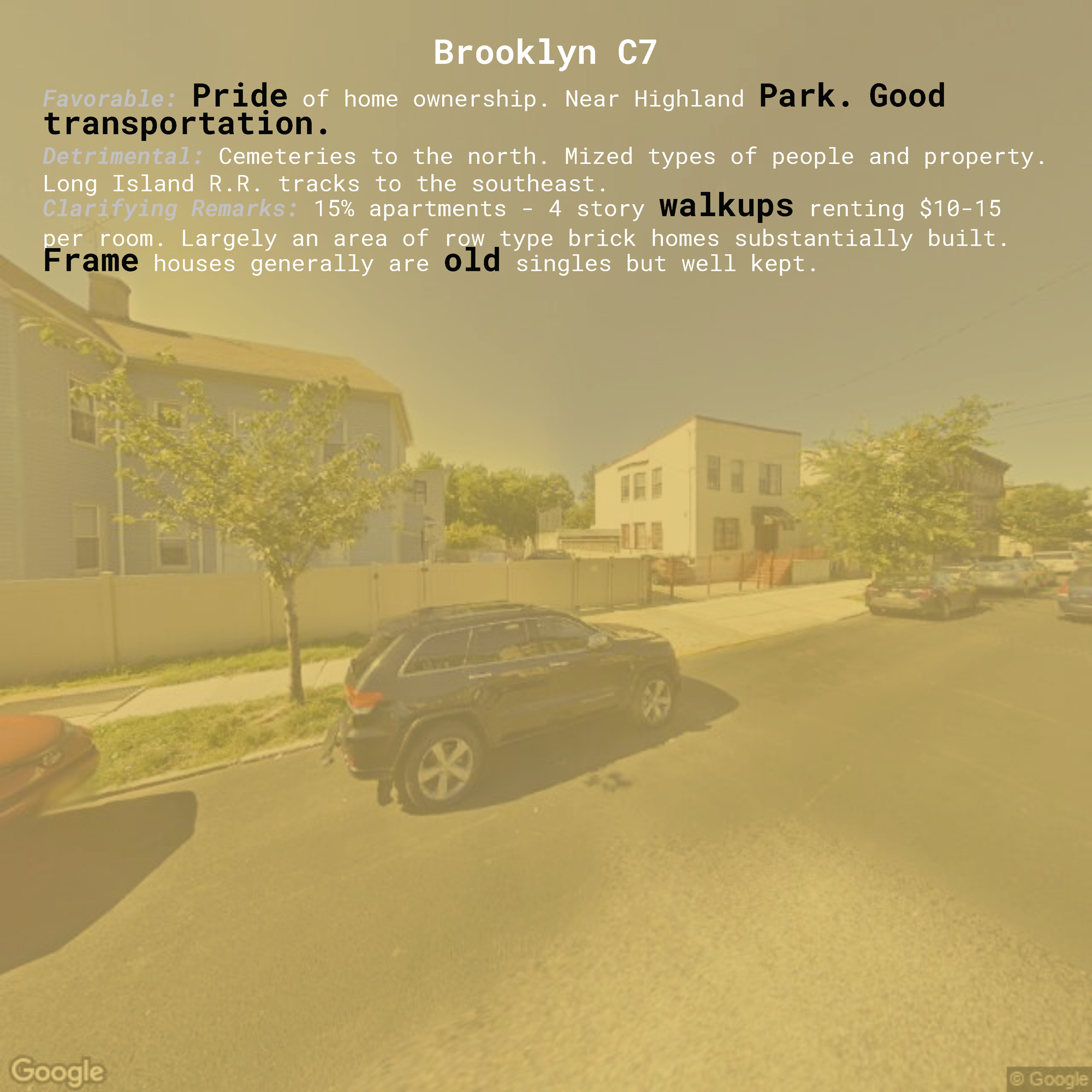
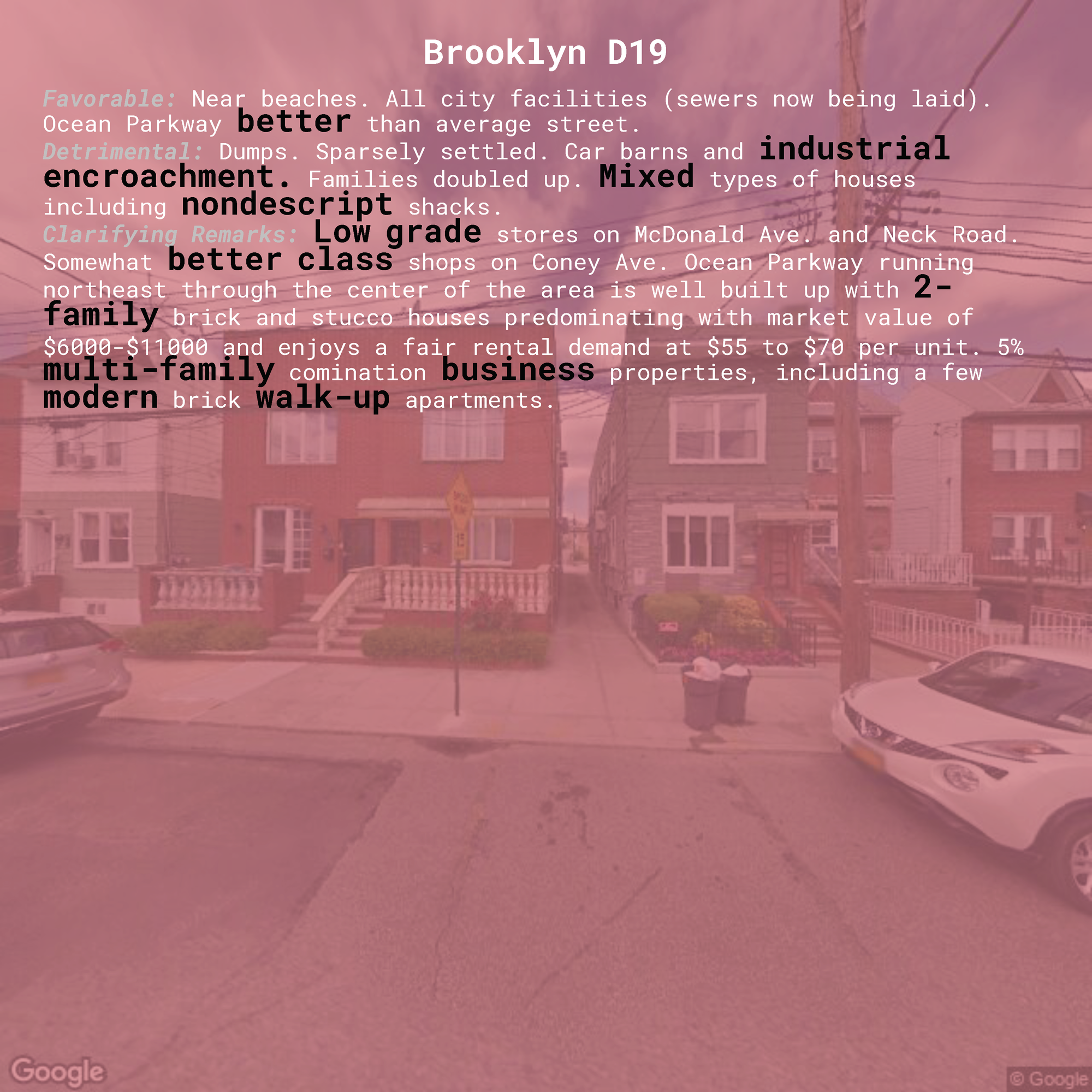
With each zone as a separate page in my book design, I wanted my reader to see both the image of the current neighborhood alongside the language used to either condemn or exalt that same neighborhood decades ago. I wanted to have the colors the original maps themselves and the inherent value associations in these colors act as a filter through which we interpret the image, obscuring and influencing our conception of the 'favorability' of that image in the same way as bigotry and discrimination clouded the judgement of the appraisers. Finally, I wanted the words I chose to highlight be visually distinguished from but still existing within the full text, drawing our attention to these key words and allowing us to read their use in context. These goals led me to the following page design, with examples for each zone:
The consistent format allows for comparisons from page to page as readers see contradictory phrases using the same words (like pride of home ownership vs. lack of pride, and high class vs. low class). The color predominates our visual interpretation of each page, prompting strong value assumptions before we've had a chance to interpret the image or the text.
I chose to use a monospace font, specifically Roboto Mono, for its association with the things that are often interpreted as cold, rigidly structured, and inhuman (like the typewriter, technology, and code).
Another iteration of this design I considered overlaid the text on top of the image itself, having both occupying the same visual space:
This design required increasing the opacity of the image filter to provide better legibility of the text (which isn't altogether achieved) and prevented me from using the zone color to highlight each word. This would also require a layout with two zones next to each other on adjacent pages of an open book, and I preferred having each zone occupy a full two pages (the left and right sides of an open book), as this demands the reader's full attention and juxtaposes the images and the text on different sides of the page, which I thought was both symbolically significant and allowed for easier comparisons.
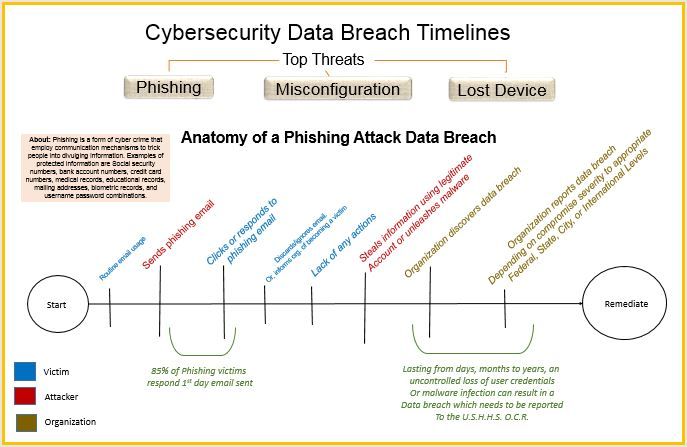
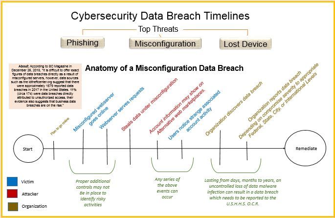
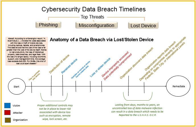
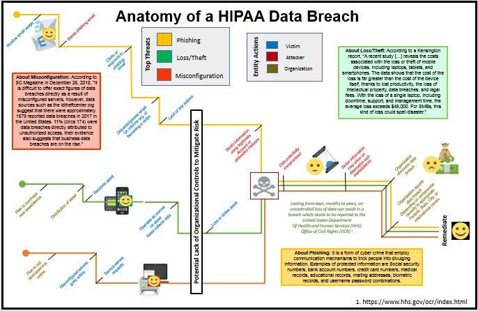
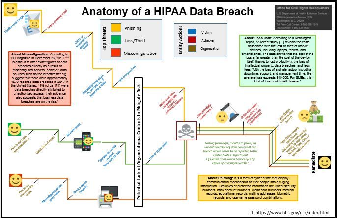
The topic under investigation is to some of the literature on top threats which can cause a HIPAA data breach and condense the material into a qualitative visualization. Examining the United States Department of Human Services Office of Civil Rights' "Wall of Shame" indicates some of the top threats which ultimately cause data breaches potentially leading to incurred fines, reputational damage, and other financial burdens.
What is the data set?
The data set is the United States Department of Human Services Office of Civil Rights' "Wall of Shame."
What are the visual decisions you made?
The visual decisions include how to tell the multiple threat stories in one visualization. On searching for predecessors, I ran across this Christmas Story visualization posted by Stephen Smith. I liked how the timeline showed many different paths and how they were unique but yet related in parts.
What were the original sketches and iterations?
Originally, I created three unique views of different threats as seen in: Phishing, Misconfiguration, and Loss/Theft.
[Original Iteration] Three Separate Views
After careful analysis and considering the feedback given by my instructors and colleagues, my next iteration included the following:
[Final Iteration] Considering Feedback from Instructors and Peers
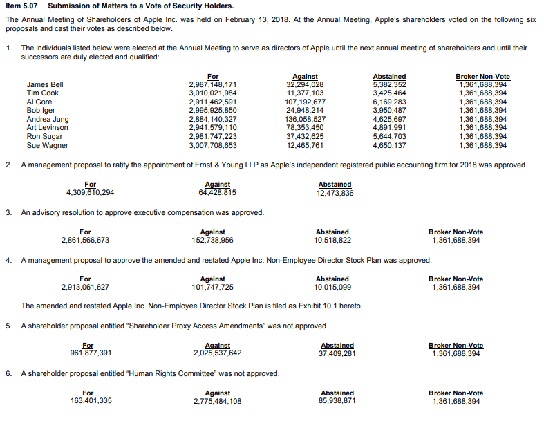
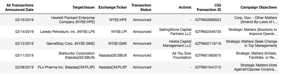
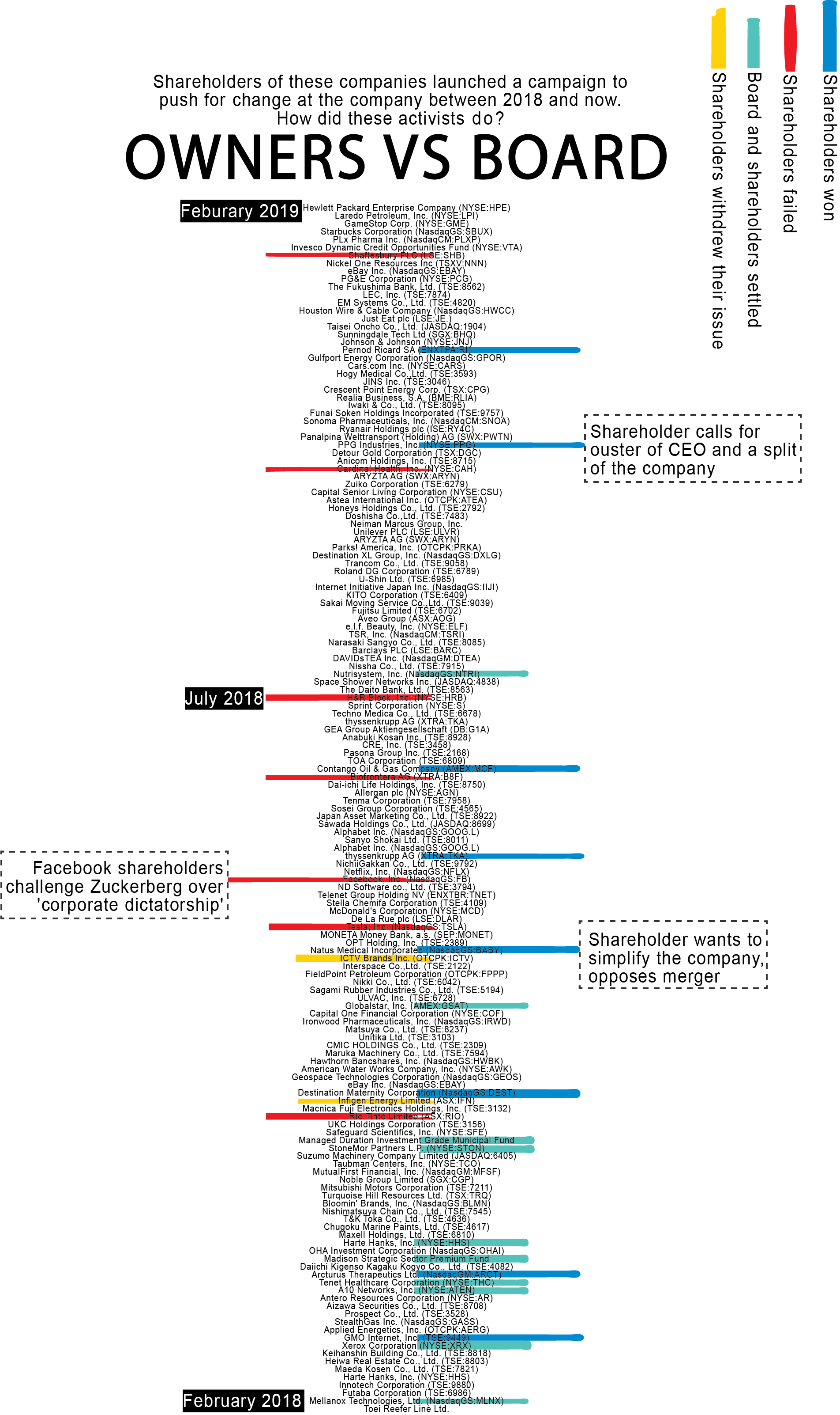
Topic: the different results of recent cases in which shareholders sought to change companies from within, by adding an issue on a company's annual general meeting agenda - to have it voted upon by all other shareholders.
Data set: all cases of shareholder activism since 2018, including the outcomes, collected from the companies' Form 8-K' (item 5.07) submissions with the SEC (retrieved from the SEC Edgar database and S&P).
Example Form 8-K:
Final format dataset, including data retrieved from S&P:
What are the visual decisions you made? The dataset was larger (from 2000) and more variables, but I decided to take more recent information (since 2018) and zoom in on the most interesting cases - and look at the background stories of those.
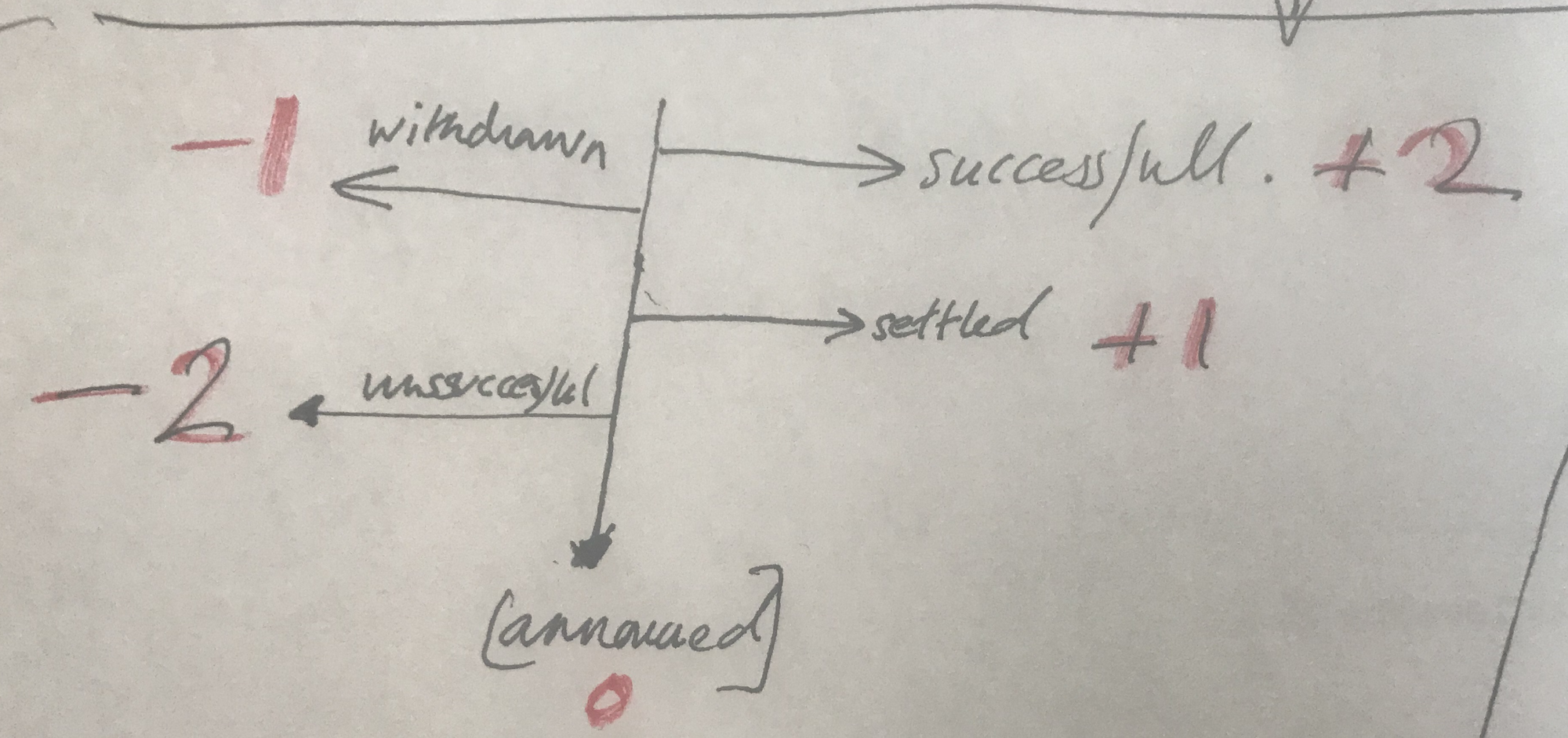
Original sketch:
For design purposes, I gave codes to the different outcomes: the amount to the right and left would represent the extreme cases of success and unsuccessful. I later decided to use color instead.
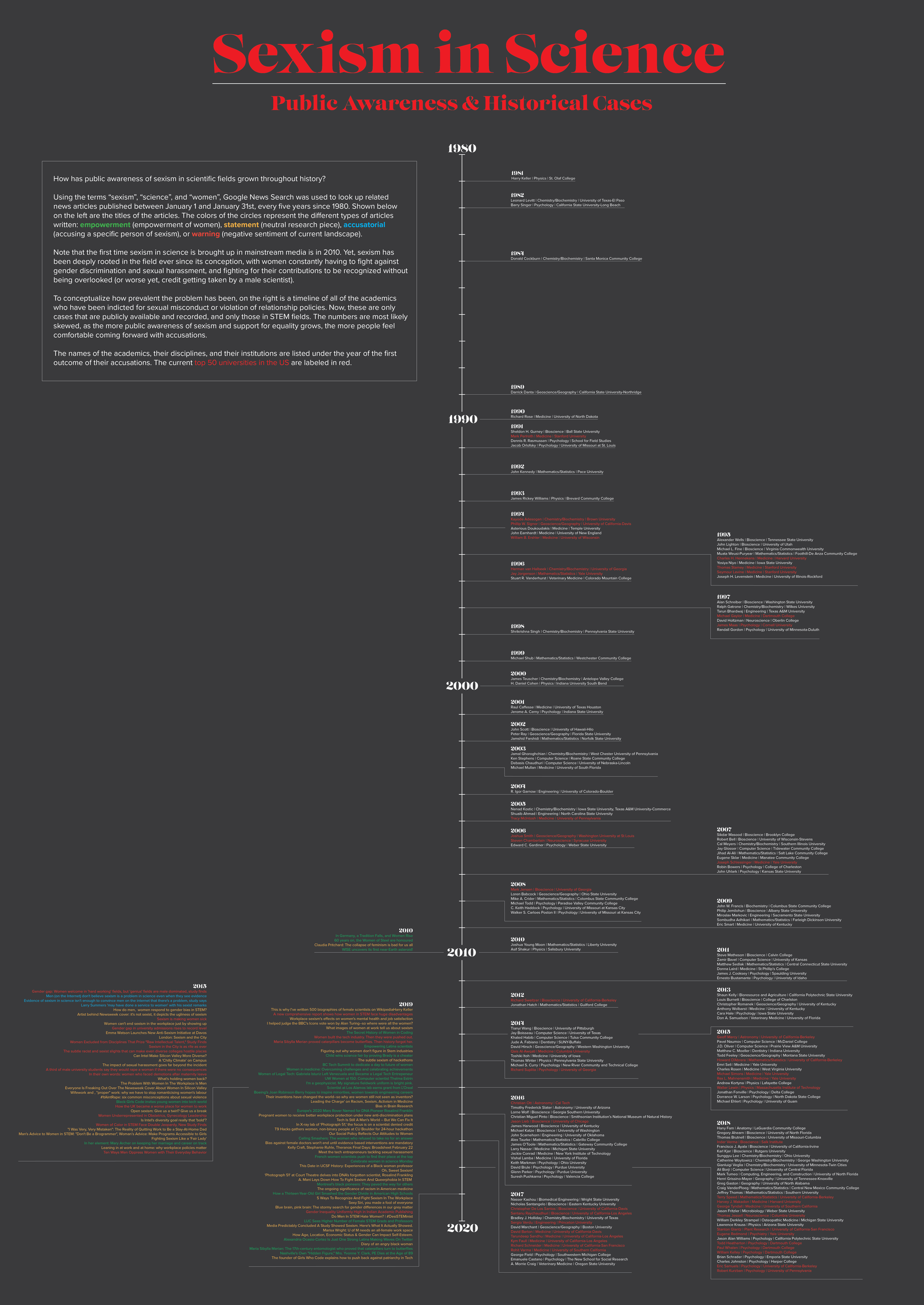
For my three qualitative visualizations, I decided to focus broadly on these questions within the union of my two subjects of interest, neuro(science) and sexual violence/harassment: How have women in science been treated throughout history? How has sexual harassment and sexism played a role in the advancement (or lack thereof) of women in science?
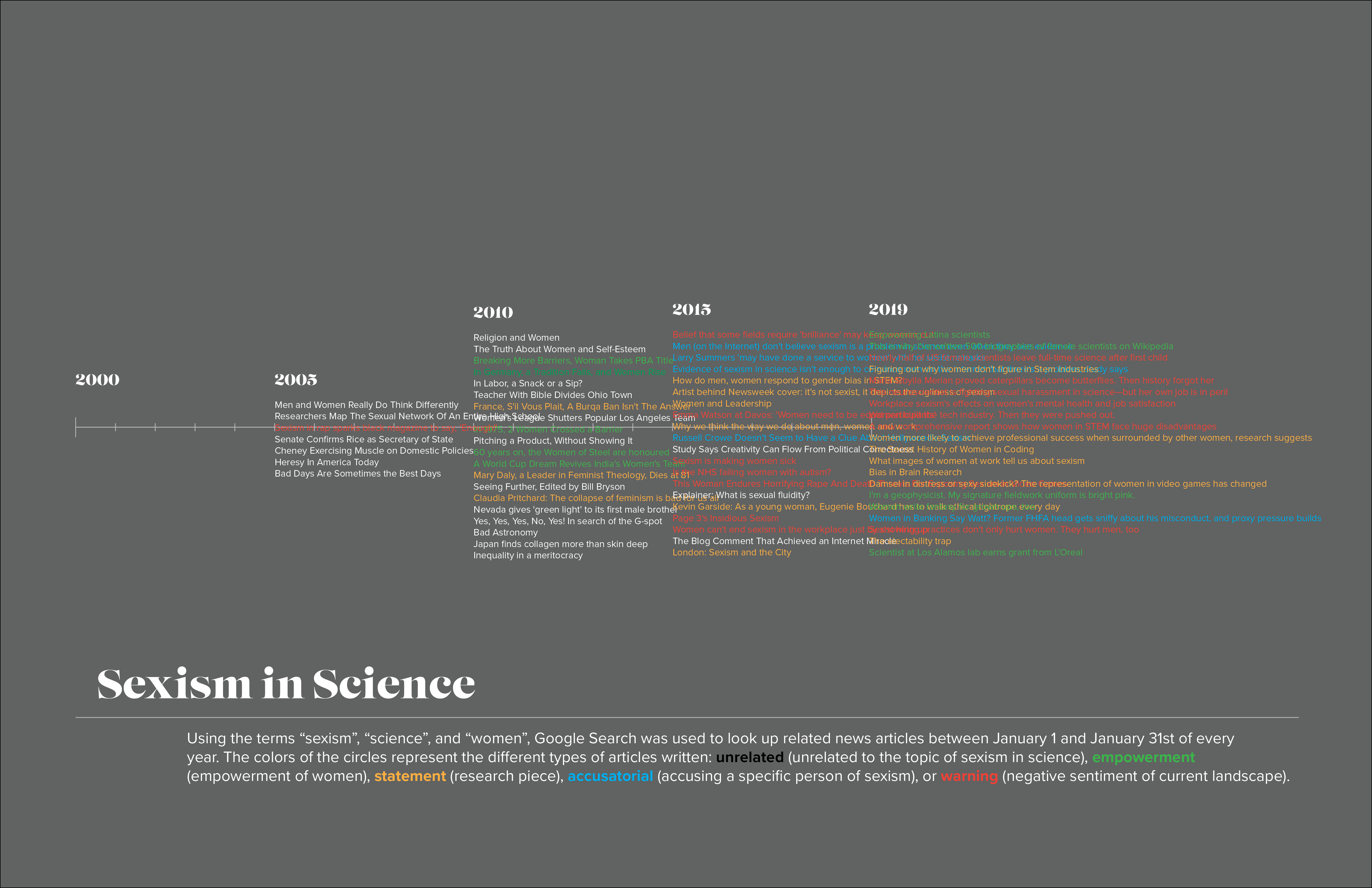
Visual 1
Visual 1. Sexism in Science, timeline version
Data
I searched the terms "science", "sexism", and "women" in Google News Search for in the month of January, every ~five years from 2000 to present day (ie. January 01 - January 31 2000, January 01 - January 31 2005, etc). Because I couldn't find a way to automatically obtain all of the article entry titles, I manually selected the first 20 titles that appeared in the search. I did find a Google News API that I plan on exploring to get all of the titles for each year, if possible.
Visualization
I categorized the titles into five categories, depending on the type of article it was: unrelated, if the article did not have to do with sexism of women in science; empowerment, if the article was written to empower or honor women; statement, if the article was asking a question, seeking to answer one, or was neutral; accusatorial, if the article accused a specific person or group of people of sexism; and warning, if the article projected a negative sentiment about the current state of society. They are color coded: white, green, yellow, aqua, and red, respectively.
The visualization is simple, where the article titles are listed in the corresponding spots on the timeline, and colored by their categorization. It is somewhat incomplete, because my dataset is incomplete.
Improvements
Ideally this would be an interactive visualization, in which you could scroll through each year's articles and click on the link to read them (I do have the links to the articles)--I don't think this would be a very good static visualization.
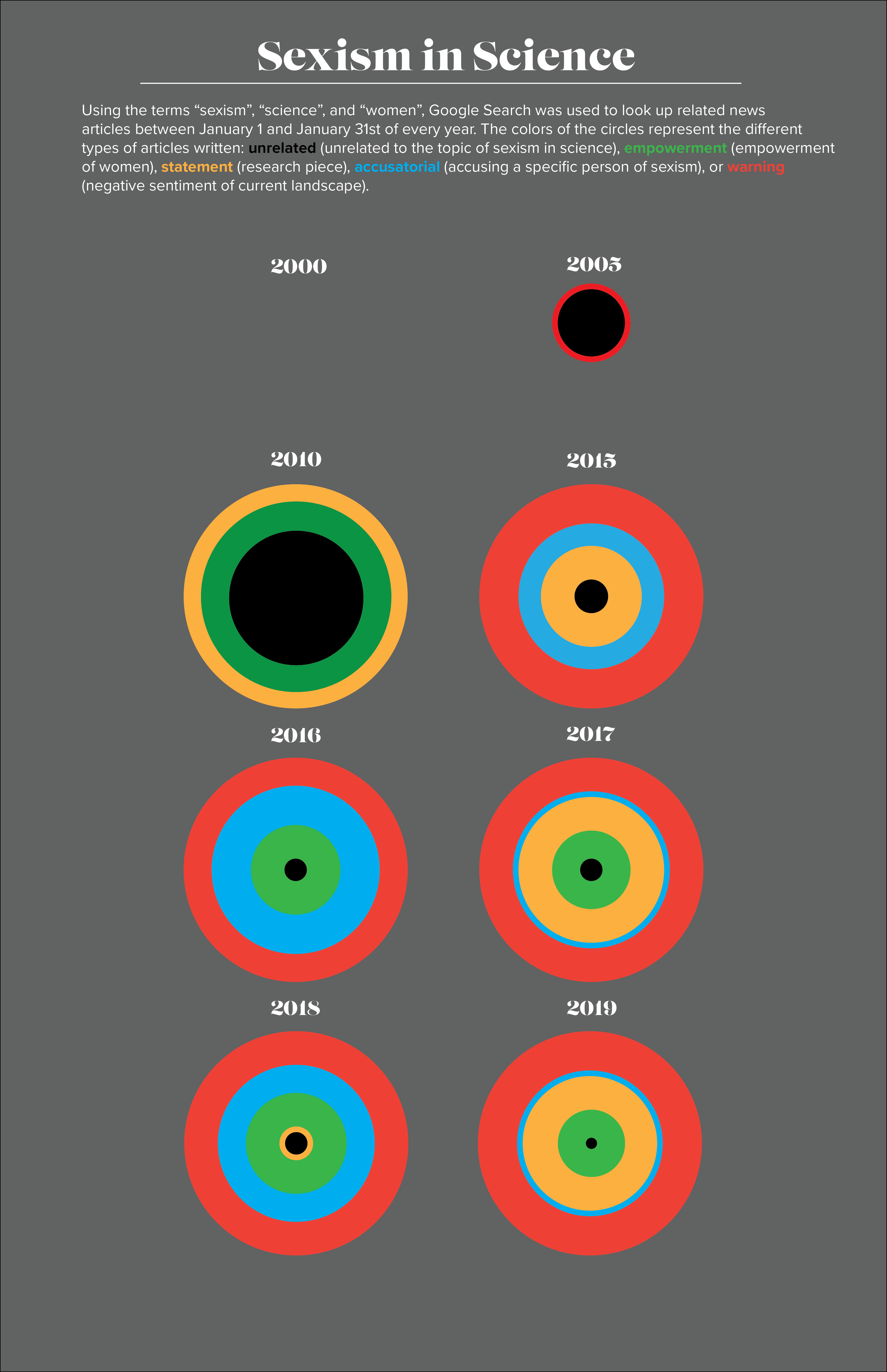
Visual 2
Visual 2. Sexism in Science, small multiples version
Data
The same data from the first visual is used for this.
Visualization
The same categorization from the first visual is used for this, except that the "unrelated" category is now black. I took a small multiples approach in which the article categories and numbers written each year (or rather, each January in each year) are visualized by the radii of the concentric circles. The total number of articles is visualized by the total radius of the concentric circles, although I may have to change this if the number of articles becomes larger.
Improvements
I would want to get the concentric circle representation of every year, not just eight. If I wanted to make this interactive, I would have links to the articles within the different categories pop up when the user hovers over each part of the concentric circles.
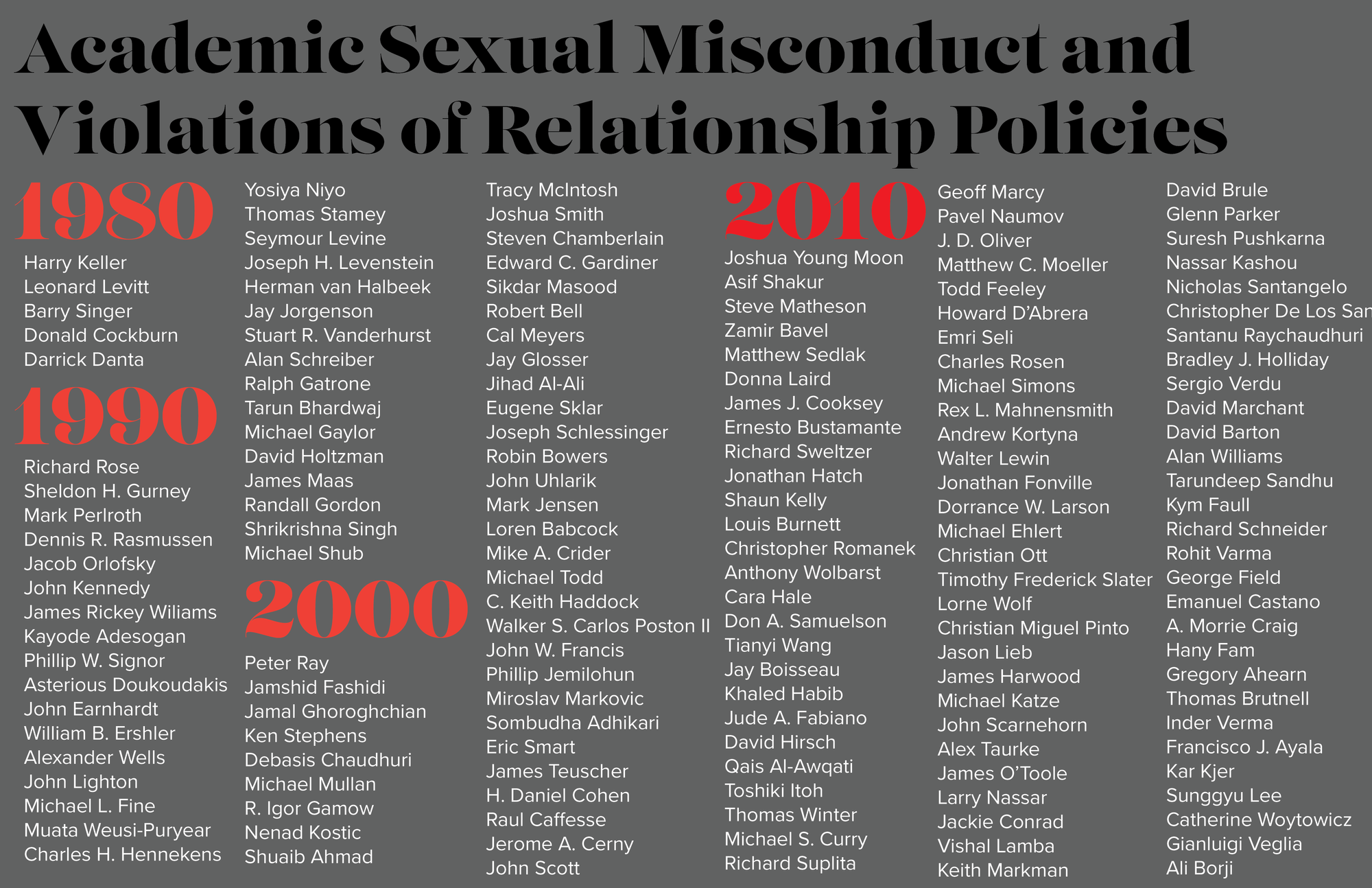
Visual 3
Visual 3. Academic Sexual Misconduct and Violation of Relationship Policies
Data
I found an amazing dataset by the Geocornition Research Laboratory that has recorded all of the public academic sexual misconduct violations of relationship policies that has occured recently (the earliest is 1917, then jumps to 1978 onwards). It lists the name, institution, position, discipline, details of outcome, and news articles related to the case, amongst other information. I extracted those from scientific disciplines for my visualization.
The purpose of this visualization is to get the names out there, as well as show the sheer number of men (and some women) who have been accused. I was trying to visualize it in a different way, but couldn't get all of the names to fit. Even in this style, I couldn't get all of the names from the 2010s to fit in the allotted space. It kind of ended up being just a list rather than a visualization.
Improvements
I think this one definitely needs to be interactive, because there is too much information that I want to show. In hindsight, maybe I should have clustered them into disciplines, but the names are the important information in this dataset. I didn't want to sacrifice the names for aesthetic purposes. An interactive timeline is intriguing, with pop ups for each year listing the information of the person indicted, summary of what happened, and links to the case.
Final Qualitative Visualization
Final. Sexism in Science: Public Awareness and Historical Cases
Data
For the final visualization, I decided to combine both of my datasets. I was leaning towards one of the other, but I spent so much time figuring out how to gather one set, and liked the other one so much, that I wanted to use both.
To increase my dataset of news article headlines related to science, sexism, and women, I played around with a number of APIs. First, I tried the Google News Search API, but it would only allow queries in the past up to one month. I also tried the Event Registry API, but I got stuck with the same problem, where it only allowed queries in the past up to twelve months. I was aiming to search for articles from 1980 up to the present, so this did not work for me. I considered using other news APIs such as the NYT API, but I didn't want my article dataset to be skewed towards a liberal/conservative bias. I ended up figuring out how to scrape news article titles from Google News Search, which worked very well. I then categorized the articles into the four categories stated above (empowerment, statement, accusation, warning), and manually deleted articles that did not relate at all to the topic (there was no room in the poster to put the unrelated articles in).
For my other dataset, I decided to include the disciplines and institutions of the academics indicted along with their names. I only included academics in STEM disciplines.
Visualization
For my final visualization, I decided to use a vertical timeline, the left side being a timeline of article headlines, and the right side being the timeline of academics indicted with sexual misconduct or violation of relationship policies. On the left, the four categories of articles are colored in different colors, while on the right, academics that worked/are working in the current top 50 US universities are highlighted in red. I wanted to show that even in colleges considered prestigious, problems of sexism and sexual harassment are rampant.
A comparison of these two timelines gives a glimpse into public awareness of the problems of sexism in science. Note that mainstream articles pertaining to sexism in science only start popping up in 2010, even though these problems have existed probably since the conception of science as a field. The publicly available dataset for academics indicted for sexual misconduct starts in 1981--much earlier than when media started picking up on it, but assume there are many more cases from the past that have never risen to the surface. As we reach modern years, the numbers of articles and indictments increase substantially, probably due to the social climate of support and acceptance of women in STEM fields, and the growing movement to fight sexism and sexual harassment in society in general.
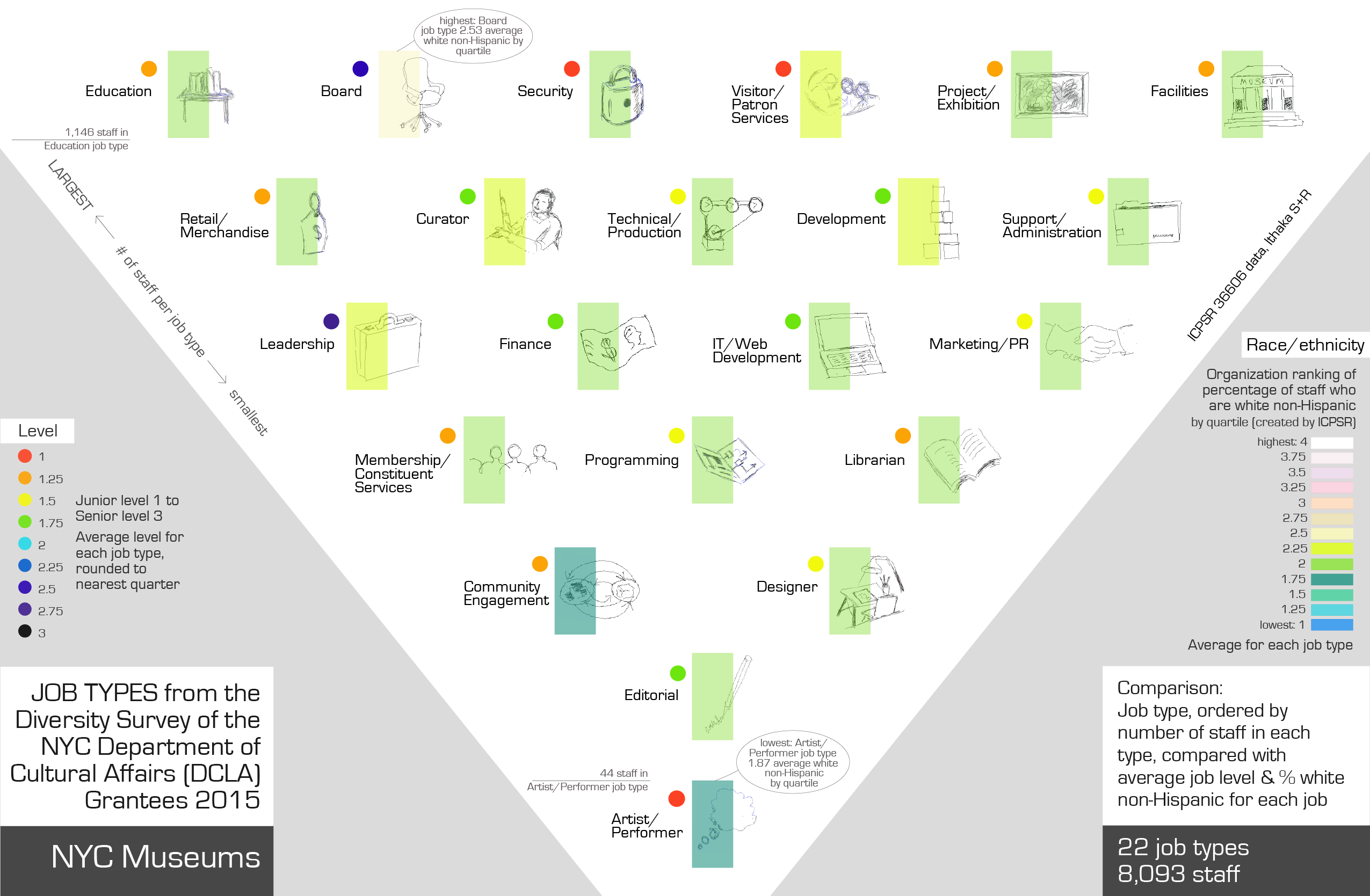
Topic NYC museums and staff diversity This data visualization explores the job types in NYC museums by number, who is in those jobs and what level these job types are (junior/mid/senior)
Data set Schonfeld, Roger, and Sweeney, Liam. Diversity Survey of the New York City Department of Cultural Affairs Grantees, 2015 - accessed from the National Archive of Data on Arts and Culture (NADAC) website https://www.icpsr.umich.edu/icpsrweb/NADAC/ downloaded here: https://www.icpsr.umich.edu/icpsrweb/NADAC/studies/36606 In 2015 Ithaka S+R surveyed the grantees of the New York City Department of Cultural Affairs (DCLA) and received demographic data on staff and board members, as well as questionnaire responses about initiatives and barriers to diversifying staff and boards. The invitation to participate in the survey was sent to the executive directors (or equivalent) of the 1,061 DCLA Capital Fund recipients for fiscal year 2016. Survey participation was a requirement for funding eligibility for fiscal year 2017. Representatives from the responding organization filled out spreadsheets on staff demographics. The spreadsheet results are compiled in the Demographics File that contains information on staff race, ethnicity, gender, disability status, and age. In addition, there are variables on staff members' roles in the organization such as employment status, job level, decade hired, job type, and discipline. The Demographics File contains 14 variables and cases on over 48,000 staff members. Selected from the survey data the museum respondents only.
Visualization Visualization shows the data for the 8,093 individual museum staff. There are 22 job types and I decided to order by number of staff in each job type. Used an upside down triangle to locate the job types in order - with most staff at the top and the job types with fewest staff at the bottom. This is individual staff data - interesting to see what the job types are, I wanted to explore correlations between job type and diversity and level of seniority. (Level is recorded here but not pay.) My aim for this qualitative project was to depict job type with some images, to give the piece a slightly handdrawn sense.
Cross correlate those jobs with diversity of staff in each job type using color rather than numbers to show data.
Second color system shows job 'level' - categorized in the dataset as 1,2,or 3: 3 is the most senior job position and 1 is the junior job position.
The original sketches / iterations used a wavy color line for the diversity quartile, and small icons downloaded from the noun project, grouped in a grid format. I started with the order of most staff per job type to least number of staff. I was inspired by the work of Georgia Lupi and her use of small annotations, use of color to denote categories, overlaying of information for one 'point' on top of each other, e.g. color underneath, drawing and text partly on top, and detailed, hand drawn visualizations. What I changed to get to the final result was moving from a grid to a triangle as the organizing shape, then turning that upside down to suggest largest at the top, changing color for diversity so that light is associated with job types that have the highest staff white non-Hispanic, hand drawing the icons and making them more consistent in style, adding the level data using color coding, changing the wave to an outline box and then to a bar half over the image, moved the group text around a lot, and significantly re-thought the heading wording, placement and look to explain the data visualization as accurately but succinctly as possible.
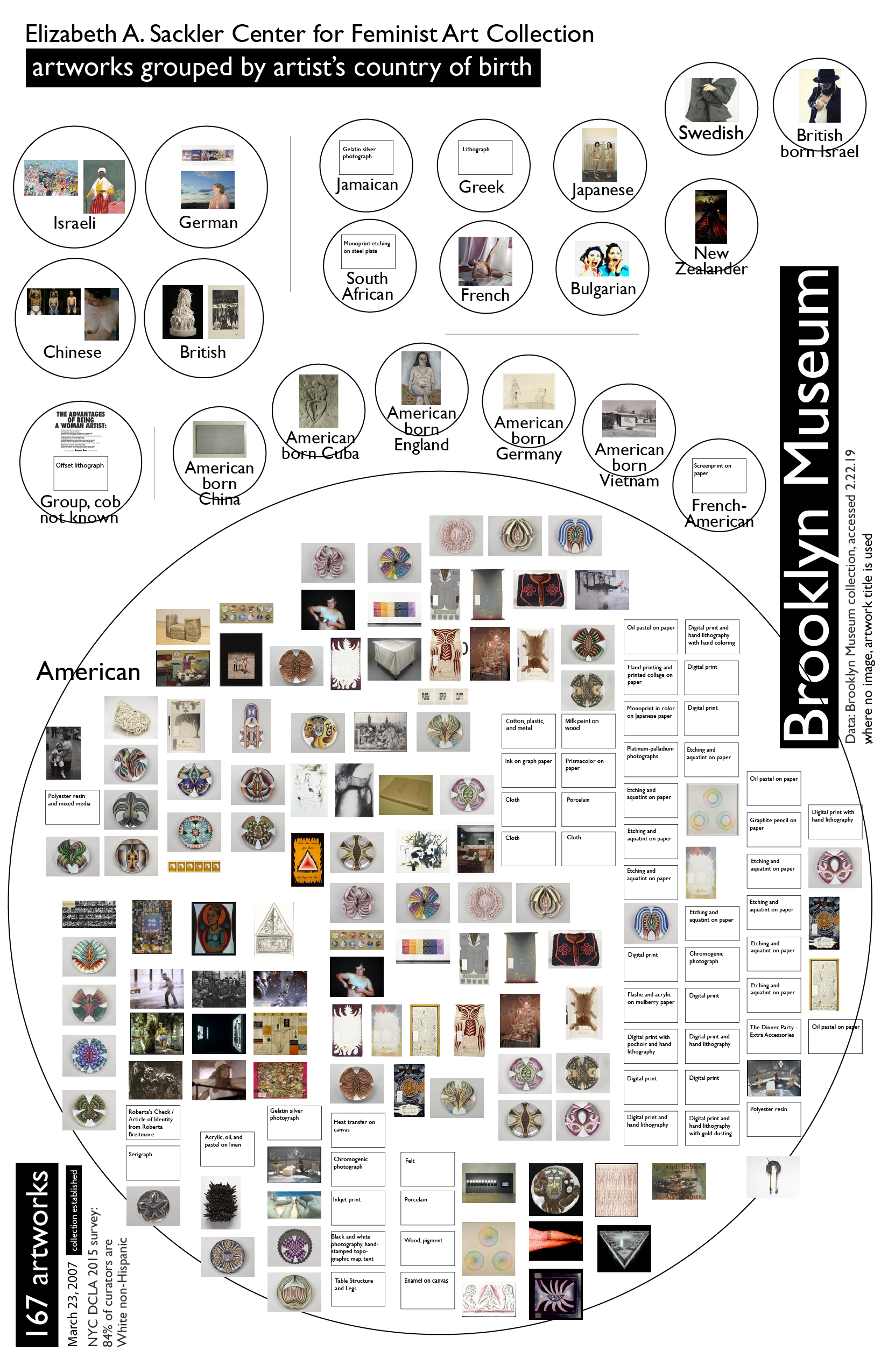
An aside - the other qualitative project I developed - less interesting data set but I liked the visualization - Brooklyn Museum data:
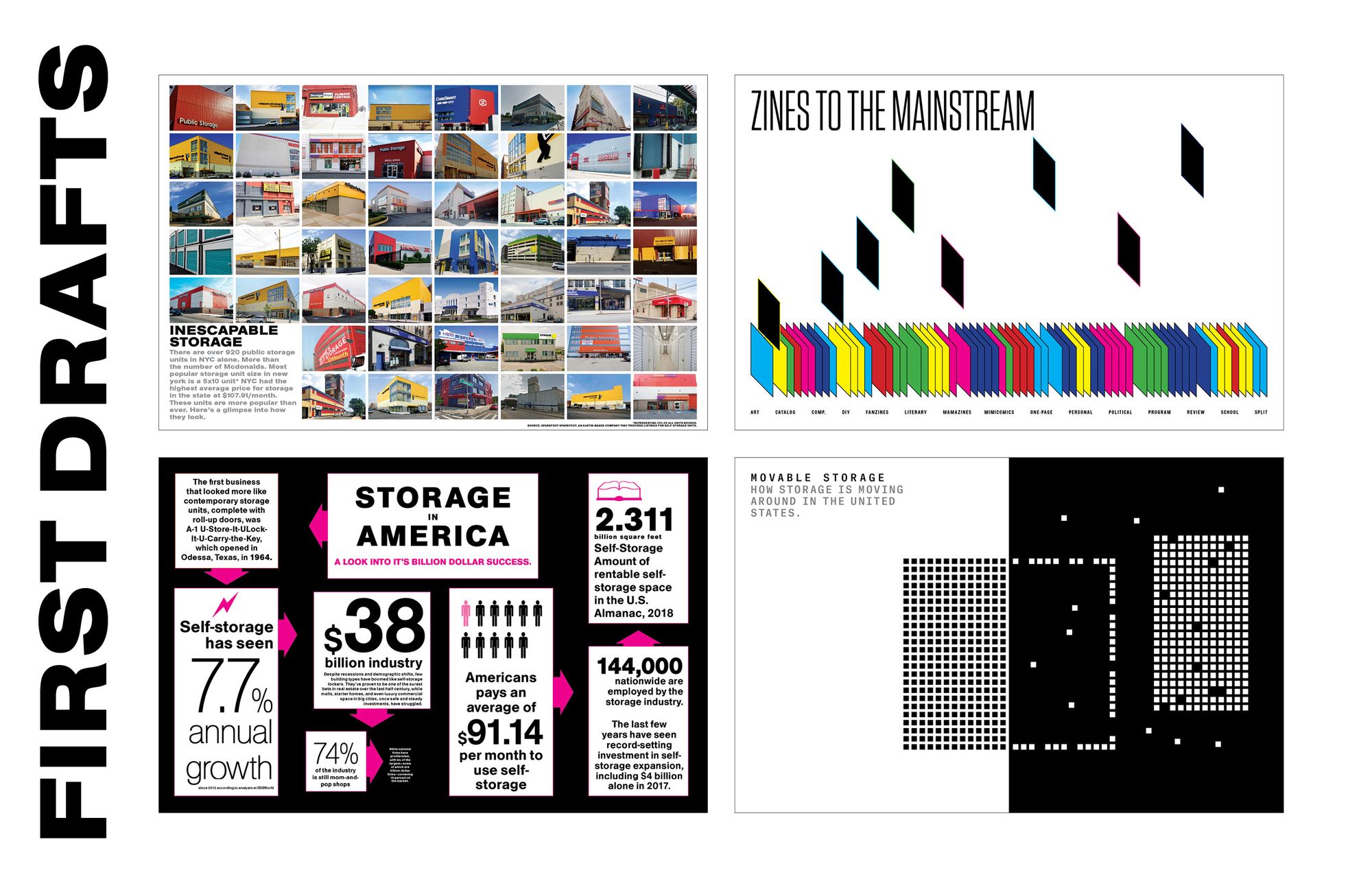
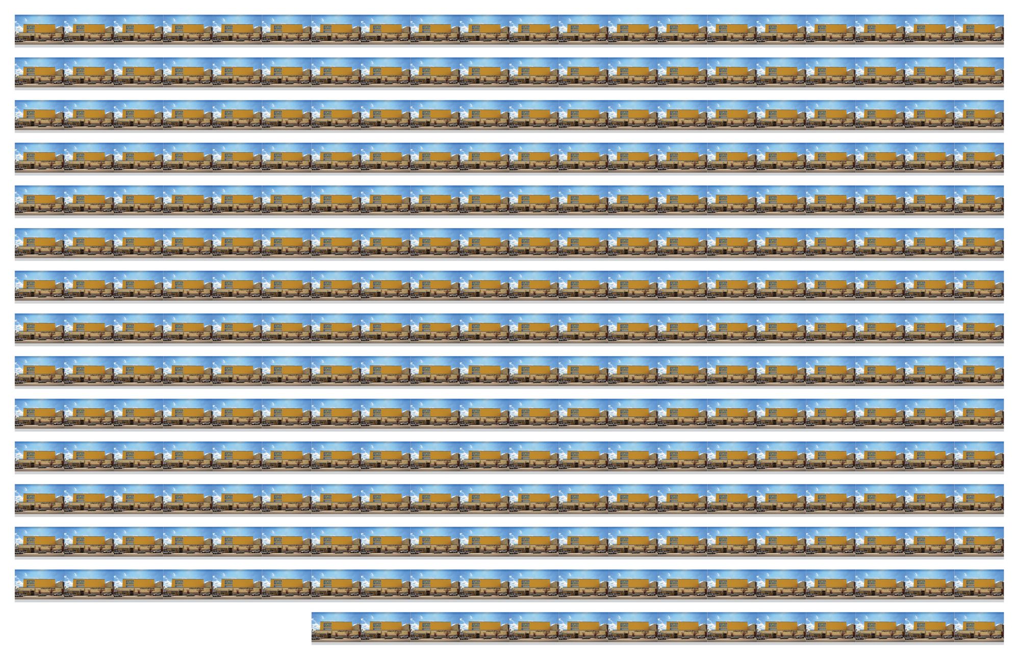
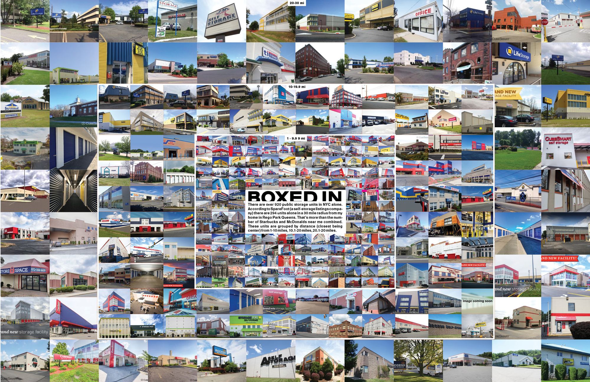
What is the topic? Self-storage Units What is the data set? Self-Storage units near me using google map and then SpareFoot (a self-storage listing site). What are the visual decisions you made? I considered at first listing them in distance order with room to put info below each unit similar to what i did before but with more info. I then decided to group them by distance coming from the center to emphasize the scale and create tension.
Here are my original iterations where I was explored some ideas in broad strokes (photos, timeline sequence, zines, movement of storage units)....
I received the most feedback on the top left, so I went back, this time using the self-storage listing site, SpareFoot, as my data source to locate self-storage units in a 30 mile radius from me. I wanted to emphasize the scale and the ubiquitous nature these units. Initially I wanted to do this sort of structure below...
