Qualitative Analysis
Topic
This book design explores the language used by the Home Owner Loan Corporation (HOLC) appraisers to rate the potential security of real estate investments within neighborhood tracts, connecting these judgements with snapshots of those same neighborhoods today.
As part of the mid-1930's New Deal suite of government programs aimed at providing stimulus to an American economy saddled with the Great Depression, president Franklin D. Roosevelt set his sights on boosting The United States' mortgage and home building market through his establishment of the HOLC. This organization aimed to spur real estate investment and facilitate homeownership by introducing and standardizing appraisal methods within this mortgage lending process. Part of this initiative included creating physical Security Maps of more than 200 cities across the United States, detailing neighborhood-by-neighborhood factors that would either favorably or detrimentally influence the perceived security of a real estate investment within that community. Each neighborhood was given a color-coded grade ranging from Green/A ("best") to Red/D ("hazardous").
This process, later coined 'redlining' after these maps littered with zones of perceived perpetual blight covered in red ink, determined who could feasibly participate in mortgage markets. Those enclosed in redlined neighborhoods would have a hard path to homeownership, finding it impossible to procure fair, non-predatory mortgages or insurance – from either the private market or the very government that issued these damning grades. People who lived in these neighborhoods were essentially "locked out of the greatest mass-based opportunity for wealth accumulation in American history" (Melvin L. Oliver and Thomas M. Shapiro in their 1995 book, Black Wealth/White Wealth, quoted by Ta-Nehisi Coates).
The motivations behind these ever-important neighborhood gradings were all too often blatantly motivated by race. In this project I wanted to explore the language used to document these redlining decisions, exploring the reasoning appraisers gave behind the grades they doled out while connecting this language with quick jaunts into the current-day versions of these communities.
Data
Mapping Inequality, a project of The Digital Scholarship Lab at the University of Richmond, underwent an extensive digitizing of HOLC Security Maps. The research team, led by Robert K. Nelson, managed to create interactive panes of these 1930's static maps, tracing each specific zone to its geographic boundaries. They also scanned the area descriptions used in the appraisal of these zones, transcribing these forms to digital text. For each city this team provides data downloads, offering original and 'georectified' images of the original maps, along with geoJSON and shapefiles of these maps by city.
For this project I used the geoJSON files for Brooklyn, the Bronx, and Manhattan – the New York metro-area city area regions that included digitized area descriptions data. These files included really helpful data for each zone within that region, including the zone ID, the zone grade, the list of lat-lon coordinates constituting the boundaries of that zone, and a dictionary containing all text from the zone's area description.
Text
I took the three of the free-form sections from the area descriptions for analysis in this project: Favorable Influences, Detrimental Influences, and Clarifying Remarks. I wanted to determine which words were frequently used across zones or were particularly telling of the appraiser's perspective in evaluating the zone and its residents. So I first complied a list of every word used across the three text fields in all zones within all three boroughs, counting how many time the words were used overall and for each grade. I then looked through the list of 1,713 unique words that were used at least once (or were misspelled in this unique way at least once) and picked out 145 of these words that I wanted to highlight.
Picking which words I wanted to highlight was a highly subjective and iterative process. I wanted to look at words were unique to higher or lower rated zones (had a comparatively higher usage rate in that zone that other zones), would tell a compelling narrative when emphasized within a zone description, or would allow the reader to compare its context across zones in a meaningful way. I also would run through visual samples of what these area descriptions would look like with a particular list to see which specific words didn't fit or looked like they were missing, adjust the list, then rinse and repeat. Ultimately I think the list I ended up with is representative to what I wanted to portray, but I'd be interested to see what a collaborative list of highlighted words would look like.
Images
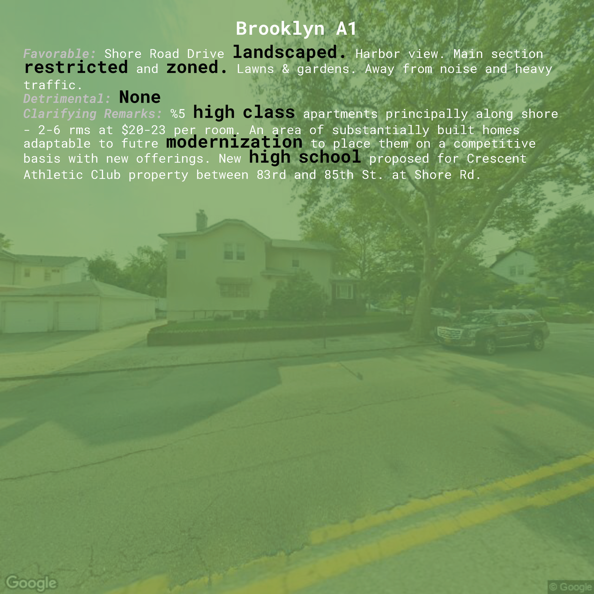
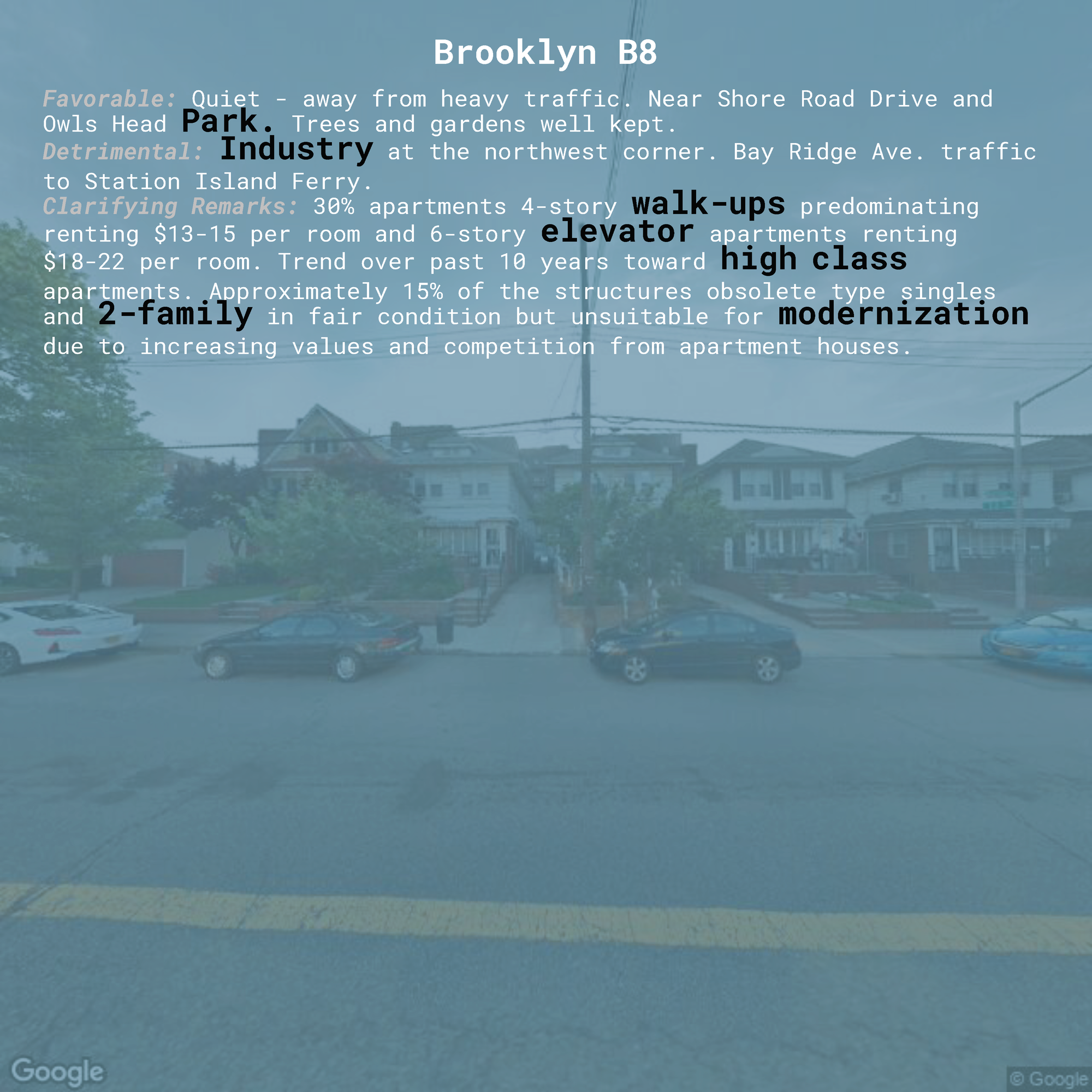
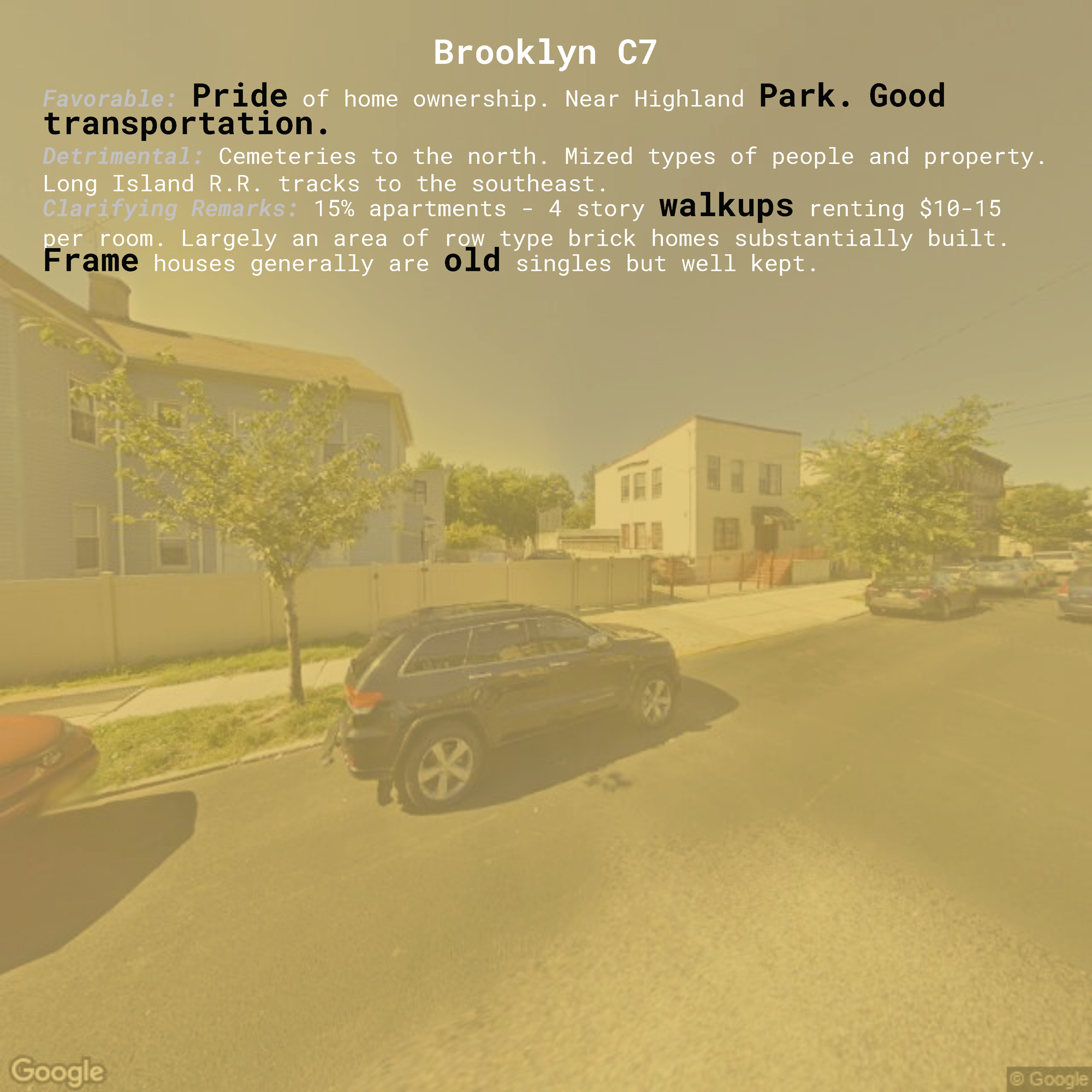
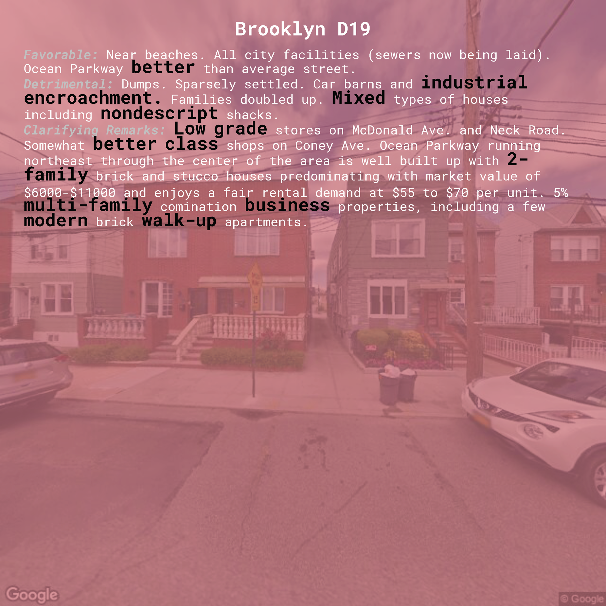
I also wanted to compile images for each zone, allowing the reader a small window into what the appraiser might have seen. Originally I thought it would be most relevant to look at these zones at the time the appraisal was made, allowing us a glimpse into what the might have actually seen – but I decided instead it would be more compelling to look at the current neighborhoods. I want my projects around this topic to portray the how the effects from this practice are still being felt and how it has left a generational hardship on its victims. To this end, I thought it would be more prudent to connect this past rhetoric with the zone's current landscape.
In order to pull images for each zone, I connected the list of lat-lon coordinates constituting the zone's border with the Google Street API. I averaged the lat and lon coordinates to get each zone's approximate center point. (While this approach would break down in trying to find the center point of a larger surface area given the complicated physics of geolocation and our circular globe, it should be sufficient for such small areas.) I then fed these coordinates into the API, saving a 2048 x 2048 image of each location that would serve as my 'representative' window into the current neighborhood.
Visualization
With each zone as a separate page in my book design, I wanted my reader to see both the image of the current neighborhood alongside the language used to either condemn or exalt that same neighborhood decades ago. I wanted to have the colors the original maps themselves and the inherent value associations in these colors act as a filter through which we interpret the image, obscuring and influencing our conception of the 'favorability' of that image in the same way as bigotry and discrimination clouded the judgement of the appraisers. Finally, I wanted the words I chose to highlight be visually distinguished from but still existing within the full text, drawing our attention to these key words and allowing us to read their use in context. These goals led me to the following page design, with examples for each zone:
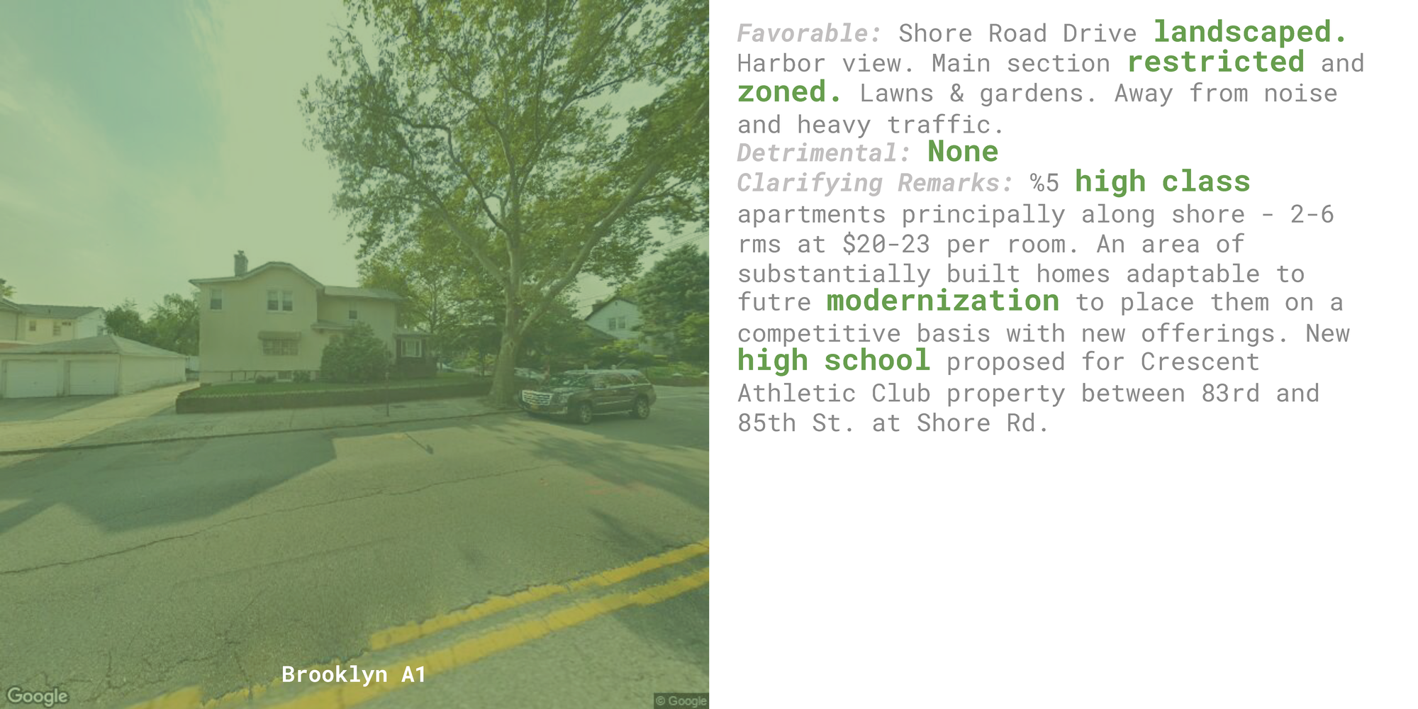
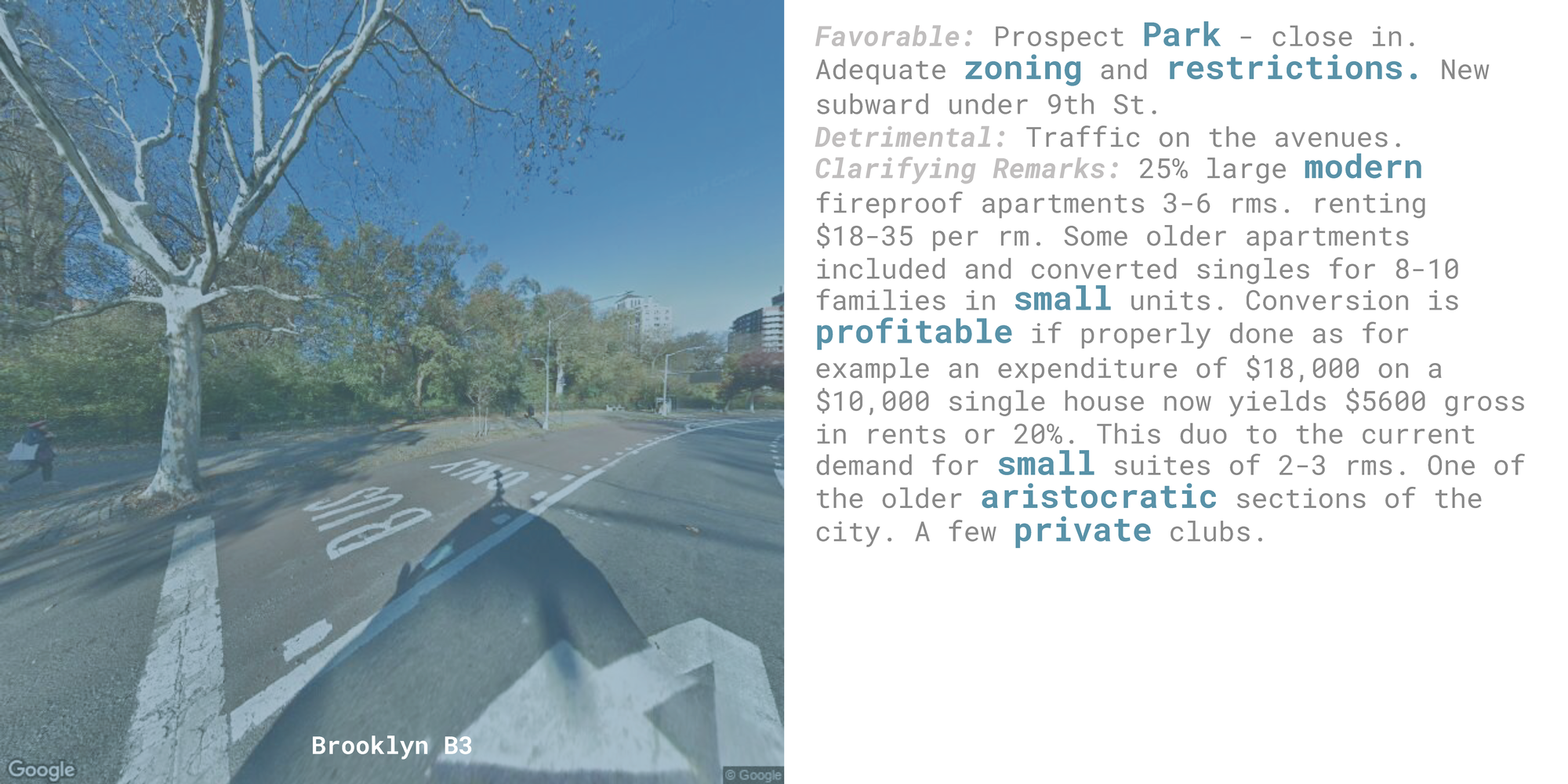
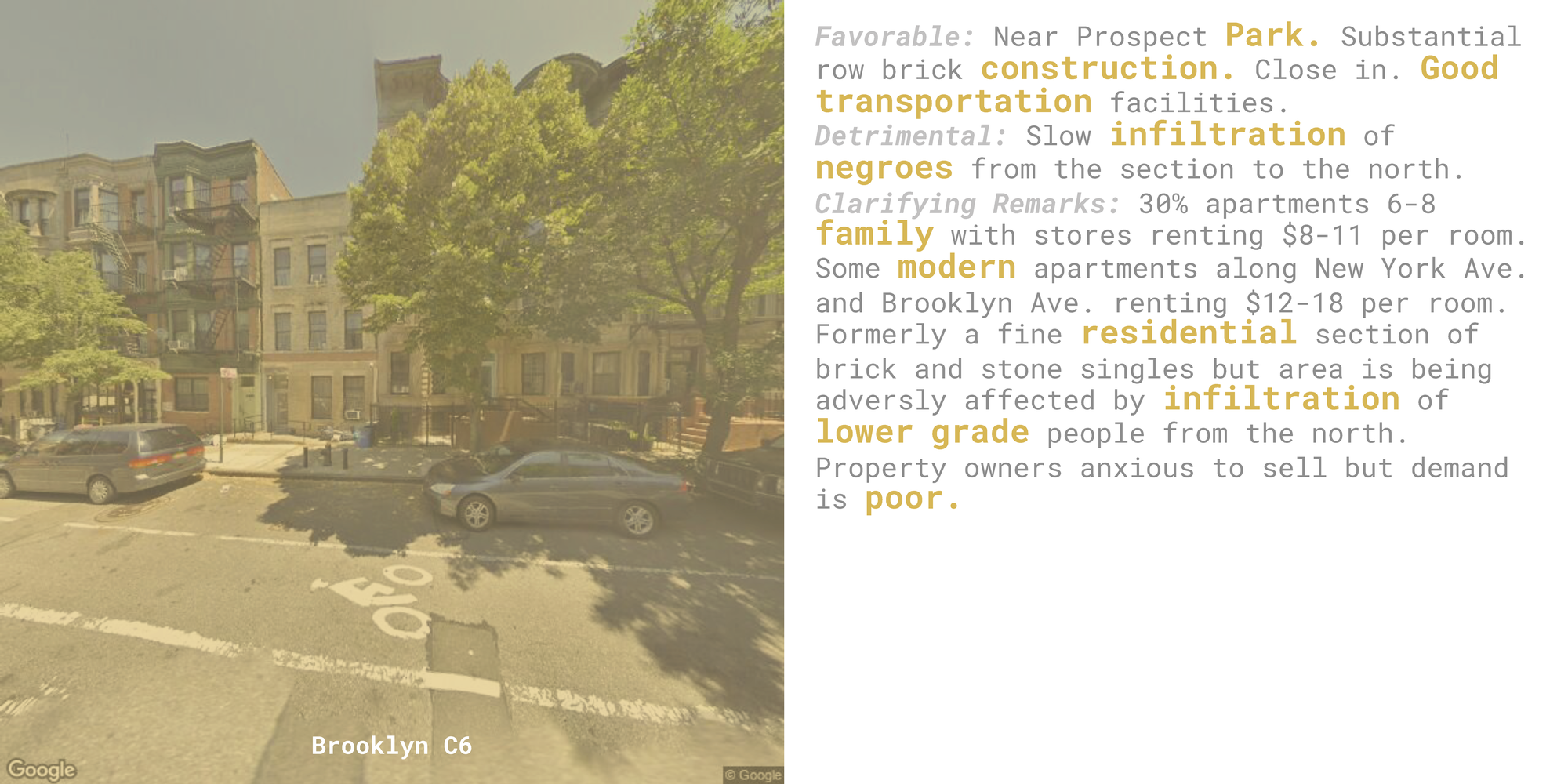
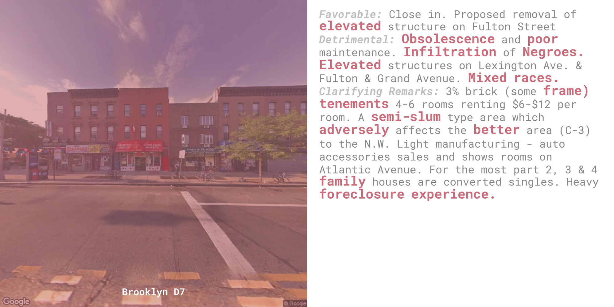
The consistent format allows for comparisons from page to page as readers see contradictory phrases using the same words (like pride of home ownership vs. lack of pride, and high class vs. low class). The color predominates our visual interpretation of each page, prompting strong value assumptions before we've had a chance to interpret the image or the text.
I chose to use a monospace font, specifically Roboto Mono, for its association with the things that are often interpreted as cold, rigidly structured, and inhuman (like the typewriter, technology, and code).
Another iteration of this design I considered overlaid the text on top of the image itself, having both occupying the same visual space:
This design required increasing the opacity of the image filter to provide better legibility of the text (which isn't altogether achieved) and prevented me from using the zone color to highlight each word. This would also require a layout with two zones next to each other on adjacent pages of an open book, and I preferred having each zone occupy a full two pages (the left and right sides of an open book), as this demands the reader's full attention and juxtaposes the images and the text on different sides of the page, which I thought was both symbolically significant and allowed for easier comparisons.
Tools
node / python / PlotDevice / Abode Illustrator