Reading 3

Responses: 9

The Anti-Sublime Ideal in New Media
by Lev Manovich

[Visualizations] carry the promise of rendering phenomena that are beyond the scale of human senses into something that is within our reach, something visible and tangible ... This promise makes data mapping into the exact opposite of the Romantic art concerned with the sublime. In contrast, data visualisation art is concerned with the anti-sublime. If Romantic artists thought of certain phenomena and effects as un-representable, as something which goes beyond the limits of human senses and reason, data visualisation artists target the exact opposite: to map such phenomena into a representation whose scale is comparable to the scales of human perception and cognition.

Read the essay (split here into four pages).

Use the tag “R3” when you post your assessment of the readings and the questions raised.

caitlyn ralph

While evidence of "graphical representation of quantitative data" dates back to the eighteenth century, it's hard to deny that the computer completely changed and, arguably, revolutionized those representations. Visualization practice lends itself, albeit in different forms, to every discipline—however, the sciences have held a stronghold on the field, producing pragmatic (and not necessarily aesthetically-pleasing) visualizations. The visualization, instead, was a tool for a practitioner in the field, like a doctor using a visualization of the human body for diagnosis. Until recently, the "cultural sphere" outside that was restricted to 2D charts and occasional 3D models, and not much more.

I appreciate how concrete these sections explain topics. I find definitional discussions in visualization literature refreshing because it adds more stable foundation to this rapidly expanding field. As for the answers to those large questions posed at the end of the first essay, my first reaction is that its the responsibility of the data visualization expert to make or advise which mappings are suited for each project. I agree that these questions are now as quintessential as older and more traditional ones, drastically shaping how a user consumes information.

Taking a step back and assessing representational art holistically, mapping with software can link old media to new media in completely new and not previously possible ways, creating a new form called meta-media. Meta-media preserves that nature of the old media while representing it as a new experience for the audience, simultaneously highlighting the software's important role in the mapping process.

As seen through provided examples by John Simon, Lisa Jevbratt, and Alex Galloway, data visualization mappings aim to take patternless and chaotic data and package it in a patterned and organized visual, ready to be understood and consumed. It maps from the concrete to the abstract back to the concrete.

I've read a lot of interesting literature about the role of the sublime in data visualization, and I am both equally startled and excited to see it discussed in the last part of this essay. From this previous literature, I hold the sublime as an important, concrete term to use when talking about data visualization's relationship with art. However, I argue against what the author writes, that data visualization is concerned only with the anti-sublime. I see sublime as a sliding scale, adjusted depending on what type of data visualization is being practiced. I think pragmatic data visualization deals with the anti-sublime, artistic data visualization deals with the sublime, and information visualization edges closer to the middle.

Isabel

Among other things, Lev Manovich discusses the role and purpose of data visualization, and data art. For him, the current challenge of data art is not the visualization of impersonal data into something meaningful and aesthetic (as this is already done), rather the challenge is how to data art can help creating a "personal subjective experience of a person living in a data society". I think this is a good point: many visualization tools allow for quick and good-looking visualizations. Maybe even because data visualization is more ubiquitous than it used to be, a work of data art should really appeal or connect to the viewer: make them think, reflect - have a subjective experience.

Suzanna Schmeelk

This is a very interesting read as it draws on many historical events, figures, and technologies to make points about data visualization.  Personally, I feel that anything which requires the eyes to read is a data visualization.  (In fact, one may argue if brail is in fact a data visualization.)  Traditionally, formulas and other scientific elements have been considered “true” data visualizations.  However, as discussed by Lev Manovich, the term data visualization has been gradually changing.  Perhaps someday we will even extend the notion of visualization past our own human senses.  What do we think?

Visualization and Mapping

Lev Manovich raises some interesting questions and points in this section.  Specifically, he questions the dimensionalities with which we live and use in data visualization.  He emphasizes that we traditionally work with upto 4D typically.  This section helped me recall our Parsons expedition to the United Nations in 2018.  At the UN we were introduced to new technology that involved a 3D video but included smells, sounds, and touch sensations through the form of vests and burning incense along with the 3D.  Adding the additional sensatory dimensions really changed the strictly 3D visualizations.  Do including the other sensatory dimensions affect the underlying visualization?  I think it did.

Media + Software = Meta-Media

In this discussion, Manovich states, “it is possible to think of all representational art as a kind of mapping: taking the wealth of an individual’s and/or a community’s experiences and reducing it to a single image, a narrative or another artistic structure.”  He references a “groundbreaking mapping project by Art+Com is a virtual opera set whose parameters are interactively controlled by actors during the opera.”  I feel that what he states is indeed a pattern.  I’m always fascinated in what we express as alien in media, art, and literature, always has some likeness to what we know life to be here on earth.  All expressions of the other are more similar to life than we realize.  In many instances, seeing something truly alien would not be appreciated or respected even by humans.   Would humans go to see two hours of dots moving across the page?  Are all expressions of the other simply a reduction to our own lives as we know them on earth?

Data Modernism

Manovich states in this section that, “Mapping one data set into another, or one media into another, is one of the most common operations in computer culture, and it is also common in new media art.”  He initiates the discussion referencing historical examples; and, then, discusses some of his favorite artists, for example, John Simon (New York).  Manovich states, “His work is unique for a number of reasons. First of all, he makes explicit connections in his pieces between the new ideas of new media and various traditions, movements and figures of modern art, in particular Mondrian, Klee, and Sol Levitt. … Simon’s explicit and systematic explorations of conceptual linkages between new media and modern art are very important. … [Simon] uses artificial life, cellular automata and other computational techniques to create complex and nuanced images which combine figurative and abstract and explicitly insert themselves within the history of modernist visual research.”

Meaningful Beauty: Data Mapping as Anti-sublime

Lev argues that “The more interesting and at the end maybe more important challenge is how to represent the personal subjective experience of a person living in a data society.”  He asks the question, of how to represent the huge volumes of data we experience in new ways.  Lev states, “rather than trying hard to pursue the anti-sublime ideal, data visualization artists should keep in mind that art has the unique license to portray human subjectivity.”  In effect, Lev is emphasizing the need to use new methods to represent data rather than simply relying on older traditional data libraries, which may not effectively unearth connections or emphasize dependencies on data.
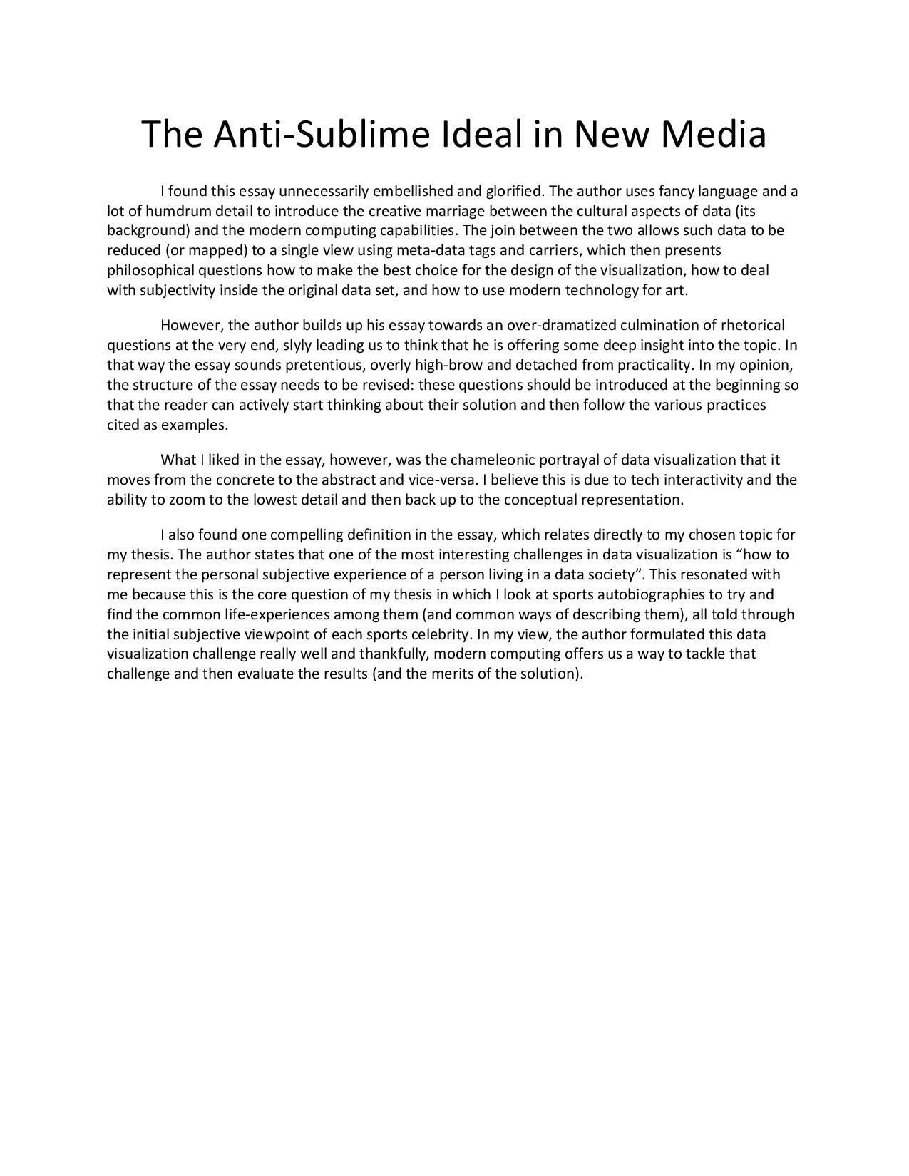
Grace Martinez

In Lev Manovich’s essay “The Anti-Sublime Ideal in New Media,” it speaks about the revolutionary role computer technology had on data visualization. It changed the way we look, collect, scale, and display data. Taking what were abstract concepts or big data sets, while drawing on and sometime re-inventing previous mediums of communication.

He compares the modern systematic  abstract art of Mondrian to data visualization in how it is “engaged in a similar reduction as it allows us to see patterns and structures behind the vast and seemingly random data sets. Thus it is possible to think of data visualisation as a new abstraction.” However, he then argues “but if modernist abstraction was in some sense anti-visual – reducing the diversity of familiar, everyday visual experience to highly minimal and redundant structures (again, Mondrian’s art provides a good example) – data visualisation often employs the opposite strategy: the same data set drives endless variations of images (think of various visualisation plug-ins available for music players such as iTunes.) Thus, data visualisation moves from the concrete to the abstract, and then again to the concrete. The quantitative data is reduced to its patterns and structures that are then exploded into many rich and concrete visual images.”

The aim of Data visualization has been to help people understand hard to comprehend concepts and ideas and data, but it’s important to remember that it is a human  interpretation of that data that is behind of all that. It is a human subjective experience and I think the more transparent we can be in our visualizatoins the more truthful and and honest our work will be. Personally, I think it’s important to remember the medium of which we chose to do portray our data visualizations. Which audience can access it? Who can understand it? Who are speaking to? How do the people/subjects we are speaking exist in the mediums we choose? What does it mean to scale very human data to symbols, shapes, and lines?

Clare Churchouse

In the Anti-Sublime Ideal in New Media, 2002, Lev Manovich describes what data mapping new media art and what some of it’s characteristics are, looks at some artists, and gives an overview of what he think may be missing and is yet to be done.
Manovich connects the concept of mapping with using a computer to transform quantified data (data which by itself is not visual) into a visual format - suggesting that visualization is “a particular subset of mapping in which a data set is mapped into an image.” By using software to “re-map old media objects into new structures,” we turn media into “meta-media.” The examples show new ways to “navigate, experience its structure, compress and expand our views of the object, and interactively control it,” but still contain the "granularity and the syntactical structure of the old media object." Thus he argues that the meta-media object has both the original media structure (language) and software tools for the user to generate descriptions of the structure and to change it (meta-language.)
He stresses the computer’s ability to simulate other media, noting that this simulation role is as revolutionary as it’s other roles. Software tools usually simulate and also allow new types of operations to transform media into meta-media. I like the connections that are made with 3 types of remixing - postmodernism, globalization, and culture and computers – and the notion that meta-media can therefore contain mixes put together in somewhat “erratic and unpredictable ways.”
He points out that we live in 4D space: data can include more dimension, thus quantified data representation involves political decisions about what to leave out. “Who has the power to decide what kind of mapping to use?”, what dimensions, what interface etc: new questions about data mapping relate to earlier cultural criticism around representation and omission, and run in parallel with the politics of media representation.
I am curious if section 3 examples might be widened out a little now to include other artists. (mis-spelling of Sol LeWitt’s name here.) The artworks he describes draw from art history, offer open source, interactive environments, giving “a new kind of image of the web and they are a new kind of image.” He creates a parallel between early c20th artists mapping urban chaos into simple geometries with c21st data visualization artists - though I am not so sure that new media work always shows clear patterns, I think that some reflects chaos/ incomprehensibility rather than reduction, but Manovich moves on to say that data visualization the same dataset often drives endless variations of images, “..reduced to its patterns and structures that are then exploded into many rich and concrete visual images.”
I like the point that new media can be seen as a representation of human activities rather than appearance. And I found his exploration of the (anti)sublime and of decision-making and motivation fascinating, and he discusses an architectural project (though why not an art project?) Here I noted that an artist can make choices from a personal or political standpoint - and also couldn’t it be said that one of the points of art is persuading the ‘rightness’ of your articulation? As in Duchamp’s 1912, Nude Descending a Staircase No.2. But Manovich makes the interesting idea of taking the arbitrary further and foregrounding it in work.
He ends with a call to make better data mapping new media projects. “Rather than trying hard to pursue the anti-sublime ideal, data visualisation artists should keep in mind that art has the unique license to portray human subjectivity – including its fundamental new dimension of being “immersed in data.”

Are there newer/other projects out there that represent the personal subjective experience of a person living in a data society?

Ryan Best

             I found this week’s reading to be quite tough – Manovich’s oblique, academic, and often philosophical language was at times quite hard for me to navigate. As someone who identifies more as a pragmatist than artist in his pursuit of data visualization, many of the examples and projects Manovich provided felt like intriguing sidetracks to my perspectives in my studies. While this perspective is undoubtedly valuable to these studies and my growth, as they serve to expand my notions of how software and data visualization contributes to the world of modern art, I’ll use one of the countless sports metaphors within American lexicon to say that this reading didn’t quite “hit home” for me.

             Still, I did find some useful considerations in the discussions Manovich introduces in this piece that stuck with me. First was his conversation about the dimensions that we have available to represent in when “a data set is mapped to an image,” which Manovich uses as his definition of data visualization. Manovich brings up interesting questions around the choices and trade-offs we make to represent data that often has more than four dimensions in a mapping limited to four dimensions, since human experience exists in a 4D space (X,Y,Z, and time). We must grapple with the questions Manovich raises every time we want to represent data in a visual space – deciding which mapping to use, what dimensions to include, and how to map those dimensions to a visual characteristic determine what message these visualizations communicate and how our audience perceives that message. It is in these choices where our visualizations can become successful or deceiving.

             I also found Manovich’s conversations around meta-media to be a useful exploration of software’s transforming effect on how we interact with media (although I found his definition of meta-media itself to lack clarity and be unnecessarily dense), specifically his explanation of software that preserve the core elements of an old media object while providing new ways to interact with and control that object. His example of Adobe Reader is particularly interesting in how it co-opts elements from interfaces of different media and applications to provide an intuitive navigable interface for that specific program.

             Finally, when Manovich speaks to how data visualization brings us the possibility to map phenomena that were previously un-representable into “a representation whose scale is comparable to the scales of human perception and cognition” that fit within a single browser frame, I think he really strikes a nerve. Having an endless menu of mappings and aesthetic levers to pull provides an immense feeling of freedom and possibility (while also at times inducing the anxiety that comes with staring at a blank canvas), but also makes those choices seem arbitrary.

“By allowing us to map anything into anything else … computer media simultaneously makes all these choices appear random – unless the artist uses special strategies to motivate his or her choices”.

This point reiterates a piece of feedback I remember from my 7 Numbers project – the posters I made that reflected aspects of the content itself in my representations of that content (like the votes organized in a senate seat floorplan) were more successful than my representations that were abstracted so much that they appeared purely random (like the 500 stocks organized in a grid given one of two shapes). Manovich sums up my feelings on this subject perfectly, as he represents my continued focus on grounding visualizations in representations that are reflective of the content itself, while not always knowing the best way to do that:

“Maybe in a ‘good’ work of data art the mapping used must somehow relate to the content and context of data – although I am not sure how this would work in general.”

             I’d also be interested to hear from Richard, Christian, and my fellow students what they interpreted as the definitions of some of the key terms Manovich used in this piece that went slightly over my head – specifically meta-media and sublime/anti-sublime.

Mio Akasako

Lev Manovich says this about data mapping as the "anti-sublime", the title term at the heart of his essay:

"If Romantic artists thought of certain phenomena and effects as un-representable, as something which goes beyond the limits of human senses and reason, data visualisation artists target the exact opposite: to map such phenomena into a representation whose scale is comparable to the scales of human perception and cognition."

I thought this was an incredibly poetic way of expressing the work of data visualization artists in the context of artistic intent. Data visualization strives to make sense of non-legible, often times large amounts of non-visual information into digestible visuals that somehow make sense to human perception. Yet, he makes another distinction between traditional represenational forms of data and data as art--he states that along with deference for the anti-sublime, perhaps a crucial role of data mapping is
to show us other realities embedded in our own, to show us the ever-present ambiguity in our perception and experience, to show us what we normally don't notice or don't pay attention to."

I found these closing remarks interesting. I always thought data visualization needed to have a concrete purpose, in conveying "actual" data to the observer; but then I realized it was necessary to define what "actual" data meant to me personally. Perhaps simple-mindedly, I classified the purpose of data visualization as a means to an end, and not the end itself--a visualization must "map some abstract and impersonal data into something meaningful and beautiful." so to say. It must lead to comprehension and some action as a result. I never thought of it as an art form (or at least I never thought I would pursue it as that), and that the visualization of the data itself could be the end.

Yet data mapping is being pursued by many artists, and the plethora of data to map is infinite. It was especially informative to have examples of artists and works listed. It reminded me of the Whitney Museum's exhibit, Programmed: Rules, Codes, and Choreographies in Art, which showcases artists who have used the medium of programming to explore conceptual art.