1. Mapping real-time news snippets
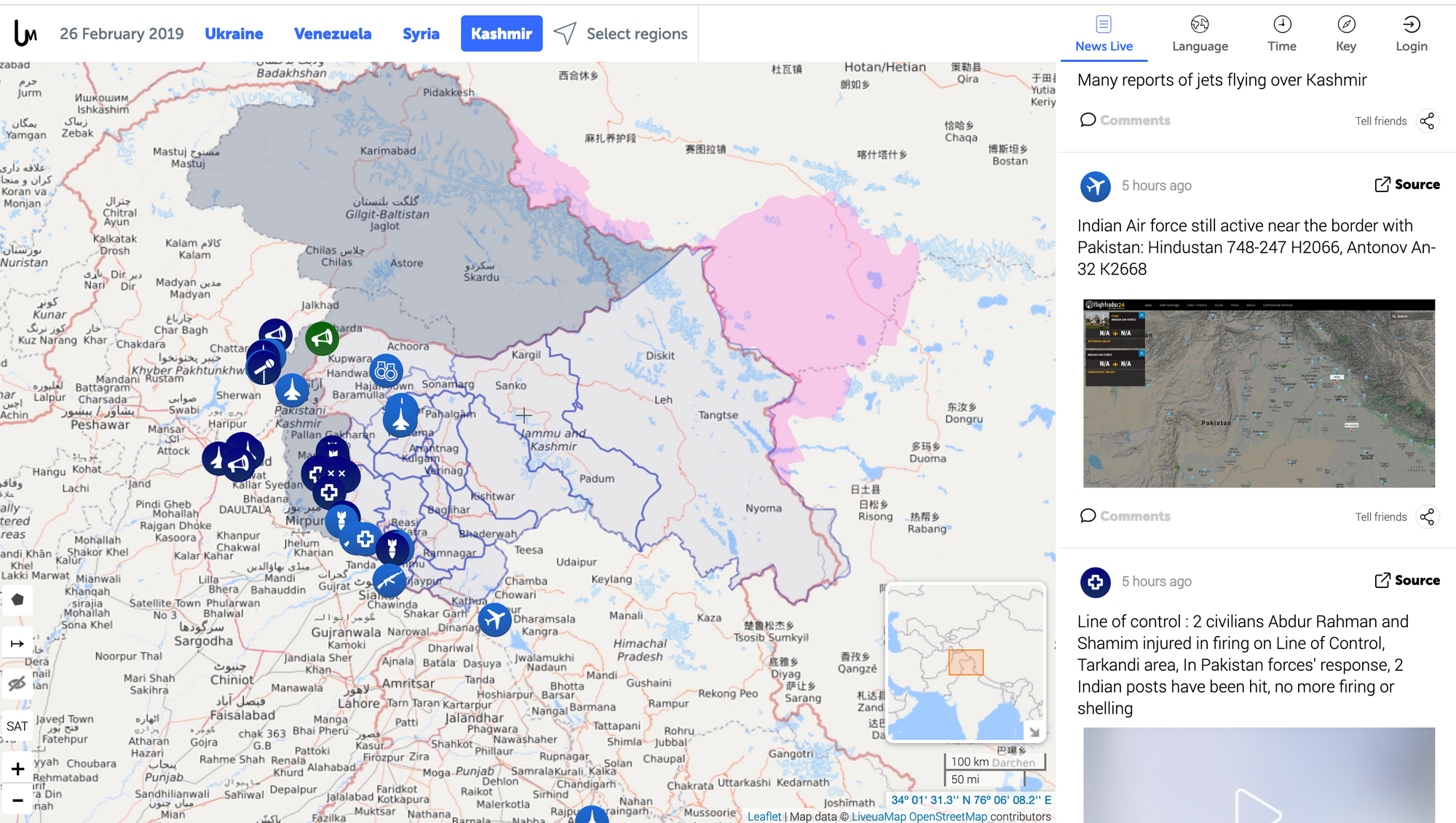
News headlines, classified and located in a specific crisis zone. The data is quantitative in so far that it must use latitude-longitude, and times. The news content itself is qualitative.
More info: see the Live Universal Awareness Map project.
2. How people come and go
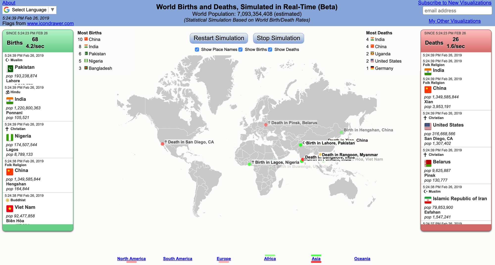
It is like watching a movie - with a good ending: births outnumber deaths. Appreciate the "dumb" simplicity of the data visual, the information is immediately clear. Each data point must mean a lot to the related individuals - somewhere in the world - whereas in this graphic, it's a simple dot.