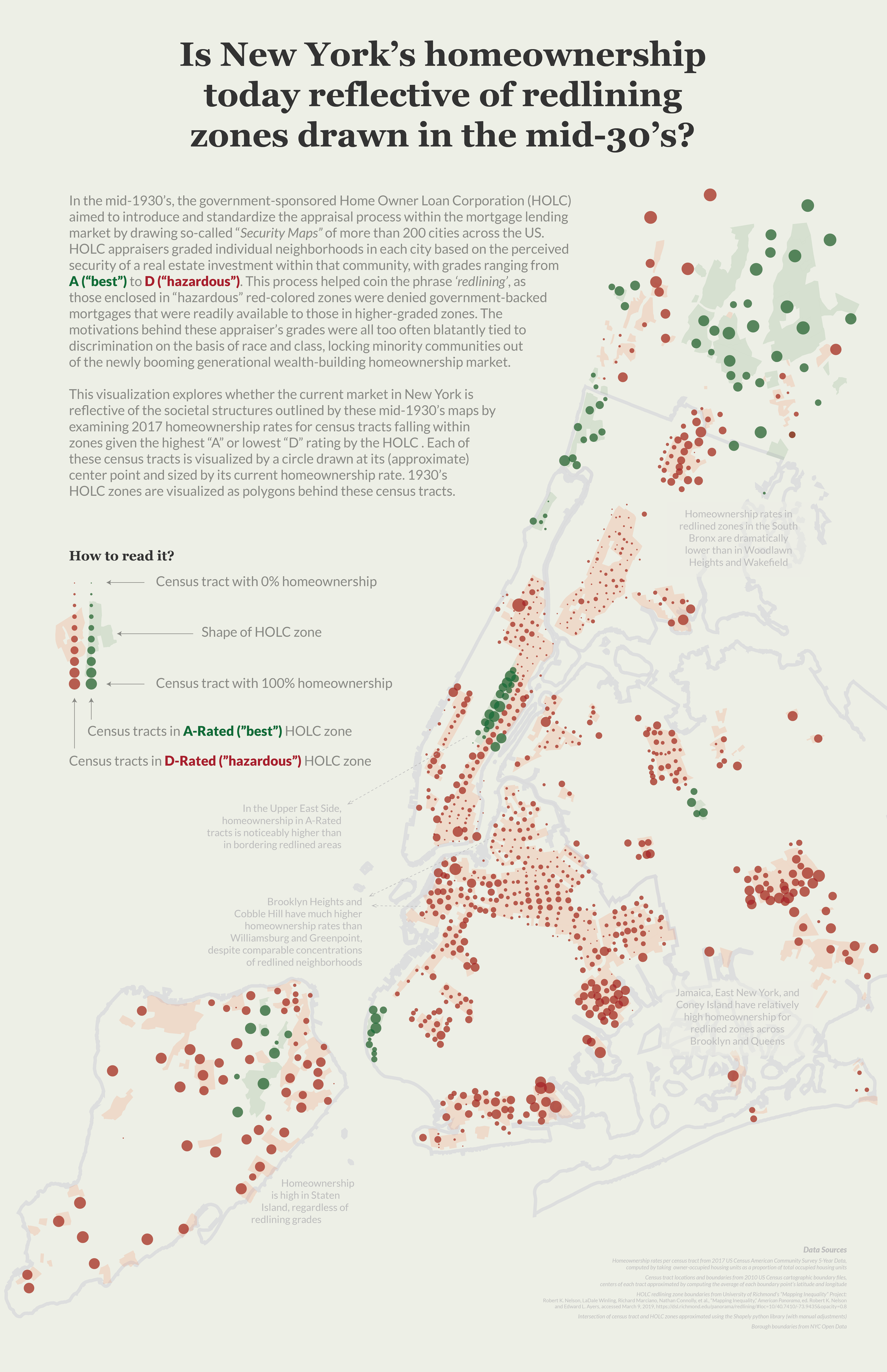
This visualization examines where the current homeownership landscape in New York City reflects the societal structures dictated in mid-1930's redlining maps, which served to exclude minority and low-class neighborhoods from the burgeoning mortgage market in the New Deal era United States.
Data
The data for this project came from a few different sources, as I was able to build on the data I used for my qualitative project and add a quantitative lens to these redlining maps. Like the qualitative project, the boundaries of each redlined zone came from the Mapping Inequality project. I then pulled geographic boundaries for all census tracts in New York State from the US Census's 2010 cartographic boundary files, filtering this list to tracts within the five boroughs and Westchester county, and the Data Profiles section of the 2017 US Census American Community Survey (ACS) 5-Year Data API to calculate the current ratio of occupied housing units in each tract that are owner-occupied (which I would use as my "homeownership percentage" estimate). Using the Shapely python library, I determined whether each census tract intersected with an HOLC zone, along with the grade of the HOLC zone(s) they intersected with. For this specific project I only maintained census tracts that intersected with an A-Rated or D-Rated zone, mapping each census tract with a circle located at the approximate center point of that tract (estimated by taking the average of the latitude and longitude of all points within the that tract's boundaries). There were a handful of tracts that intersected with multiple HOLC zones present on this map, and in those instances I maintained only one of these associations. The process for picking which grade to assign each of these census tracts was rather subjective – looking at the map I made a judgement call on which HOLC zone the tract was closest to, and associated that tract with only the grading for the zone I determined looked closest.
Visualization
I decided to push forward the considerations of this poster from last class, which explored homeownership's relationship with these redlining grades with a heat map small multiples approach:
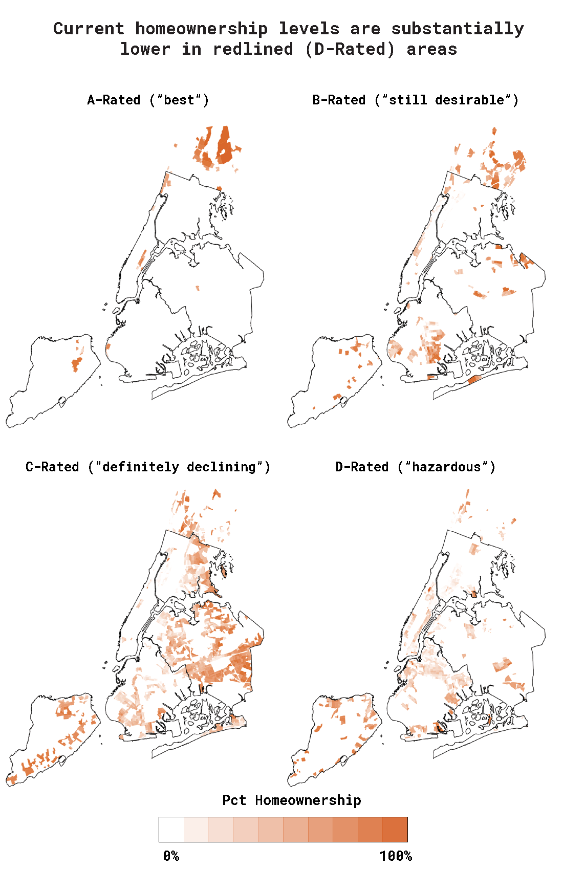
While approaching how to iterate and improve on this visualization, I kept a few pieces of feedback I received in critiques last class in the forefront of my thinking – specifically that using the heat maps in a small multiple form didn't allow for quick comparisons between grades, and that an interesting narrative angle to this data might be not only exploring whether A-rated zones are different than D-rated zones, but where D-rated zones differ from one another. To incorporate this feedback with somewhat limited space on the poster, I decided to scrap the small multiples approach in favor of one map that covered as much of the poster as it could. This gave this map more room to breathe on the poster and pushed me to visually represent different zone gradings in a now shared space. My goal with the approach to share this space for all tracts, I wanted to facilitate easier comparisons from area to area, both across different grades and within the same grade. I decided to only keep A-rated and D-rated zones (losing B-rated and C-rated), since I didn't want to clutter a constrained visual area and pursue a narrative of comparing the highest and lowest echelons of this rating system.
I also ended up scrapping the heat map approach in favor of using shapes to represent each tract. I had two main reasons for this decision: first, it seemed to be more successful in visually highlighting differences in homeownership rates across zones and clusters/pockets of tracts. Second, it established a connecting between an abstraction of census tracts and the map itself, which might provide me a bridge to represent these tracts or zones in a more purely graphical non-GIS approach without losing the association with this map – the two could work in conjunction and now share a visual language.
I also wanted to add a visual legend to explain my visualization approach, which definitely would not be able to function alone without this explainer. I also added annotations to highlight specific pockets of this data that I found interesting or compelling and might merit further exploration. My goal was to include this text so it didn't detract from the power of the visuals themselves – they'd be muted enough to not distract while present enough to be noticed. I made sure they were smaller and blended in with the map and the background a bit to establish them as a clear third in the text hierarchy (behind my intro paragraph and visual legend). These annotation should exist as a pay-off for the dedicated reader to read during their detailed exploration of this visual, which has a lot of data points and narrative packed into these 187 square inches.
The coloring and format behind the visual language I used in this piece (especially the "How To Read It?" label) was inspired by Giorgia Lupi and Accurat, especially The Empire Strikes Back
Next Steps
There are a few directions I'm exited to explore that would help me improve on this visualization and the strength of its narrative. First, I didn't incorporate any longitudinal data into the story yet. That was other feedback I was very interested in pursuing after last class, but didn't find a great way to fit it in here. I also pulled related homeownership data from the 1990, 2000, and 2010 decennial censuses but have a good deal of work left to do before this data would be usable or would tell an interesting story. This includes making sure I find the right census tract boundaries for those years and seeing how far back I can find relevant data, since this story would be strongest if I could show how homeownership (or other relevant statistics) have change since the maps were drawn in the 1930's, instead of having nothing to explain what happened during the 80+ years of history between then and now. I'm also interested in exploring what that 'abstracted' non-GIS visual would be that would pair well with this approach and allow for easier comparisons across zones, areas, or tracts. Finally, I was excited by the concept of pushing the concept of a data-driven book after the qualitative project, and I don't want to lose focus on that approach. I'll also need to really think through how this visual (or the next iteration(s) of this visual) would pair with the approach I had in the qualitative project – would full-page maps operate as their own chapters in a book that look at zone-by-zone language and images? What would a zone-specific visual look like in the page of a book?
Tools
Adobe Illustrator / d3 / Python / Shapely / Pandas
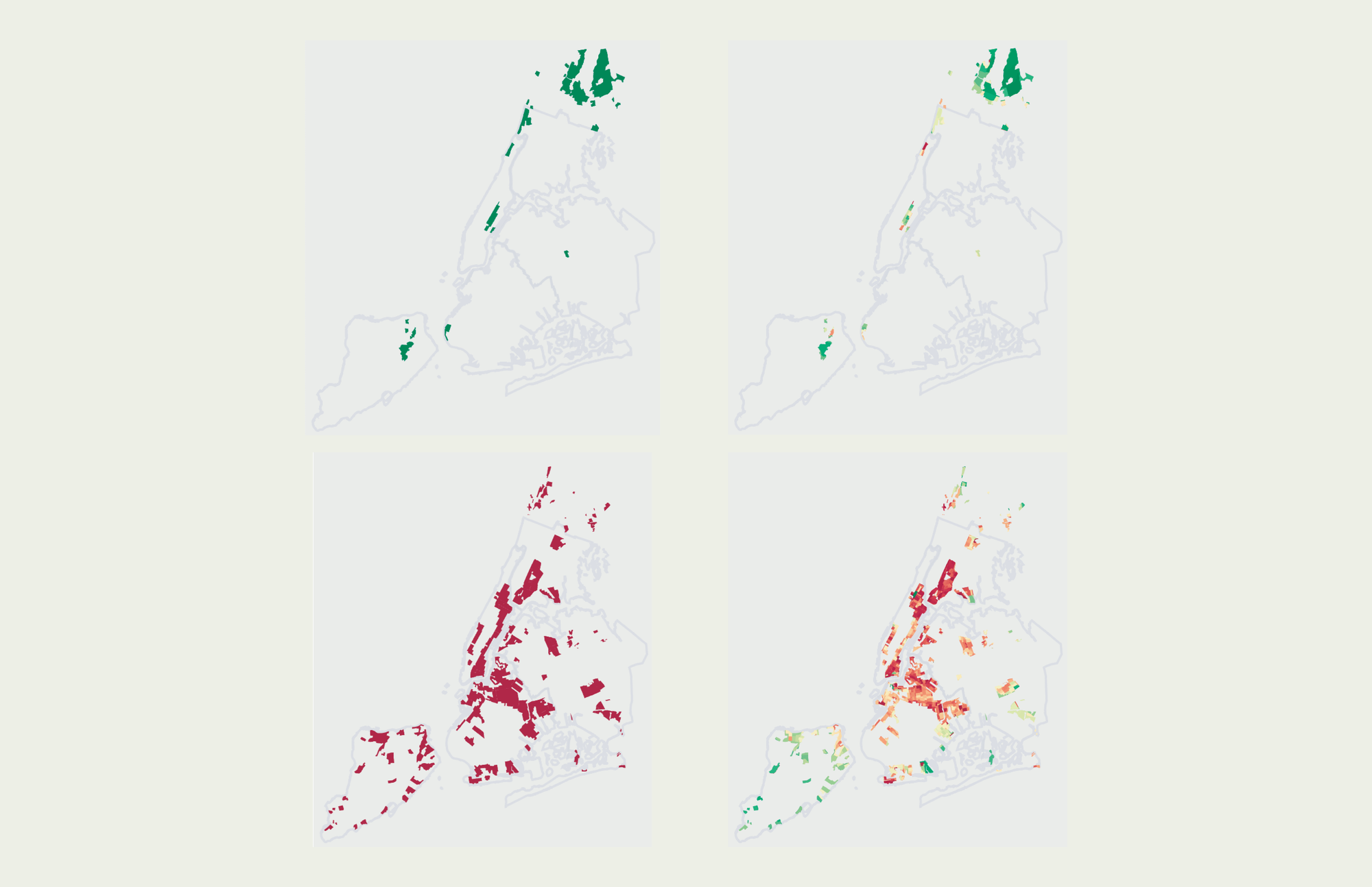
Earlier Iterations
Early iterations and approaches to this project focused on pushing the small multiples heat map approach, playing with colors and layouts that could provide more effective comparisons in a visually compelling way (although no such approach succeeded quite as well as the final design):