Qualitative Visualizations: Drafts
Subject + Topic + Question
For my three qualitative visualizations, I decided to focus broadly on these questions within the union of my two subjects of interest, neuro(science) and sexual violence/harassment:
How have women in science been treated throughout history? How has sexual harassment and sexism played a role in the advancement (or lack thereof) of women in science?
Visual 1
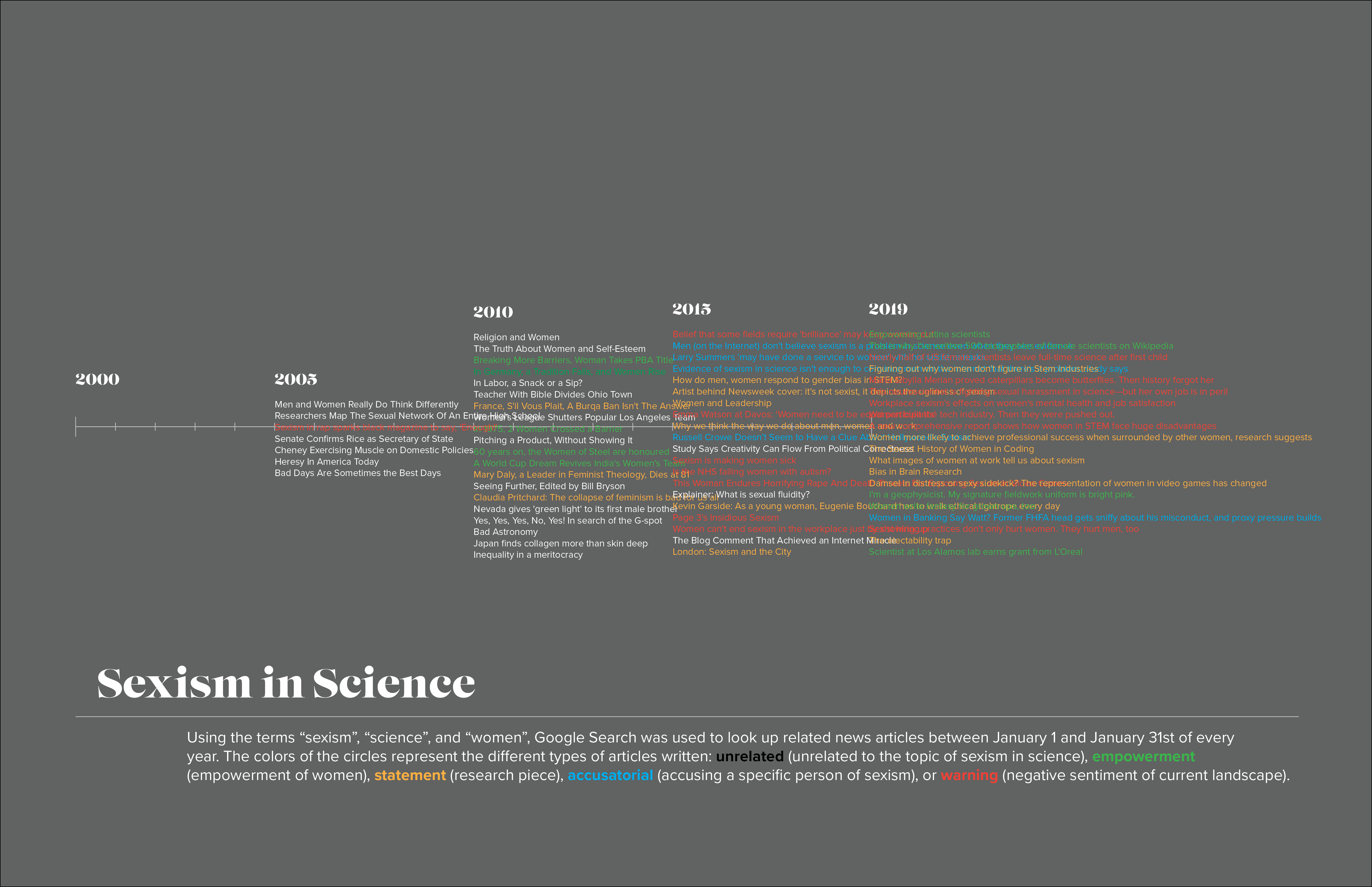
Data
I searched the terms "science", "sexism", and "women" in Google News Search for in the month of January, every ~five years from 2000 to present day (ie. January 01 - January 31 2000, January 01 - January 31 2005, etc). Because I couldn't find a way to automatically obtain all of the article entry titles, I manually selected the first 20 titles that appeared in the search. I did find a Google News API that I plan on exploring to get all of the titles for each year, if possible.
Visualization
I categorized the titles into five categories, depending on the type of article it was: unrelated, if the article did not have to do with sexism of women in science; empowerment, if the article was written to empower or honor women; statement, if the article was asking a question, seeking to answer one, or was neutral; accusatorial, if the article accused a specific person or group of people of sexism; and warning, if the article projected a negative sentiment about the current state of society. They are color coded: white, green, yellow, aqua, and red, respectively.
The visualization is simple, where the article titles are listed in the corresponding spots on the timeline, and colored by their categorization. It is somewhat incomplete, because my dataset is incomplete.
Improvements
Ideally this would be an interactive visualization, in which you could scroll through each year's articles and click on the link to read them (I do have the links to the articles)--I don't think this would be a very good static visualization.
Visual 2
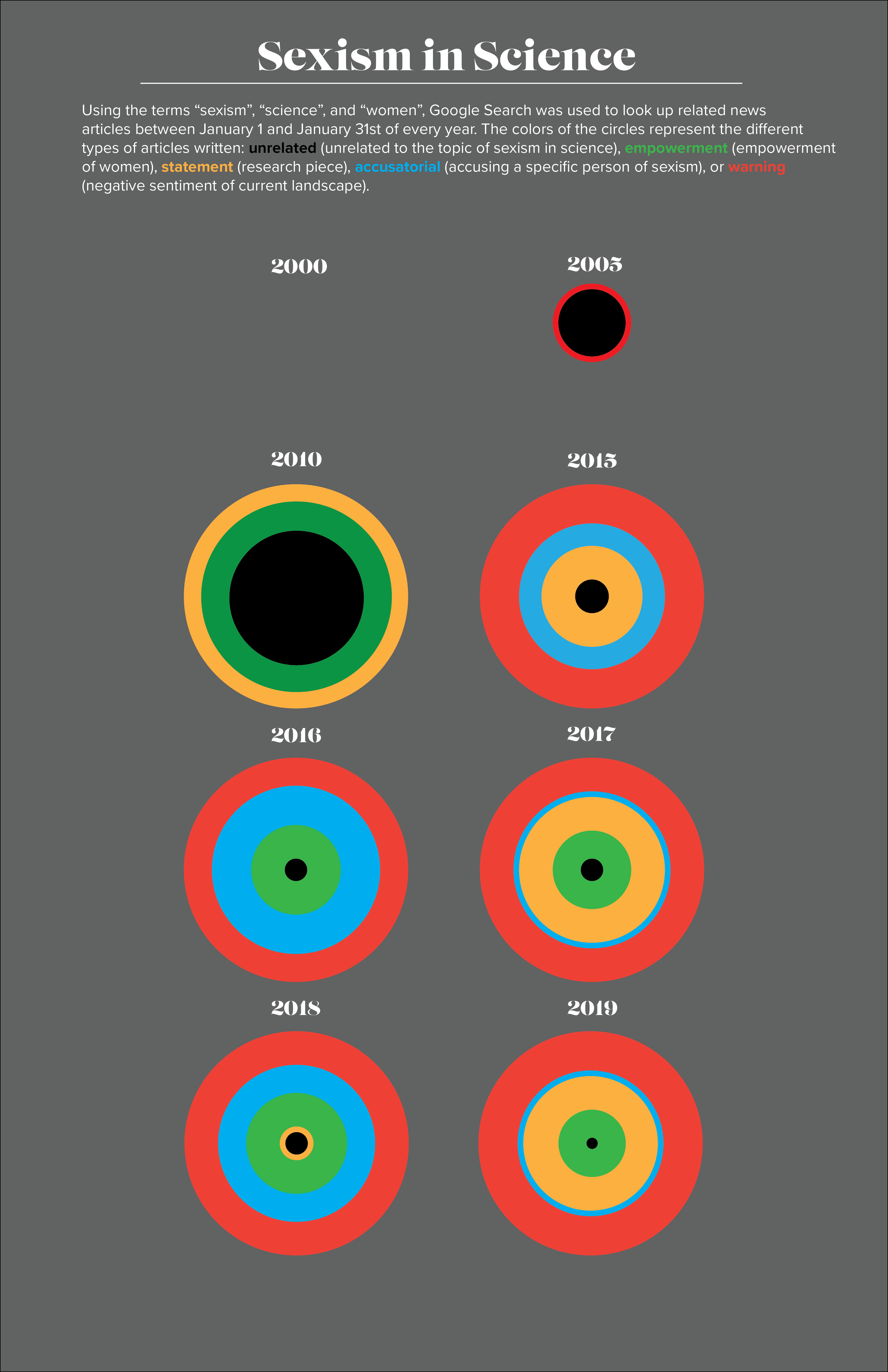
Data
The same data from the first visual is used for this.
Visualization
The same categorization from the first visual is used for this, except that the "unrelated" category is now black. I took a small multiples approach in which the article categories and numbers written each year (or rather, each January in each year) are visualized by the radii of the concentric circles. The total number of articles is visualized by the total radius of the concentric circles, although I may have to change this if the number of articles becomes larger.
Improvements
I would want to get the concentric circle representation of every year, not just eight. If I wanted to make this interactive, I would have links to the articles within the different categories pop up when the user hovers over each part of the concentric circles.
Visual 3
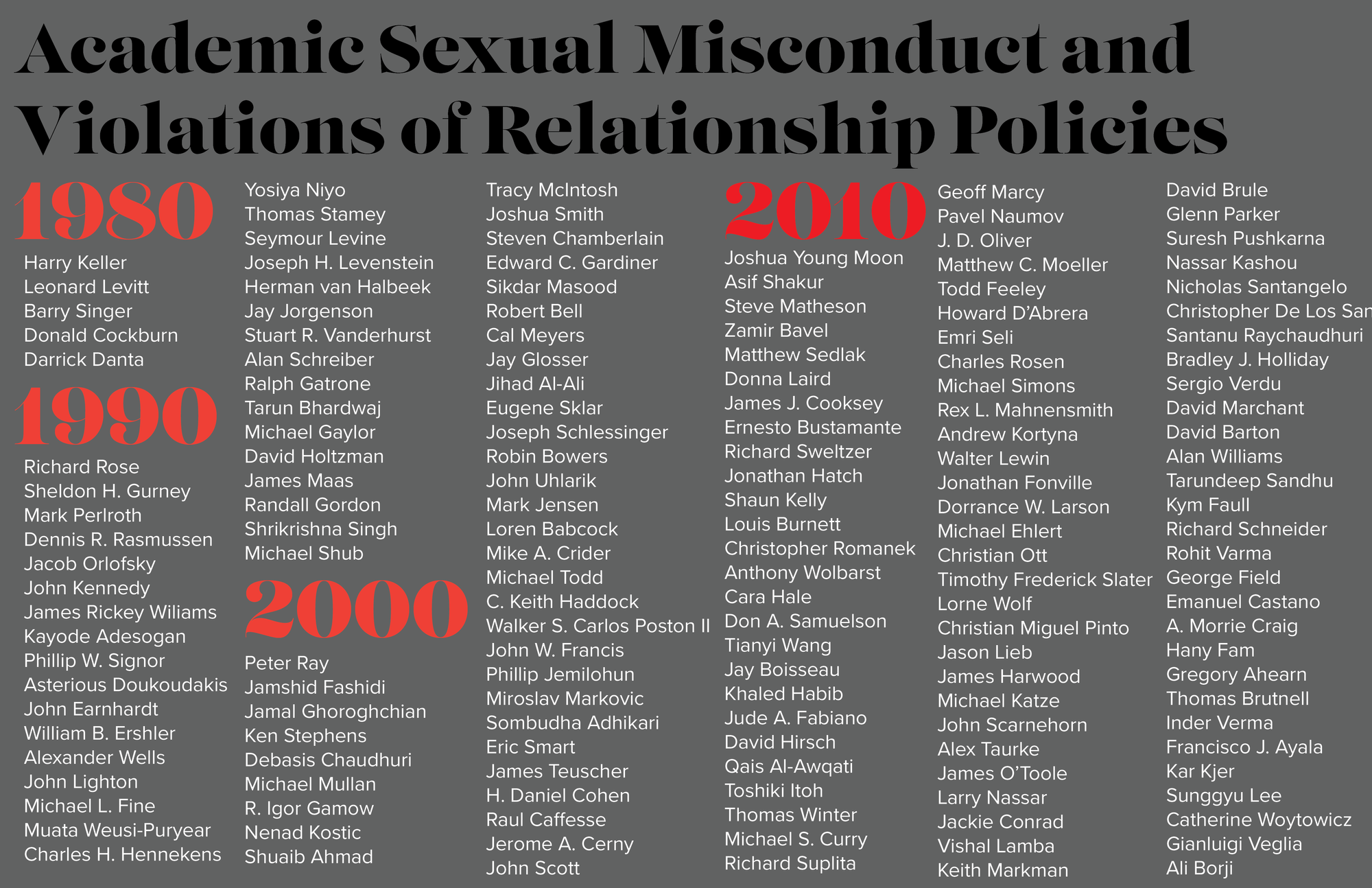
Data
I found an amazing dataset by the Geocornition Research Laboratory that has recorded all of the public academic sexual misconduct violations of relationship policies that has occured recently (the earliest is 1917, then jumps to 1978 onwards). It lists the name, institution, position, discipline, details of outcome, and news articles related to the case, amongst other information. I extracted those from scientific disciplines for my visualization.
Visualization
The purpose of this visualization is to get the names out there, as well as show the sheer number of men (and some women) who have been accused. I was trying to visualize it in a different way, but couldn't get all of the names to fit. Even in this style, I couldn't get all of the names from the 2010s to fit in the allotted space. It kind of ended up being just a list rather than a visualization.
Improvements
I think this one definitely needs to be interactive, because there is too much information that I want to show. In hindsight, maybe I should have clustered them into disciplines, but the names are the important information in this dataset. I didn't want to sacrifice the names for aesthetic purposes. An interactive timeline is intriguing, with pop ups for each year listing the information of the person indicted, summary of what happened, and links to the case.
Final Qualitative Visualization
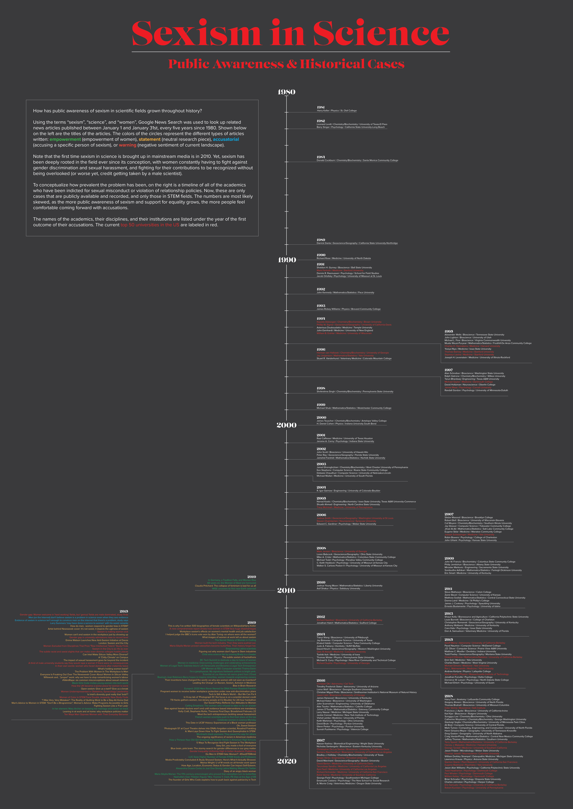
Data
For the final visualization, I decided to combine both of my datasets. I was leaning towards one of the other, but I spent so much time figuring out how to gather one set, and liked the other one so much, that I wanted to use both.
To increase my dataset of news article headlines related to science, sexism, and women, I played around with a number of APIs. First, I tried the Google News Search API, but it would only allow queries in the past up to one month. I also tried the Event Registry API, but I got stuck with the same problem, where it only allowed queries in the past up to twelve months. I was aiming to search for articles from 1980 up to the present, so this did not work for me. I considered using other news APIs such as the NYT API, but I didn't want my article dataset to be skewed towards a liberal/conservative bias. I ended up figuring out how to scrape news article titles from Google News Search, which worked very well. I then categorized the articles into the four categories stated above (empowerment, statement, accusation, warning), and manually deleted articles that did not relate at all to the topic (there was no room in the poster to put the unrelated articles in).
For my other dataset, I decided to include the disciplines and institutions of the academics indicted along with their names. I only included academics in STEM disciplines.
Visualization
For my final visualization, I decided to use a vertical timeline, the left side being a timeline of article headlines, and the right side being the timeline of academics indicted with sexual misconduct or violation of relationship policies. On the left, the four categories of articles are colored in different colors, while on the right, academics that worked/are working in the current top 50 US universities are highlighted in red. I wanted to show that even in colleges considered prestigious, problems of sexism and sexual harassment are rampant.
A comparison of these two timelines gives a glimpse into public awareness of the problems of sexism in science. Note that mainstream articles pertaining to sexism in science only start popping up in 2010, even though these problems have existed probably since the conception of science as a field. The publicly available dataset for academics indicted for sexual misconduct starts in 1981--much earlier than when media started picking up on it, but assume there are many more cases from the past that have never risen to the surface. As we reach modern years, the numbers of articles and indictments increase substantially, probably due to the social climate of support and acceptance of women in STEM fields, and the growing movement to fight sexism and sexual harassment in society in general.