Topic
NYC museums and staff diversity
This data visualization explores the job types in NYC museums by number, who is in those jobs and what level these job types are (junior/mid/senior)
Data set
Schonfeld, Roger, and Sweeney, Liam. Diversity Survey of the New York City Department of Cultural Affairs Grantees, 2015 - accessed from the National Archive of Data on Arts and Culture (NADAC) website https://www.icpsr.umich.edu/icpsrweb/NADAC/ downloaded here: https://www.icpsr.umich.edu/icpsrweb/NADAC/studies/36606
In 2015 Ithaka S+R surveyed the grantees of the New York City Department of Cultural Affairs (DCLA) and received demographic data on staff and board members, as well as questionnaire responses about initiatives and barriers to diversifying staff and boards. The invitation to participate in the survey was sent to the executive directors (or equivalent) of the 1,061 DCLA Capital Fund recipients for fiscal year 2016. Survey participation was a requirement for funding eligibility for fiscal year 2017.
Representatives from the responding organization filled out spreadsheets on staff demographics. The spreadsheet results are compiled in the Demographics File that contains information on staff race, ethnicity, gender, disability status, and age. In addition, there are variables on staff members' roles in the organization such as employment status, job level, decade hired, job type, and discipline. The Demographics File contains 14 variables and cases on over 48,000 staff members.
Selected from the survey data the museum respondents only.
Visualization
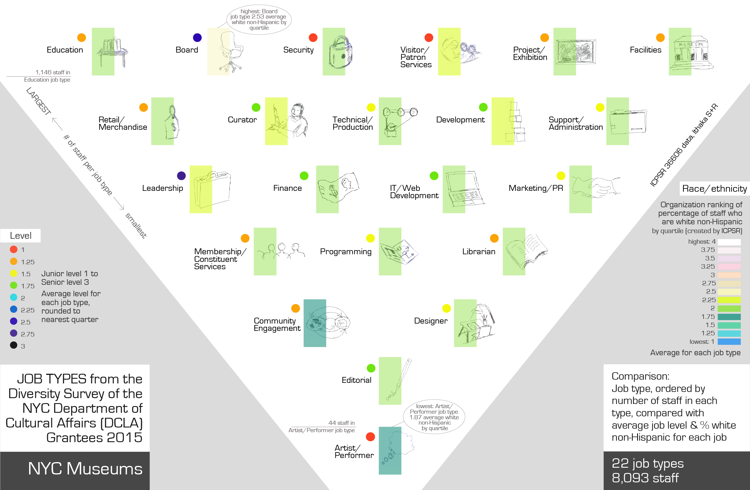
Visualization shows the data for the 8,093 individual museum staff. There are 22 job types and I decided to order by number of staff in each job type. Used an upside down triangle to locate the job types in order - with most staff at the top and the job types with fewest staff at the bottom.
This is individual staff data - interesting to see what the job types are, I wanted to explore correlations between job type and diversity and level of seniority. (Level is recorded here but not pay.)
My aim for this qualitative project was to depict job type with some images, to give the piece a slightly handdrawn sense.
- Cross correlate those jobs with diversity of staff in each job type using color rather than numbers to show data.
- Second color system shows job 'level' - categorized in the dataset as 1,2,or 3: 3 is the most senior job position and 1 is the junior job position.
The original sketches / iterations used a wavy color line for the diversity quartile, and small icons downloaded from the noun project, grouped in a grid format. I started with the order of most staff per job type to least number of staff. I was inspired by the work of Georgia Lupi and her use of small annotations, use of color to denote categories, overlaying of information for one 'point' on top of each other, e.g. color underneath, drawing and text partly on top, and detailed, hand drawn visualizations. What I changed to get to the final result was moving from a grid to a triangle as the organizing shape, then turning that upside down to suggest largest at the top, changing color for diversity so that light is associated with job types that have the highest staff white non-Hispanic, hand drawing the icons and making them more consistent in style, adding the level data using color coding, changing the wave to an outline box and then to a bar half over the image, moved the group text around a lot, and significantly re-thought the heading wording, placement and look to explain the data visualization as accurately but succinctly as possible.
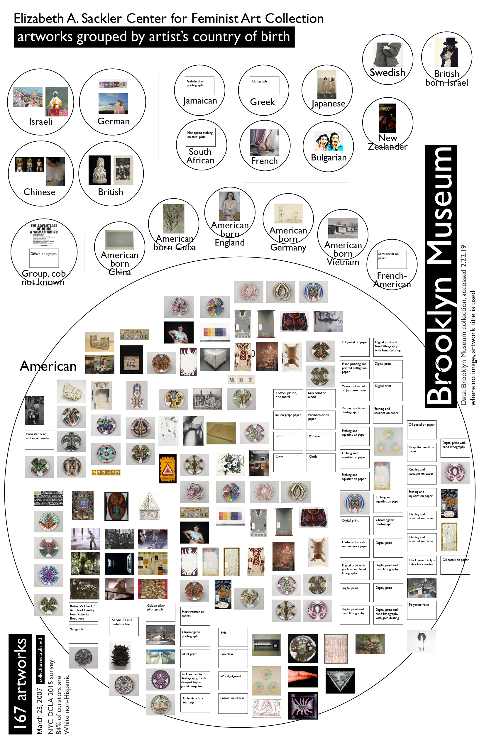
An aside - the other qualitative project I developed - less interesting data set but I liked the visualization - Brooklyn Museum data: