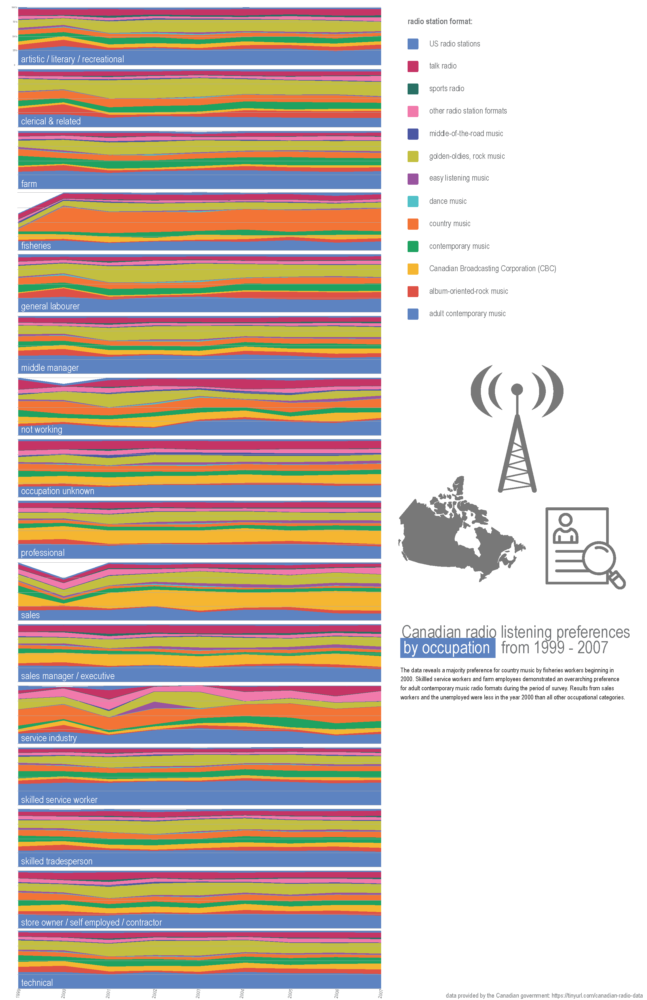
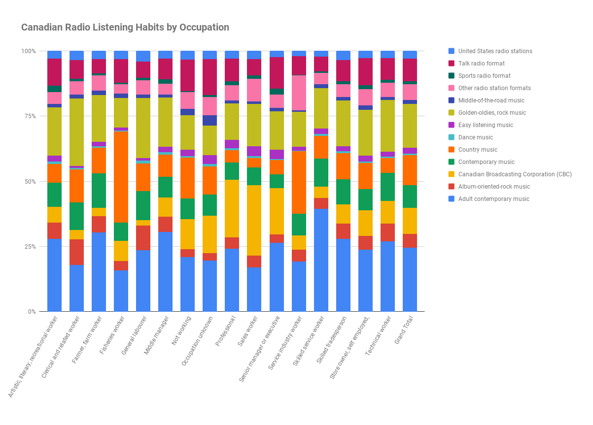
The final visualization produced for the quantitative assignment was based on this dataset provided by the government of Canada, on surveyed radio format listening preferences defined by total percentage share of the listeners’ occupations. Based on the feedback received on the initial drafts last week, this was the data that compelled the most attention and interest.
Other topics that were in the running last week (drafts) were:
- Canadian non-commercial radio - Operating expenses vs income/revenue
- Canadian commercial radio operating expense growth over time
(It turns out that Canada releases some high quality data about their radio operations, much more so than other places!)
- Some technical data about the frequency power and ranges for UK radio stations
- and some nonsense mapping of various radio station technical parameters which were mapped as if they had qualitative meaning but ended up becoming more pure aesthetically interesting (like a glitch chart.)
In general, I found it difficult to procure meaningful quantitative data about the radio industry broadly that could be mapped and made more interesting through visualization. It was clear to me (especially after feedback) to revisit/refine to the Canadian listening habits data --- but after this project I don’t intend to return to this data set again.
The initial draft of this data set (created through Google Sheets) aggregated the percentage information into one value per occupation per radio format for the whole time period of the survey (1999 - 2007), as seen directly below. I knew that I wanted my second draft to show how these preferences changed by each year, within each occupation. In order to somewhat successfully accomplish this, I thought that a small multiples stacked bar-chart (based on the original draft stacked bar chart) would be the key. I didn’t want to plot each graph in a grid form, and instead run them either all horizontally or all vertically --- both of which presented challenges within the static print format (specifically on 11 x 17 paper.)
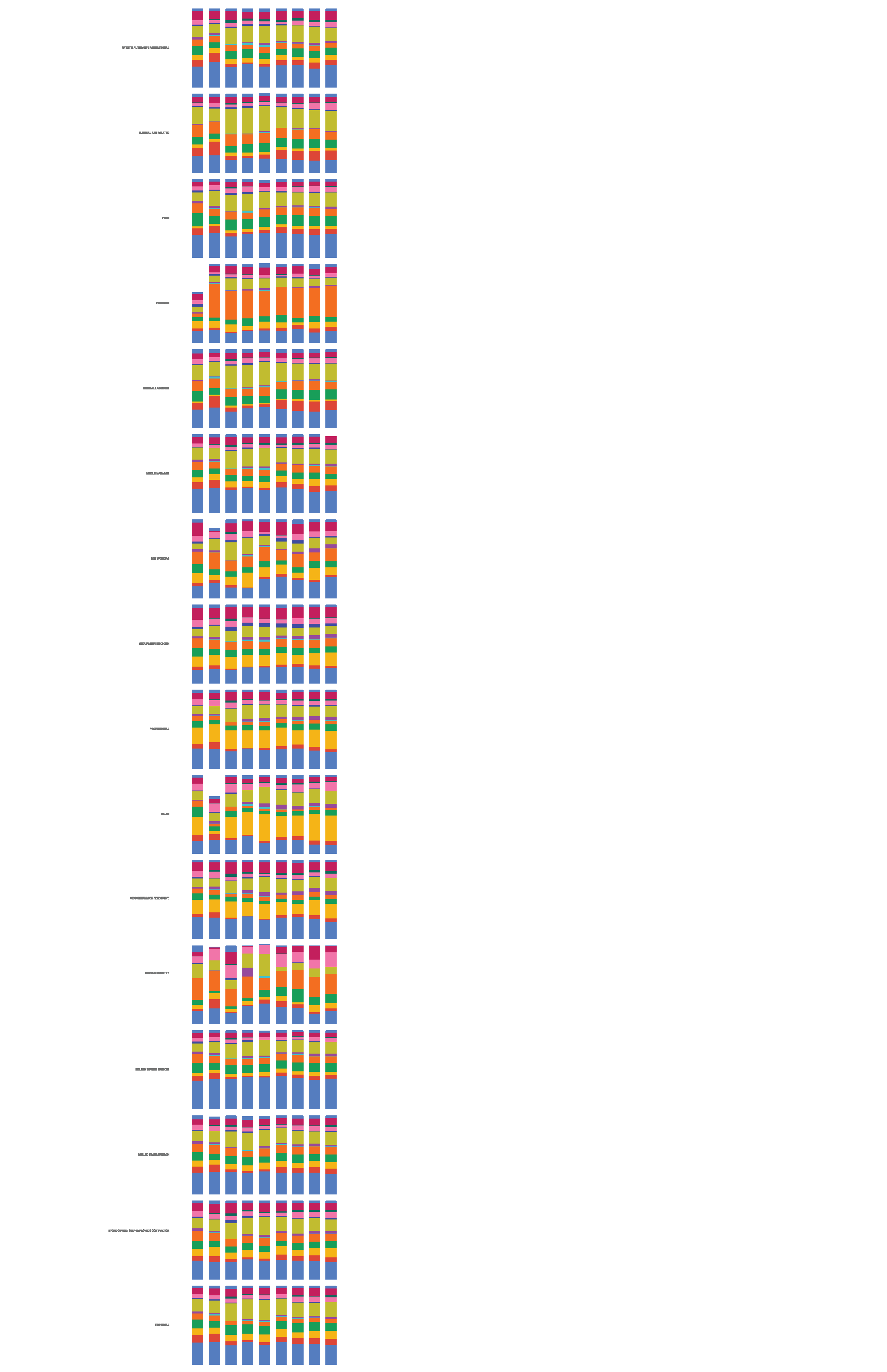
Due to these challenges, I changed the format from the stacked column chart and moved to a stacked area line chart, thinking that getting rid of the white spaces between each bar would be easier on the viewer’s eyes. I also was able to elongate the graphs to more reasonably use the area of the page surface than the column chart allowed. (I had determined to stick with the Sheets output charts for this exercise, as it seemed as good a format as any to relay the information from the data set. The color choices are arbitrary but appealing – and I tried several alternatives --but stuck with the original aesthetic which ended up looking the best, particularly after running through the copier on a fuller/darker color setting.)
I then created one graph per occupation and began a tedious process of combining and reformatting the exported svgs in Illustrator.
In order to be actually informative, I think the paper format is a bit of a failure in terms of size and clarity of the information. I’m also missing the roll-over/hover effect that is helpful in a screen format for precise percentages. The dataset is a bit of a stretch for quantitative analysis --- though I am working with precise numbers here, as opposed to radio station call numbers, etc. In the end the design choices feel a bit random in terms of the information that is being presented. I made multiple versions of this --- a few versions included the lines extending from each graph and to turn into wavy lines that were meant to resemble radiowaves, but in the end that looked like a mess (and serve as a reminder of my very limited Illustrator skills.) The final version did not include any extended radio lines.
I’m appreciative for the two weeks on this quantitative assignment. It was satisfying to search for tangentially topical datasets and explore through an ‘off the shelf’ medium and format the information into exploratory graphics.